Design • UX Design • March 20, 2013 • 13 minutes READ
A couple of years ago I saw Twitter’s form validation for the first time and I was absolutely amazed. User Interface nerds among you probably know what I’m talking about. At the time we were almost jumping with excitement.
The discrete charm of well-designed form validation in Twitter’s forms was absolutely seductive. Informative error messages popped out right when I’d made an error, immediately eliminating irritation. “Inline validation” helped me understand what was going on right away. I could feel that this simple form was trying to have an actual conversation with me. That was a revelation! At the end, I didn’t have to wait for a reload of the whole page to check if the form was filled in with the right data.
This experience completely changed my approach to the design of forms. It helped me understand that form validations are meant to have conversations with users and guide them through the difficult times of errors and uncertainty.
The term “form validation” might need a little bit of clarification. Form validation is the technical process where a web-form checks if the information provided by a user is correct. The output of this process is emotional rather than technical. The form either points out that the user made an error, or assures that the provided data is accurate. To give you an example: if a user provides the data in a form field labeled “email address” the form should check if the provided text is in the right format (user@example.com) and if this e-mail address isn’t already registered.
Generally speaking, there are two types of form validation:
- After submit validation – when the user provides all the data and submits the form, usually by hitting the button, the information is sent to the server and validated. The response of the “validator” is sent back to the user’s computer and it’s visualized as either a confirmation message (“everything went fine!”) or a set of error messages.
- Inline validation – validation messages are shown immediately after the user types in data to form fields. Usually, information is shown next to the fields and encourages the user to take immediate action.
Importance of Form Validation
Form validation is at the center of communication during the most important processes of interaction between the web/mobile visitor and the interface. Its importance exceeds its size and perceived simplicity. Don’t believe me? Consider when you can typically encounter form validation:
Online Email Template Builder
With Postcards you can create and edit email templates online without any coding skills! Includes more than 100 components to help you create custom emails templates faster than ever before.
Try FreeOther Products
- Sign-up/sign-in forms
- Shopping cart – check-out forms
- Newsletter forms
That’s a bunch of important moments in your interface life-span, right? The business side of your endeavor probably hangs on this.
Let’s compare the online to the offline world. This always puts things into a familiar perspective. Let me make a simple analogy: form validation is the equivalent of having a conversation with a salesman right before a purchase – when everything is still on a knife’s edge. If the salesman is impolite and refuses to provide any assistance, you’ll certainly leave the shop without completing your purchase. If the salesman is professional, polite and helpful – you’ll reach for your wallet.
Most form validations are as rude as the rudest salesman. Forms with error messages such as “Database error!”, “Wrong e-mail!” not only fail in terms of savoir-vivre – they usually result in a high drop-out rate.
Poor communication leads to poor business results and there is plenty of proof for that. Research conducted by Luke Wroblewski clearly shows that using properly designed inline form validation might make a tremendous difference:
“When compared to our control version, the inline validation form with the best performance showed compelling improvements across all the data we measured. Specifically, we saw:
- a 22% increase in success rates,
- a 22% decrease in errors made,
- a 31% increase in satisfaction rating,
- a 42% decrease in completion times, and
- a 47% decrease in the number of eye fixations.
This shouldn’t be ignored. Designing form validation in the right way might have a huge impact on your business!
And this is the point when we leave theory and jump into practice. Let’s see what the best players in the field designed and then we’ll learn how to step-by-step design perfect form validation.
Excited?
Each example used below can be uploaded directly to UXPin – The UX Design App as a reusable wireframe template.
Avoid confusion
Generally speaking there are four important elements that good form validation consists of:
- Right time of informing about problems/success
- Right place for validation messages
- Right color
- Clear language
All these factors have one clear goal: to avoid confusion. Confusion is the arch-enemy of conversion. If you don’t want to risk a sky-rocketing drop-out rate, create validation that eliminates any risk of your customers being confused. That’s the road to a high conversion rate.
Right time
As we could see in the example of Luke Wroblewski’s research – the right time to inform about the success/failure of provided data is right after the user has submitted the information. Inline form validation that immediately informs users about the correctness of provided data results in an increase in the conversion rate.
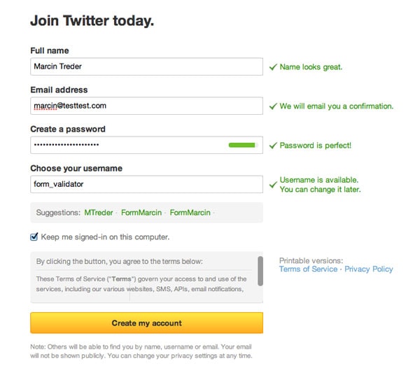
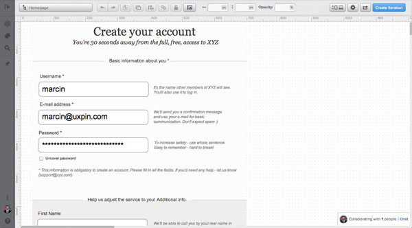
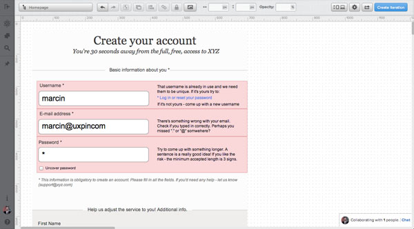
Twitter is an obvious example here. They did a great job of avoiding user confusion.
On the screen below you can see that I’m trying to register with an e-mail address that was already used. The form informs me that I should stop right at the second step and consider some back-up options, so I won’t be disappointed with the final result. A classic “after submit” validation would wait for me to fill in the whole form, reload the page and then it would let me know that something was wrong.
Twitter chooses a better time to stop me – there’s no doubt about that. The immediate response of the form saves me a massive loss of time (yes, today even 3 minutes is a massive loss).
And what’s even more amazing – Twitter is actually trying to have a conversation in this critical moment of our acquaintance. Thanks to inline validation, they can immediately offer me some options. Perhaps I’m the owner of the account registered with the e-mail and I just wanted to log in? Who knows – maybe I’ve just forgot the password?
This is not only great form validation, which adds a lot to the conversion rate; it’s also a top-notch customer service.
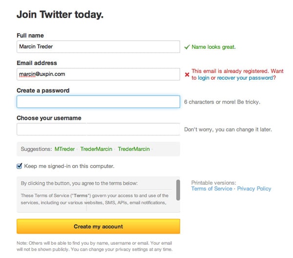
Twitter Form Validation – Error Message
Twitter Form Validation – Error Message – Upload Wireframing Template to UXPin
Right place
The place of the validation message is as important as the right time of showing it. On the discussed Twitter example – if the message wasn’t next to the field, but placed somewhere below, I wouldn’t manage to notice it quickly. If I didn’t notice it…well, that would just be confusing and dangerously close to forcing me to leave the form without finishing the process.
When you’re wondering what place to choose for your validation messages, follow this rule of thumb – always place the message in the context of action. If you want to inform the user about an error occurring in a particular field – show it next to the field. If the error is general (e.g. a problem with sending data to the server) and there wasn’t a reload of the page – show the message next to the submit button, if there was a reload of the page – show it at the top of the page.
Take a look at the example below. Light CMS shows error messages next to each field. That’s really easy to notice and understand.
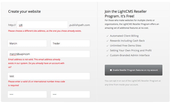
Light CMS Form Validation – Error Message
Light CMS Form Validation – Upload Wireframing Template to UXPin
Etsy’s form is also a great example of well placed validation messages. In this case I also really like the construction of the form and the visualization of error messages. The clear division into sections (Sign Up Using Facebook, the main sign-up form) provides clear guidance through the sign-up process.
Error messages have a lovely visualization – with a red border around form fields and red message boxes – the intention of the communication couldn’t be clearer.
That’s a good attempt at eliminating confusion from the form.
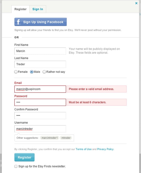
Etsy Form Validation – Error Message
Etsy Form Validation – Upload Wireframing Template to UXPin
If the construction of the form doesn’t give you too much space for a clear error message, follow the example of Vimeo.
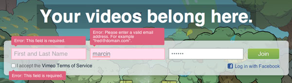
Vimeo Form Validation – Error Message
Vimeo, using tooltips pointing at specific form fields with errors, avoids lots of confusion. The color-based correlation is also helpful. A red error message corresponds with a red background and red border of a field with errors.
Error messages are placed in the context of action (in this case an error) and that’s the foundation of clear communication.
Of course the problem here is the “after submit validation” which makes people wait till the validation of the form is done on the server. However, in the case of such a short form, I wouldn’t expect it to be a critical design error.
Vimeo Form Validation – Upload Wireframing Template to UXPin
Right color
Color – is easy as 1, 2, 3 – red is for errors, blue for information, yellow for warnings, green for the confirmation of success. This color system is the most intuitive you can imagine. At least part of it (red & yellow focus attention and raise blood pressure) is backed up by evolution and the whole system of color – meaning is present e.g. on the roads. Don’t confuse it and you’ll be ok.
On all the examples above we’ve seen this rule in action. Let’s review a couple more interesting solutions, so you’ll have plenty of inspiration.
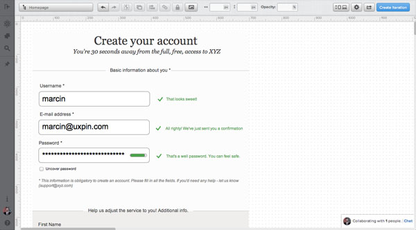
Again Twitter rules when it comes to proper form validation. Confirmation messages are extremely clear with the green color and the little “check” icons add to the overall greatness.
Pay attention also to the password field. The green indicator inside the field shows how safe your password is. Now that’s a home run. Love it!
Twitter Form Validation – Confirmation Message
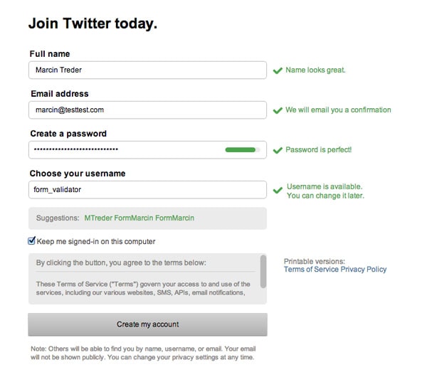
Twitter Form Validation – Upload Wireframing Template to UXPin
Pinterest is also an interesting example of the smart usage of color in validation messages. With a red box around the whole field, the danger of an error is emphasized. The addition of neatly done inline validation makes it a truly anti-confusion solution.
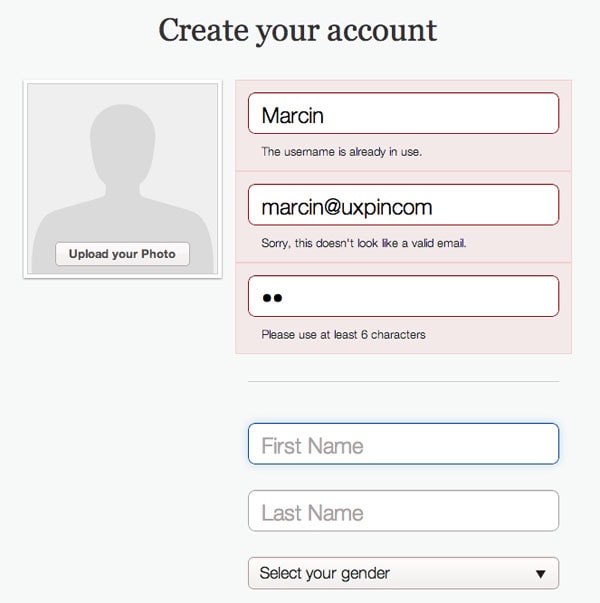
Pinterest Form Validation – Error Message
Take also a close look at the construction of the form. Six fields are visually divided into two sections. One is all about logging in to the service and it’s somehow formal. The other is personal – First Name, Last Name and Gender. The division makes a lot of sense because your last name and gender aren’t obligatory.
However, not indicating that some fields are obligatory and some aren’t, is on the verge of being a dark pattern. People might feel tricked into filling in their last name and gender (which might be used for advertisement targeting reasons).
I can see their very efficient strategy of gaining data, but I would be very careful with such practices. Usually, I recommend asking users for non-obligatory data after the sign-up process.
Pinterest Form Validation – Upload Wireframing Template to UXPin
Right language
Finally – language – that’s the tough one. I spent hours looking for examples worth mentioning and didn’t find anything that was perfect.
A validation message should clearly state:
– What happened
– What’s the next step the user should take to succeed (this doesn’t necessarily apply to the confirmation of success messages)
And should always avoid using technical jargon.
The rules are simple, but somehow they are very easy to ignore. A typical error might state that “the email is invalid” without telling the customer why it’s invalid (a typo? Is it occupied?). This brings confusion on board. A risky business.
Of course, again, Twitter is an example of the usage of clear and crispy language. When they say that your e-mail address is OK, they use a confirmation message to say “we’ll e-mail you confirmation”. If the e-mail is already registered, they give you the option to log in, or recover your password. If you manage to create a perfectly safe password, Twitter will tell you “perfect password!”.
Now isn’t that nice? It’s all about having an ordinary conversation.
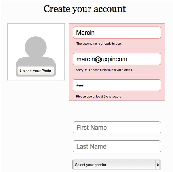
Delicious makes lots of mistakes in their form and its validation, but they handle the language side in an interesting way.
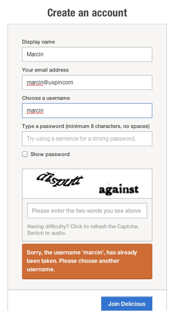
Delicious Form Validation – Error Message
First of all, and I absolutely love it, they added a little info to the password field “Try using a sentence for a strong password.” Isn’t that helpful? I’ve been waiting to see something like that for a long time. It makes a lot of sense when it comes to the safety of a password. Much more than requiring people to type a capital letter and a number.
Secondly, Delicious beautifully inform about an error with choosing a username:
1) “Sorry, the username ‘marcin’, has already been taken” – clear information about what happened.
2) “Please choose another username” – clear call to action
However, they lack a back-up option. Perhaps I just forgot that I had an account?
Anyway, Delicious broke the rules of right time, right place and color… but, thanks to the right language, their form is still rather usable. This is how important language is.
Delicious Form Validation – Upload Wireframing Template to UXPin
Sum up
We’ve seen some great work on form validation, but we haven’t seen perfection yet. This is something that we’ll build on our own to demonstrate how easy it is to follow the four rules of designing the right form validation:
- Right time of informing about problems/success
- Right place for validation messages
- Right color
- Clear language
Time for a step-by-step tutorial!
By following our 4 simple rules mentioned above, we’ll create perfect form validation. Form validation that will minimize the risk of losing a customer on the way to the ultimate goal of the service.
Just to prove my point, I’ll design a form with a section of additional, non-obligatory, information. Something similar to Pinterest’s form. As I said, usually I wouldn’t recommend doing it that way, but if you really must, there’s a couple of things you can do to make it easier for people.
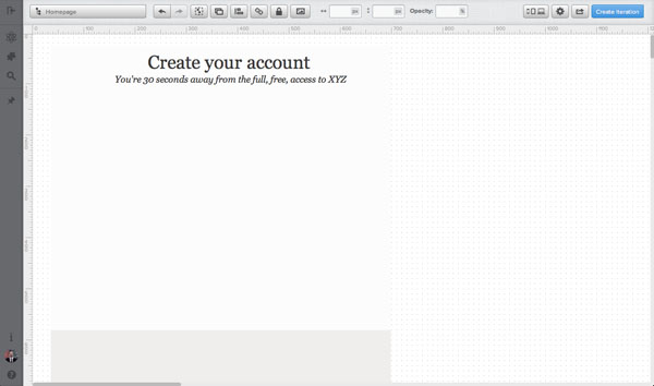
I’ll start with the structure of the form and a header. The structure is really easy. The white part is devoted to obligatory fields, the gray part to non-obligatory, additional information.
I’ll just draw simple boxes, to fix the space and give my design a structure.
Then I’ll add a header – something very plain, putting persuasive information into the sub-headline. Again – I’m looking for an anti-confusion solution.
2. Form Fields
In the next step, I’ll add form fields and labels. Since I’m strongly against labels inside the fields (very confusing, if you start to write something inside the field, stop for a couple of minutes and then want to start again… there’s no indicator of what you should write in the field), I’ll place them above the form fields.
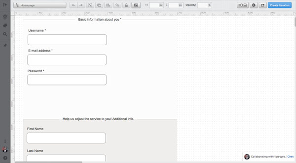
Additionally, I’ve added two sub-headers that explain what types of information need to be provided in each section.
3. Form field Information
Form field information is something that’s often omitted, but in reality it’s very helpful as a start of the conversation with users. By using one or a maximum of two sentences, you can explain some risky things like “why do you need my e-mail?” and build basic trust.
I’ll add information next to almost all the fields:
- Username – “It’s the name other members of XYZ will see. You’ll also use it to log in.”
- E-mail address – “We’ll send you a confirmation message and use your e-mail for basic communication. Don’t expect spam :)”
- Password – “To increase safety – use a whole sentence. Easy to remember – hard to break!”
- First Name – “We’ll be able to call you by your real name in our communication!”
- Gender – “It’ll let us adjust the service here and there a little bit!”
This additional information might not be critical, but it’s the starting point of a “relationship”. It’s better to say more, than to confuse users.
4. Error messages
When it comes to error messages, we need to really carefully consider all of our rules.
- The right time to show the message is right after the error is spotted. We’re going to design for inline validation.
- The right place is next to the field – so I’m going to replace additional information next to the field with an error message
- The right color is of course red and I’m going to put a robust box underneath the whole field with an error
- Clear non-technical language – no “database error” etc.
Take a look at the result:
I’d like my error messages to “explain” and “guide” people through the process. I’m trying hard not to leave any doubt, which can result in leaving the form without correcting the data. Here’s the full text:
– Username error – “That username is already in use and we need them to be unique. If it’s yours try to:
* Log in or reset your password
If it’s not yours – “come up with a new username”
– E-mail error – “There’s something wrong with your email. Check if you typed it in correctly. Perhaps you missed “.” or “@” somewhere?”
– Password error – “Try to come up with something longer. A sentence is a really good idea! If you like the risk – the minimum accepted length is 3 signs.”
Can you see the pattern in these error messages? I’m stating clearly that there was a problem and immediately I’m coming up with a solution.
5. Confirmation messages
And finally – confirmation messages. These are a pure pleasure to design. Since they pop out right after typing text into the fields, I’ve decided to come up with a more subtle solution. I don’t want people to stop on the confirmation message. They should scan it quickly and go to another field feeling good about the previous step.
No heavy colorful boxes, not long sentences – just a quick confirmation.
And that’s it! Easy as 1, 2, 3. Form validation aligned with our four rules. It didn’t hurt, did it?
Like what you’re reading? Subscribe to our top stories.
Forms are necessary components of many applications and websites. We use them to log in, purchase items, send feedback, and enter our personal information. Think about the websites you use and how many times you enter information: how often do you run into errors? How frustrating is it to navigate those errors?
Error messages are an indicator of system status: they let users know that a hurdle was encountered and give solutions to fix them. But in order for the error messages to be effective, people need to see them, understand them, and be able to act upon them easily. Visibility of system status is one of Jakob Nielsen’s 10 usability heuristics. It refers to how well the state of the system is conveyed to its users. Ideally, systems should always keep users informed about what is going on, through appropriate feedback within reasonable time.
To err is human, and people will make mistakes when using software. An error flow is the sequence of steps that the user must go through in order to correct the error. A thoughtful error flow allows users to easily fix their mistakes and proceed with their tasks.
There are three main principles that should be followed when designing error-correction flows:
- The error message should be easy to notice and understand.
- The field(s) in error should be easy to locate.
- Users shouldn’t have to memorize the instructions for fixing the error.
These guidelines need little explanation: first, if users don’t know that there is a problem with their input, they won’t be able to fix it. Second, people shouldn’t have to hunt for the error through the form. And last but not least, they shouldn’t have to remember how to fix the problem while they’re fixing it: the instructions should be right in front of their eyes.
In this article, we discuss helpful guidelines for designing error flows.
1. Aim for Inline Validation Whenever Possible
Ideally, all validation should be inline: that is, as soon as the user has finished filling in a field, an indicator should appear nearby if the field contains an error. This type of error message is easily noticeable; moreover, fixing the error immediately after the field has been completed requires the least interaction cost for users: they don’t need to locate it or navigate to the field, nor do they have to switch context from a new field to return to an old field they thought they had completed successfully.
Of course, there will be situations where inline validation won’t be possible and data entered by the user will need to be sent to a server for verification.
2. Indicate Successful Entry for Complex Fields
Inline validation can also be used to indicate successful completion. For example, if your users must create a unique username, a green checkmark and a message that the username is available let users know they can proceed to the next step. Follow the error-prevention guidelines: offer suggestions for field values, constrain inputs to legal values, and be flexible by allowing for typos, abbreviations, or different input formats.
For complex input such as new passwords, instant inline validation (which appears as the field value is being typed) will prevent users from guessing or checking multiple times if what they’ve entered meets the guidelines set by the system. In the example below, the password-strength indicator changes as the user is typing and helps the user decide if the string entered so far is good enough or more characters need to be added.
However, don’t go overboard with success indicators. Success indicators shouldn’t distract users from filling out forms and should only be used when the additional context helps complete the form faster or more accurately. For example, you don’t need to show a success message when the only requirement on the field is that it is filled in, as that message won’t provide much additional context to your user.
3. Keep Error Messages Next to Fields
With inline validation, the error message is naturally shown next to the field causing the error. But even when the fields are not validated inline, it pays off to show an actionable error message below or next to the problem field in order to help the user fix the error. The message should follow error-message guidelines: it should be explicit, human-readable, polite, precise, and should give constructive advice.
Keeping error messages next to the fields in error minimizes working-memory load: users can see the error message while fixing the error instead of having to remember it.
4. Use Color to Differentiate Errors from Normal Field States
Red is the color that is associated most with errors, along with orange or yellow for warnings, and green or blue for success. Make sure that the color of the validation text stands out from the rest of the form so the user will notice it quickly. Add a semitransparent background of the same color to the error field to make it salient on a long page with many form fields.
5. Add Iconography or Subtle Animation for Easy Scanning
Together with color, an icon to the left of your error message or validation summary will draw attention to the error and also help users who are color blind. When the user scans the form, the icon will stand out and draw the eye to what needs to be fixed.
A subtle pulse or bounce animation on the icon corresponding to an error can further draw users’ attention to the error. However, don’t abuse animation: if there are multiple errors, many animated icons can be overwhelming. And don’t animate text — animated error messages are hard to read.
6. Use Modals or Confirmation Dialogs Sparingly
When you need to draw extra attention to a potential error, you can use a modal or confirmation dialog to explain details and help the user fix the issue. However, use such dialogs sparingly as they have two big disadvantages: (1) they are disruptive; (2) the error message is presented in a window that needs to be dismissed in order to fix the error, so any complex instructions will have to be stored in users’ working memory, thus increasing their cognitive load. They are, however, okay if the error message is simple or the form could still be submitted as it is.
7. Don’t Validate Fields Before Input is Complete
In most cases, avoid showing the error until the user has finished with the field and moved to the next field. It can be annoying to see an error message before being given the opportunity to finish typing.
8. Don’t Use Validation Summaries as the Only Indication of an Error
A validation summary is shown at the top of the form and lets users know that there are errors that need to be fixed on the page, whether those errors are in the viewport or below the fold. A validation summary can give the user a global understanding of all the errors in a form, but shouldn’t be used as the only form of error indication, as it forces the user to search for the field in error; moreover, the error message may no longer be present in the viewport when the user reaches the error field, thus forcing the user to memorize the error message while fixing the issue.
9. Don’t Use Tooltips to Report Errors
Tooltips are sometimes used to indicate errors. An alert icon is usually displayed next to the field(s) in error, and then, once users hover on the icon or move focus in that field, a tooltip or a toast containing the error message will appear.
Generally, we recommend against this method of signaling errors. First, some alert icons are hard to notice. Second, users may wonder what is wrong with the field, without realizing that they can actually see the error message if they take an extra step. Third, why make users work more (i.e., hover or move focus to field) in order to see the error message?
10. Provide Extra Help for Repeated Errors
If the same error occurs repeatedly (usually 3 times or more in a single form-filling attempt), it is often an indication of a serious problem in the user interface. Quite possibly, your error messages are insufficiently helpful, but there could also be another mismatch between the design and users’ needs. As always, remember that when users make errors, it’s not their fault. It’s your design that’s too error-prone.
We recommend reviewing analytics data for repeated errors and then reviewing (or testing) the design to try to improve it. A rewritten error message would often be the first thing to try.
As more of a band-aid solution, you can also show a link to more detailed help information or documentation after a user has made the same error too many times.
Conclusion
Error flows should be designed to help users fix the mistakes in a form and advise them how to avoid making more. Ensure that users can easily detect errors, understand how to fix them, and see the error message while correcting the corresponding error. Remove the guesswork and let users get on with their tasks.
- Previous
- Overview: Forms
- Next
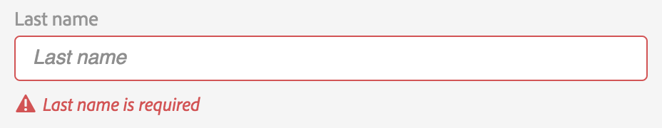
Before submitting data to the server, it is important to ensure all required form controls are filled out, in the correct format.
This is called client-side form validation, and helps ensure data submitted matches the requirements set forth in the various form controls.
This article leads you through basic concepts and examples of client-side form validation.
| Prerequisites: |
Computer literacy, a reasonable understanding of HTML, CSS, and JavaScript. |
|---|---|
| Objective: |
To understand what client-side form validation is, why it’s important, and how to apply various techniques to implement it. |
Client-side validation is an initial check and an important feature of good user experience; by catching invalid data on the client-side, the user can fix it straight away.
If it gets to the server and is then rejected, a noticeable delay is caused by a round trip to the server and then back to the client-side to tell the user to fix their data.
However, client-side validation should not be considered an exhaustive security measure! Your apps should always perform security checks on any form-submitted data on the server-side as well as the client-side, because client-side validation is too easy to bypass, so malicious users can still easily send bad data through to your server.
Read Website security for an idea of what could happen; implementing server-side validation is somewhat beyond the scope of this module, but you should bear it in mind.
What is form validation?
Go to any popular site with a registration form, and you will notice that they provide feedback when you don’t enter your data in the format they are expecting.
You’ll get messages such as:
- «This field is required» (You can’t leave this field blank).
- «Please enter your phone number in the format xxx-xxxx» (A specific data format is required for it to be considered valid).
- «Please enter a valid email address» (the data you entered is not in the right format).
- «Your password needs to be between 8 and 30 characters long and contain one uppercase letter, one symbol, and a number.» (A very specific data format is required for your data).
This is called form validation.
When you enter data, the browser and/or the web server will check to see that the data is in the correct format and within the constraints set by the application. Validation done in the browser is called client-side validation, while validation done on the server is called server-side validation.
In this chapter we are focusing on client-side validation.
If the information is correctly formatted, the application allows the data to be submitted to the server and (usually) saved in a database; if the information isn’t correctly formatted, it gives the user an error message explaining what needs to be corrected, and lets them try again.
We want to make filling out web forms as easy as possible. So why do we insist on validating our forms?
There are three main reasons:
- We want to get the right data, in the right format. Our applications won’t work properly if our users’ data is stored in the wrong format, is incorrect, or is omitted altogether.
- We want to protect our users’ data. Forcing our users to enter secure passwords makes it easier to protect their account information.
- We want to protect ourselves. There are many ways that malicious users can misuse unprotected forms to damage the application. See Website security.
Warning: Never trust data passed to your server from the client. Even if your form is validating correctly and preventing malformed input on the client-side, a malicious user can still alter the network request.
Different types of client-side validation
There are two different types of client-side validation that you’ll encounter on the web:
-
Built-in form validation uses HTML form validation features, which we’ve discussed in many places throughout this module.
This validation generally doesn’t require much JavaScript. Built-in form validation has better performance than JavaScript, but it is not as customizable as JavaScript validation. -
JavaScript validation is coded using JavaScript.
This validation is completely customizable, but you need to create it all (or use a library).
Using built-in form validation
One of the most significant features of modern form controls is the ability to validate most user data without relying on JavaScript.
This is done by using validation attributes on form elements.
We’ve seen many of these earlier in the course, but to recap:
required: Specifies whether a form field needs to be filled in before the form can be submitted.minlengthandmaxlength: Specifies the minimum and maximum length of textual data (strings).minandmax: Specifies the minimum and maximum values of numerical input types.type: Specifies whether the data needs to be a number, an email address, or some other specific preset type.pattern: Specifies a regular expression that defines a pattern the entered data needs to follow.
If the data entered in a form field follows all of the rules specified by the above attributes, it is considered valid.
If not, it is considered invalid.
When an element is valid, the following things are true:
- The element matches the
:validCSS pseudo-class, which lets you apply a specific style to valid elements. - If the user tries to send the data, the browser will submit the form, provided there is nothing else stopping it from doing so (e.g., JavaScript).
When an element is invalid, the following things are true:
- The element matches the
:invalidCSS pseudo-class, and sometimes other UI pseudo-classes (e.g.,:out-of-range) depending on the error, which lets you apply a specific style to invalid elements. - If the user tries to send the data, the browser will block the form and display an error message.
Built-in form validation examples
In this section, we’ll test out some of the attributes that we discussed above.
Simple start file
Let’s start with a simple example: an input that allows you to choose whether you prefer a banana or a cherry.
This example involves a simple text <input> with an associated <label> and a submit <button>.
Find the source code on GitHub at fruit-start.html and a live example below.
<form>
  <label for="choose">Would you prefer a banana or cherry?</label>
  <input id="choose" name="i-like" />
  <button>Submit</button>
</form>
input:invalid {
  border: 2px dashed red;
}

input:valid {
  border: 2px solid black;
}
To begin, make a copy of fruit-start.html in a new directory on your hard drive.
The required attribute
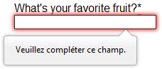
The simplest HTML validation feature is the required attribute.
To make an input mandatory, add this attribute to the element.
When this attribute is set, the element matches the :required UI pseudo-class and the form won’t submit, displaying an error message on submission when the input is empty.
While empty, the input will also be considered invalid, matching the :invalid UI pseudo-class.
Add a required attribute to your input, as shown below.
<form>
  <label for="choose">Would you prefer a banana or cherry? (required)</label>
  <input id="choose" name="i-like" required />
  <button>Submit</button>
</form>
Note the CSS that is included in the example file:
input:invalid {
  border: 2px dashed red;
}

input:invalid:required {
  background-image: linear-gradient(to right, pink, lightgreen);
}

input:valid {
  border: 2px solid black;
}
This CSS causes the input to have a red dashed border when it is invalid and a more subtle solid black border when valid.
We also added a background gradient when the input is required and invalid. Try out the new behavior in the example below:
Try submitting the form without a value.
Note how the invalid input gets focus, a default error message («Please fill out this field») appears, and the form is prevented from being sent.
The presence of the required attribute on any element that supports this attribute means the element matches the :required pseudo-class whether it has a value or not. If the <input> has no value, the input will match the :invalid pseudo-class.
Note: For good user experience, indicate to the user when form fields are required.
It isn’t only good user experience, it is required by WCAG accessibility guidelines.
Also, only require users to input data you actually need: For example, why do you really need to know someone’s gender or title?
Validating against a regular expression
Another useful validation feature is the pattern attribute, which expects a Regular Expression as its value.
A regular expression (regex) is a pattern that can be used to match character combinations in text strings, so regexps are ideal for form validation and serve a variety of other uses in JavaScript.
Regexps are quite complex, and we don’t intend to teach you them exhaustively in this article.
Below are some examples to give you a basic idea of how they work.
a— Matches one character that isa(notb, notaa, and so on).abc— Matchesa, followed byb, followed byc.ab?c— Matchesa, optionally followed by a singleb, followed byc. (acorabc)ab*c— Matchesa, optionally followed by any number ofbs, followed byc. (ac,abc,abbbbbc, and so on).a|b— Matches one character that isaorb.abc|xyz— Matches exactlyabcor exactlyxyz(but notabcxyzoraory, and so on).
There are many more possibilities that we don’t cover here.
For a complete list and many examples, consult our Regular expressions documentation.
Let’s implement an example.
Update your HTML to add a pattern attribute like this:
<form>
  <label for="choose">Would you prefer a banana or a cherry?</label>
  <input id="choose" name="i-like" required pattern="[Bb]anana|[Cc]herry" />
  <button>Submit</button>
</form>
input:invalid {
  border: 2px dashed red;
}

input:valid {
  border: 2px solid black;
}
This gives us the following update — try it out:
In this example, the <input> element accepts one of four possible values: the strings «banana», «Banana», «cherry», or «Cherry». Regular expressions are case-sensitive, but we’ve made it support capitalized as well as lower-case versions using an extra «Aa» pattern nested inside square brackets.
At this point, try changing the value inside the pattern attribute to equal some of the examples you saw earlier, and look at how that affects the values you can enter to make the input value valid.
Try writing some of your own, and see how it goes.
Make them fruit-related where possible so that your examples make sense!
If a non-empty value of the <input> doesn’t match the regular expression’s pattern, the input will match the :invalid pseudo-class.
Note: Some <input> element types don’t need a pattern attribute to be validated against a regular expression. Specifying the email type, for example, validates the inputs value against a well-formed email address pattern or a pattern matching a comma-separated list of email addresses if it has the multiple attribute.
Constraining the length of your entries
You can constrain the character length of all text fields created by <input> or <textarea> by using the minlength and maxlength attributes.
A field is invalid if it has a value and that value has fewer characters than the minlength value or more than the maxlength value.
Browsers often don’t let the user type a longer value than expected into text fields. A better user experience than just using maxlength is to also provide character count feedback in an accessible manner and let them edit their content down to size.
An example of this is the character limit seen on Twitter when Tweeting. JavaScript, including solutions using maxlength, can be used to provide this.
Constraining the values of your entries
For number fields (i.e. <input type="number">), the min and max attributes can be used to provide a range of valid values.
If the field contains a value outside this range, it will be invalid.
Let’s look at another example.
Create a new copy of the fruit-start.html file.
Now delete the contents of the <body> element, and replace it with the following:
<form>
  <div>
    <label for="choose">Would you prefer a banana or a cherry?</label>
    <input
      type="text"
      id="choose"
      name="i-like"
      required
      minlength="6"
      maxlength="6" />
  </div>
  <div>
    <label for="number">How many would you like?</label>
    <input type="number" id="number" name="amount" value="1" min="1" max="10" />
  </div>
  <div>
    <button>Submit</button>
  </div>
</form>
- Here you’ll see that we’ve given the
textfield aminlengthandmaxlengthof six, which is the same length as banana and cherry. -
We’ve also given the
numberfield aminof one and amaxof ten.
Entered numbers outside this range will show as invalid; users won’t be able to use the increment/decrement arrows to move the value outside of this range.
If the user manually enters a number outside of this range, the data is invalid.
The number is not required, so removing the value will still result in a valid value.
input:invalid {
  border: 2px dashed red;
}

input:valid {
  border: 2px solid black;
}

div {
  margin-bottom: 10px;
}
Here is the example running live:
Note: <input type="number"> (and other types, such as range and date) can also take a step attribute, which specifies what increment the value will go up or down by when the input controls are used (such as the up and down number buttons).
In the above example we’ve not included a step attribute, so the value defaults to 1. This means that floats, like 3.2, will also show as invalid.
Full example
Here is a full example to show usage of HTML’s built-in validation features.
First, some HTML:
<form>
  <p>
    <fieldset>
      <legend>Do you have a driver's license?<span aria-label="required">*</span></legend>
      <!-- While only one radio button in a same-named group can be selected at a time,
           and therefore only one radio button in a same-named group having the "required"
           attribute suffices in making a selection a requirement -->
      <input type="radio" required name="driver" id="r1" value="yes"><label for="r1">Yes</label>
      <input type="radio" required name="driver" id="r2" value="no"><label for="r2">No</label>
    </fieldset>
  </p>
  <p>
    <label for="n1">How old are you?</label>
    <!-- The pattern attribute can act as a fallback for browsers which
         don't implement the number input type but support the pattern attribute.
         Please note that browsers that support the pattern attribute will make it
         fail silently when used with a number field.
         Its usage here acts only as a fallback -->
    <input type="number" min="12" max="120" step="1" id="n1" name="age"
           pattern="d+">
  </p>
  <p>
    <label for="t1">What's your favorite fruit?<span aria-label="required">*</span></label>
    <input type="text" id="t1" name="fruit" list="l1" required
           pattern="[Bb]anana|[Cc]herry|[Aa]pple|[Ss]trawberry|[Ll]emon|[Oo]range">
    <datalist id="l1">
      <option>Banana</option>
      <option>Cherry</option>
      <option>Apple</option>
      <option>Strawberry</option>
      <option>Lemon</option>
      <option>Orange</option>
    </datalist>
  </p>
  <p>
    <label for="t2">What's your email address?</label>
    <input type="email" id="t2" name="email">
  </p>
  <p>
    <label for="t3">Leave a short message</label>
    <textarea id="t3" name="msg" maxlength="140" rows="5"></textarea>
  </p>
  <p>
    <button>Submit</button>
  </p>
</form>
And now some CSS to style the HTML:
form {
  font: 1em sans-serif;
  max-width: 320px;
}

p > label {
  display: block;
}

input[type="text"],
input[type="email"],
input[type="number"],
textarea,
fieldset {
  width: 100%;
  border: 1px solid #333;
  box-sizing: border-box;
}

input:invalid {
  box-shadow: 0 0 5px 1px red;
}

input:focus:invalid {
  box-shadow: none;
}
This renders as follows:
See Validation-related attributes for a complete list of attributes that can be used to constrain input values and the input types that support them.
Validating forms using JavaScript
You must use JavaScript if you want to take control over the look and feel of native error messages.
In this section we will look at the different ways to do this.
The Constraint Validation API
The Constraint Validation API consists of a set of methods and properties available on the following form element DOM interfaces:
HTMLButtonElement(represents a<button>element)HTMLFieldSetElement(represents a<fieldset>element)HTMLInputElement(represents an<input>element)HTMLOutputElement(represents an<output>element)HTMLSelectElement(represents a<select>element)HTMLTextAreaElement(represents a<textarea>element)
The Constraint Validation API makes the following properties available on the above elements.
validationMessage: Returns a localized message describing the validation constraints that the control doesn’t satisfy (if any). If the control is not a candidate for constraint validation (willValidateisfalse) or the element’s value satisfies its constraints (is valid), this will return an empty string.validity: Returns aValidityStateobject that contains several properties describing the validity state of the element. You can find full details of all the available properties in theValidityStatereference page; below is listed a few of the more common ones:patternMismatch: Returnstrueif the value does not match the specifiedpattern, andfalseif it does match. If true, the element matches the:invalidCSS pseudo-class.tooLong: Returnstrueif the value is longer than the maximum length specified by themaxlengthattribute, orfalseif it is shorter than or equal to the maximum. If true, the element matches the:invalidCSS pseudo-class.tooShort: Returnstrueif the value is shorter than the minimum length specified by theminlengthattribute, orfalseif it is greater than or equal to the minimum. If true, the element matches the:invalidCSS pseudo-class.rangeOverflow: Returnstrueif the value is greater than the maximum specified by themaxattribute, orfalseif it is less than or equal to the maximum. If true, the element matches the:invalidand:out-of-rangeCSS pseudo-classes.rangeUnderflow: Returnstrueif the value is less than the minimum specified by theminattribute, orfalseif it is greater than or equal to the minimum. If true, the element matches the:invalidand:out-of-rangeCSS pseudo-classes.typeMismatch: Returnstrueif the value is not in the required syntax (whentypeisemailorurl), orfalseif the syntax is correct. Iftrue, the element matches the:invalidCSS pseudo-class.valid: Returnstrueif the element meets all its validation constraints, and is therefore considered to be valid, orfalseif it fails any constraint. If true, the element matches the:validCSS pseudo-class; the:invalidCSS pseudo-class otherwise.valueMissing: Returnstrueif the element has arequiredattribute, but no value, orfalseotherwise. If true, the element matches the:invalidCSS pseudo-class.
willValidate: Returnstrueif the element will be validated when the form is submitted;falseotherwise.
The Constraint Validation API also makes the following methods available on the above elements and the form element.
checkValidity(): Returnstrueif the element’s value has no validity problems;falseotherwise. If the element is invalid, this method also fires aninvalidevent on the element.reportValidity(): Reports invalid field(s) using events. This method is useful in combination withpreventDefault()in anonSubmitevent handler.setCustomValidity(message): Adds a custom error message to the element; if you set a custom error message, the element is considered to be invalid, and the specified error is displayed. This lets you use JavaScript code to establish a validation failure other than those offered by the standard HTML validation constraints. The message is shown to the user when reporting the problem.
Implementing a customized error message
As you saw in the HTML validation constraint examples earlier, each time a user tries to submit an invalid form, the browser displays an error message. The way this message is displayed depends on the browser.
These automated messages have two drawbacks:
- There is no standard way to change their look and feel with CSS.
- They depend on the browser locale, which means that you can have a page in one language but an error message displayed in another language, as seen in the following Firefox screenshot.
Customizing these error messages is one of the most common use cases of the Constraint Validation API.
Let’s work through a simple example of how to do this.
We’ll start with some simple HTML (feel free to put this in a blank HTML file; use a fresh copy of fruit-start.html as a basis, if you like):
<form>
  <label for="mail">
    I would like you to provide me with an email address:
  </label>
  <input type="email" id="mail" name="mail" />
  <button>Submit</button>
</form>
And add the following JavaScript to the page:
const email = document.getElementById("mail");

email.addEventListener("input", (event) => {
  if (email.validity.typeMismatch) {
    email.setCustomValidity("I am expecting an email address!");
  } else {
    email.setCustomValidity("");
  }
});
Here we store a reference to the email input, then add an event listener to it that runs the contained code each time the value inside the input is changed.
Inside the contained code, we check whether the email input’s validity.typeMismatch property returns true, meaning that the contained value doesn’t match the pattern for a well-formed email address. If so, we call the setCustomValidity() method with a custom message. This renders the input invalid, so that when you try to submit the form, submission fails and the custom error message is displayed.
If the validity.typeMismatch property returns false, we call the setCustomValidity() method with an empty string. This renders the input valid, so the form will submit.
You can try it out below:
A more detailed example
Now that we’ve seen a really simple example, let’s see how we can use this API to build some slightly more complex custom validation.
First, the HTML. Again, feel free to build this along with us:
<form novalidate>
  <p>
    <label for="mail">
      <span>Please enter an email address:</span>
      <input type="email" id="mail" name="mail" required minlength="8" />
      <span class="error" aria-live="polite"></span>
    </label>
  </p>
  <button>Submit</button>
</form>
This simple form uses the novalidate attribute to turn off the browser’s automatic validation; this lets our script take control over validation.
However, this doesn’t disable support for the constraint validation API nor the application of CSS pseudo-classes like :valid, etc.
That means that even though the browser doesn’t automatically check the validity of the form before sending its data, you can still do it yourself and style the form accordingly.
Our input to validate is an <input type="email">, which is required, and has a minlength of 8 characters. Let’s check these using our own code, and show a custom error message for each one.
We are aiming to show the error messages inside a <span> element.
The aria-live attribute is set on that <span> to make sure that our custom error message will be presented to everyone, including it being read out to screen reader users.
Note: A key point here is that setting the novalidate attribute on the form is what stops the form from showing its own error message bubbles, and allows us to instead display the custom error messages in the DOM in some manner of our own choosing.
Now onto some basic CSS to improve the look of the form slightly, and provide some visual feedback when the input data is invalid:
body {
  font: 1em sans-serif;
  width: 200px;
  padding: 0;
  margin: 0 auto;
}

p * {
  display: block;
}

input[type="email"] {
  appearance: none;

  width: 100%;
  border: 1px solid #333;
  margin: 0;

  font-family: inherit;
  font-size: 90%;

  box-sizing: border-box;
}

/* This is our style for the invalid fields */
input:invalid {
  border-color: #900;
  background-color: #fdd;
}

input:focus:invalid {
  outline: none;
}

/* This is the style of our error messages */
.error {
  width: 100%;
  padding: 0;

  font-size: 80%;
  color: white;
  background-color: #900;
  border-radius: 0 0 5px 5px;

  box-sizing: border-box;
}

.error.active {
  padding: 0.3em;
}
Now let’s look at the JavaScript that implements the custom error validation.
// There are many ways to pick a DOM node; here we get the form itself and the email
// input box, as well as the span element into which we will place the error message.
const form = document.querySelector("form");
const email = document.getElementById("mail");
const emailError = document.querySelector("#mail + span.error");

email.addEventListener("input", (event) => {
  // Each time the user types something, we check if the
  // form fields are valid.

  if (email.validity.valid) {
    // In case there is an error message visible, if the field
    // is valid, we remove the error message.
    emailError.textContent = ""; // Reset the content of the message
    emailError.className = "error"; // Reset the visual state of the message
  } else {
    // If there is still an error, show the correct error
    showError();
  }
});

form.addEventListener("submit", (event) => {
  // if the email field is valid, we let the form submit
  if (!email.validity.valid) {
    // If it isn't, we display an appropriate error message
    showError();
    // Then we prevent the form from being sent by canceling the event
    event.preventDefault();
  }
});

function showError() {
  if (email.validity.valueMissing) {
    // If the field is empty,
    // display the following error message.
    emailError.textContent = "You need to enter an email address.";
  } else if (email.validity.typeMismatch) {
    // If the field doesn't contain an email address,
    // display the following error message.
    emailError.textContent = "Entered value needs to be an email address.";
  } else if (email.validity.tooShort) {
    // If the data is too short,
    // display the following error message.
    emailError.textContent = `Email should be at least ${email.minLength} characters; you entered ${email.value.length}.`;
  }

  // Set the styling appropriately
  emailError.className = "error active";
}
The comments explain things pretty well, but briefly:
-
Every time we change the value of the input, we check to see if it contains valid data.
If it has then we remove any error message being shown.
If the data is not valid, we runshowError()to show the appropriate error. -
Every time we try to submit the form, we again check to see if the data is valid. If so, we let the form submit.
If not, we runshowError()to show the appropriate error, and stop the form submitting withpreventDefault(). - The
showError()function uses various properties of the input’svalidityobject to determine what the error is, and then displays an error message as appropriate.
Here is the live result:
The constraint validation API gives you a powerful tool to handle form validation, letting you have enormous control over the user interface above and beyond what you can do with HTML and CSS alone.
Validating forms without a built-in API
In some cases, such as custom controls, you won’t be able to or won’t want to use the Constraint Validation API. You’re still able to use JavaScript to validate your form, but you’ll just have to write your own.
To validate a form, ask yourself a few questions:
- What kind of validation should I perform?
-
You need to determine how to validate your data: string operations, type conversion, regular expressions, and so on. It’s up to you.
- What should I do if the form doesn’t validate?
-
This is clearly a UI matter. You have to decide how the form will behave. Does the form send the data anyway?
Should you highlight the fields that are in error?
Should you display error messages? - How can I help the user to correct invalid data?
-
In order to reduce the user’s frustration, it’s very important to provide as much helpful information as possible in order to guide them in correcting their inputs.
You should offer up-front suggestions so they know what’s expected, as well as clear error messages.
If you want to dig into form validation UI requirements, here are some useful articles you should read:- Help users enter the right data in forms
- Validating input
- How to Report Errors in Forms: 10 Design Guidelines
An example that doesn’t use the constraint validation API
In order to illustrate this, the following is a simplified version of the previous example without the Constraint Validation API.
The HTML is almost the same; we just removed the HTML validation features.
<form>
  <p>
    <label for="mail">
      <span>Please enter an email address:</span>
      <input type="text" id="mail" name="mail" />
      <span class="error" aria-live="polite"></span>
    </label>
  </p>
  <button>Submit</button>
</form>
Similarly, the CSS doesn’t need to change very much; we’ve just turned the :invalid CSS pseudo-class into a real class and avoided using the attribute selector that doesn’t work on Internet Explorer 6.
body {
  font: 1em sans-serif;
  width: 200px;
  padding: 0;
  margin: 0 auto;
}

form {
  max-width: 200px;
}

p * {
  display: block;
}

input.mail {
  appearance: none;
  width: 100%;
  border: 1px solid #333;
  margin: 0;

  font-family: inherit;
  font-size: 90%;

  box-sizing: border-box;
}

/* This is our style for the invalid fields */
input.invalid {
  border-color: #900;
  background-color: #fdd;
}

input:focus.invalid {
  outline: none;
}

/* This is the style of our error messages */
.error {
  width: 100%;
  padding: 0;

  font-size: 80%;
  color: white;
  background-color: #900;
  border-radius: 0 0 5px 5px;
  box-sizing: border-box;
}

.error.active {
  padding: 0.3em;
}
The big changes are in the JavaScript code, which needs to do much more heavy lifting.
const form = document.querySelector("form");
const email = document.getElementById("mail");
const error = email.nextElementSibling;

// As per the HTML Specification
const emailRegExp =
  /^[a-zA-Z0-9.!#$%&'*+/=?^_`{|}~-]+@[a-zA-Z0-9-]+(?:.[a-zA-Z0-9-]+)*$/;

// Now we can rebuild our validation constraint
// Because we do not rely on CSS pseudo-class, we have to
// explicitly set the valid/invalid class on our email field
window.addEventListener("load", () => {
  // Here, we test if the field is empty (remember, the field is not required)
  // If it is not, we check if its content is a well-formed email address.
  const isValid = email.value.length === 0 || emailRegExp.test(email.value);
  email.className = isValid ? "valid" : "invalid";
});

// This defines what happens when the user types in the field
email.addEventListener("input", () => {
  const isValid = email.value.length === 0 || emailRegExp.test(email.value);
  if (isValid) {
    email.className = "valid";
    error.textContent = "";
    error.className = "error";
  } else {
    email.className = "invalid";
  }
});

// This defines what happens when the user tries to submit the data
form.addEventListener("submit", (event) => {
  event.preventDefault();

  const isValid = email.value.length === 0 || emailRegExp.test(email.value);
  if (!isValid) {
    email.className = "invalid";
    error.textContent = "I expect an email, darling!";
    error.className = "error active";
  } else {
    email.className = "valid";
    error.textContent = "";
    error.className = "error";
  }
});
The result looks like this:
As you can see, it’s not that hard to build a validation system on your own. The difficult part is to make it generic enough to use both cross-platform and on any form you might create. There are many libraries available to perform form validation, such as Validate.js.
Test your skills!
You’ve reached the end of this article, but can you remember the most important information? You can find some further tests to verify that you’ve retained this information before you move on — see Test your skills: Form validation.
Summary
Client-side form validation sometimes requires JavaScript if you want to customize styling and error messages, but it always requires you to think carefully about the user.
Always remember to help your users correct the data they provide. To that end, be sure to:
- Display explicit error messages.
- Be permissive about the input format.
- Point out exactly where the error occurs, especially on large forms.
Once you have checked that the form is filled out correctly, the form can be submitted.
We’ll cover sending form data next.
- Previous
- Overview: Forms
- Next
In this module
Advanced Topics
Designing of forms and form validation should also follow proper UX practices. In this article, Form Validation UX And Best Practices, we will discuss the following topics:
One of the best form validations we have seen is Twitter’s, where the form validation is made simple but very informative. Every mistake the user made; Twitter’s form validation is right on point. The “inline” validation helped users fully understand what the typical error is about and how to correct the error.
The experience we had about Twitter’s form validation should be our example of how form validations should be made. As UX practitioners and UX designers, we should create a conclusion form validation that will help users understand informative error messages popped and, at the same time, have a human conversation with them. This way, it will help guide them through the difficult times and ease any confusion or uncertainty.
What is form validation
Before discussing the best practices of creating form validations, we should first know form validation.
The term “form validation” is a technical term used on the web to check if the information entered by the user in the webform is correct. However, we should understand that the process involved here is more emotional than technical.
The form should point out the user made an error or assures the user that the given the log user data is correct.
Types of form validation
We have two types of form validation:
1. After submit validation
This is when the user fills out and submits all the required data in the form. When the user hits the enter button to submit, the information is sent to the server for the form informs to be validated. The response of the “validator” is sent to the user through a confirmation or informative error messages.
2. Inline validation
These are validation messages that are shown immediately after the user types the data in the form fields. The validation message is usually displayed next to the fields, and its purpose is to encourage the user to take immediate action.
The importance of form validation
Form validation serves as the center of communication during the essential processes of interaction between the user interface and the user. Form validation may seem simple and provides a small purpose in the overall interface, but its importance exceeds all of these.
For example, consider the form validation on these processes:
- Sign-up/sign-in
- Shopping cart and check out
- Newsletter forms
Imagine that your users could not get through these forms because of poor form validation? Those are basic forms in your user interface, and it affects your business as well.
In short, if you have poor form validation communication, you will also likely suffer from poor business results.
Luke Wroblewski’s research clearly proves this point and that using proper inline validation makes a huge difference.
In his research, the inline validation group compared to the controlled version showed compelling improvements across all the data that are measured:
- 22% increase in success rates
- 22% decrease in error message
- 31% increase in satisfaction rating
- 42% decrease in completion times
- 47% decrease in the number of eye fixations
These data are essential primary and should not be ignored. It shows that form validation is critical, and it has a significant impact on your business.
Form validation practices
Before we discuss the best practices of form validation, let us discuss some bad practices first so we can compare them to the best practices for UX designers:
Poor validation practices
It is pretty annoying to experience the entire process of filling up the form, and then you have to wait for the validation after the user clicks the submit button.
You may have seen these kinds of forms in many systems or portals where all validations are just shown (usually above the page) after the form is submitted.
There are also many cases where the validation results are displayed on modal or popups. Even though the user interface of this looks excellent, the context of the error occurring is lost as soon as the modal is closed.
And in this case, the result would be that the user has to revisit the form to find the input form field to correct the error message.
There will be times that the error message will be forgotten by the time the user reaches the input fields and results in losing the path midway, which results in losing the user’s interest in the end. This clearly will have an impact on your business in a bad way.
Form validation best practices
When it comes to the best practices of form validation, you need to remember these things:
- Form validations provide information just in time (telling users the right time)
- Form validations select the most appropriate place for displaying messages and error messages
- Form validations inform in plain and straightforward language for non-technical users to understand
So let us discuss each of the characteristics above:
Just in time validations
One of the best practices in form validation is to inform your users when they make an error so they can immediately verify and correct it before they take the next step.
This way, you avoid error messages in the input field but also helps users build their confidence in what they are doing. All these lead to a successful form completion without any apprehension.
Another best practice is to assist your users by providing them extra information about the fields. This information can be hints, tips, help, etc (confirmation message).
Most appropriate place
Another best practice of good form validation is to keep it very close to the field being validated. This refers to proximity, which is a design principle that must be complied with while deciding the right place.
An example of this is during the sign-up process, where a username is no longer available. You usually see the validation above or below the username field, immediately informs users that the entered username is unavailable. Some form validations even provide name suggestions to help them in the username field.
Plain and simple language
This is part of the best practices in creating a form validation but usually gets the minor importance by most UX designers. You need to remember that the right messaging is fundamental to the users because this will tell them what went wrong and how to correct it.
Your form validation message can make or break a situation for your users when they do not fully understand what the error message is about.
A classic example of this is the 404 error, which is very a technical. process You may translate this error message to Page Not Found so your users can understand the error on their end. Again, the goal of humanizing technical terms is for your users to understand the success messages without confusion or challenge.
Regardless of the type of web form, there is on the site, whether it is a registration form or form for new leads, it is still challenging to get your users to sign up.
Based on a study by Sumo, only 2 out of 100 web visitors opt into email lists.
Having said this, catching your users’ attention is not easy as well. A related study showed that a user is distracted within 8 seconds.
These studies post a challenge for all UX designers when it comes to the goal of getting users to fill up a form. This, we need to design the form and form validation to be easy and provides a smooth user experience for everyone.
How to create a form validation (a step-by-step tutorial)
Step 1: Structure and header
We can start with the form structure and the header. The form structure is straightforward. Most of the time, the white part is set for obligatory input fields, while the gray part is for non-obligatory input fields or input fields for additional information.
You may also start by drawing simple boxes just to have an idea of the spacing and give the design a structure.
The following section is the header. You can start with something plain but with a strong visual connection and put persuasive information into a sub-headline.
Step 2: Form fields
The next step is adding the form fields and labels. Tip: to avoid confusion, we recommend that you avoid labels inside the fields. Instead, you can place the labels just above the form fields.
You may also add two sub-headers that explain the kind of information that you need in each field or section.
Step 3: Form field information
This section is often omitted. But, we suggest that you add form field information whenever you can since this input field is very helpful for your users. It also starts a conversation with your users.
An example would be something like, “Why do you need my email” (which builds users’ trust).
Step 4: Error messages
When it comes to error validation messages, consider the following rules:
- The perfect time to show the message is right after the error is spotted (inline form validation)
- The right place is next to the form input field
- The right color is red
- Use clear, nontechnical language for your non-tech users
Your error messages should explain and guide your users through the process. Try not to leave any doubt, which can result in users leaving the form without correcting their data or error messages in the input field.
Step 5: Confirmation messages
Finally, your confirmation messages. A tip here would be thinking out of the box, so users do not stop on the confirmation message. Instead, your users should be able to scan through it quickly and go to another field feeling confident about the previous step.
The pros and cons of form validation (before and after submission)
Here are the pros and cons of before and after submission form validation:
Validation rules (server-side and client-side)
Here are the basics of form validation errors and messages: Whenever the user answers and fills up the form or input field, these are all checked for errors in a secured server. On the server-side, this section should be protected against malicious users.
On the client-side, client validation should be added to improve the user experience. Client validation should happen on the browser and should be visible to the users and immediately inform users whether the data is valid or not.
Before submission (inline validation)
Inline validation errors and messages, as discussed, is a particular client-side validation, where answers are checked as soon as they are entered by the user (user input).
The errors from inline validation are usually using a red cross close to the field box. Inline validation on errors and success informs on the incorrect data as well as the correct data, which is usually shown with a green tick near the web forms field.
The pros of inline validation
- Sense of accomplishment- Since inline validation also validates the correct steps done by the user, it motivates the user to complete the web forms as they feel a sense of accomplishment in every correct action.
- Step-by-step- Compared to a form that only validates the user of the error after submission, inline validation makes it easy for the user to fill in the form with its step-by-step validation.
- Success in numbers- A study about inline validation suggests that it reduces completion times and errors by 22%
The cons of inline validation
- Breaks the flow- Inline validation can cause users tend to constantly switch between two mental modes: form filling and error-correcting. This may cause users to slow down and increase cognitive effort, which affects user experience and satisfaction.
- Frustration from early detection- An obvious example is when you are typing, and then an error appears. This experience can drive users from feeling frustrated.
- Increase in errors- There is a study on inline validation that can cause users to make more mistakes. Since the errors appear as the form is completed, users can get distracted and may lead to entering more incorrect data in the following steps.
- Confusing- There are instances when some data cannot be validated on the client-side since this will depend on the database. This can lead to several inconsistencies, where inline validation on a specific field is okay and when validated by the server turned out to be incorrect. This can lead to more confusion and frustration.
After submission (classic form validation)
This type of data validation allows users to type freely, even if they are making mistakes along the way.
The data entered is sent to the server only after the user hits the submit validation button. This is a classic way of submitting data and is believed to have a poor user experience. However, it has some advantages as well.
Pros of classic form validation
- Easy going with the flow- Compared to inline validation, the classic good form validation consists and allows user focuses on filling up the form by refraining them with corrections in every field (insightful and dynamic thinking).
- Fewer mistakes- The classic after-form validation suggests that it reduces users from making mistakes since they are focused on one task only.
- Consistency- All data inputs are validated by the server and are guaranteed to be consistent.
Cons of classic form validation
- Overwhelming frustration- It can be overwhelming for users to receive all errors in one go, and this can be frustrating as well. Not to mention the cases when the form is unclear on what is wrong or why it comes back empty
- Reduces the completion rate- When the user is frustrated, it can lead to a higher dropout rate
The mix and match method
Now that we are aware that every form validation method has its ups and downs, a good workaround for a well designed form validation is a mix and match validation strategies.
If the inline form validation, when implemented first, might cause an increase in user errors, then do not implement this first.
You may apply the following technique for a well design form validation:
- First time with the form: Apply the classic after submission form validation. This respects the customer’s flow and reduces friction.
- Second time with the form: If input errors are sent back to the customer with all the highlighted mistakes. You can move from a clean form to a form with errors, which then prevents a quick switch of mental mode. This is where inline validation comes to play. The users can feel guided and can quickly identify all errors when they type the corrections.
The take away: extra tips
Regardless of the type of form validation you choose, consider our suggestions below when it comes to deciding how you give feedback to your users:
- Be precise: Do not place all the errors in one big square. Instead, place them where they should be, and that is right next to the corresponding field.
- Be empathetic: Humanize your words and explain to your users what went wrong. Try to make suggestions and help your users get the correct data quickly and smoothly.
- Be flexible: Whenever this is possible. Do not be too specific or rigid with your inputs. Like for example, users can get mad by asking them to write their phone number again, just because they left a blank space. If you want a specific format, try to explain them by using masks, for example.
Today, we’ll be examining what form validation is and why you, Joe Webdesigner, should care about it. Here’s a teaser: it’s one of the easiest ways to improve the usability of your designs and most web designers forget about it all the time! We’ll also showcase some examples of great form validation design. Read on young grasshoppers… knowledge awaits.
What Is Form Validation?
In the context of a human relationship, validation is when you feel the need to be told that you are right; In the context of a web-form, validation is when the form tells you that you’re wrong. To be specific, form validation is the process where a web-form checks to see if the information that’s been entered into it is correct.
For example:
- If a field is marked «Email Address», the form might check to see if the text that’s been entered is a valid email address.
- If the field is marked «Phone Number», the form might check for a specific formatting (or a certain number of digits)
You get the idea… validation just makes sure that the user hasn’t made a mistake.
It’s human nature to make mistakes though, and unfortunately, your web form probably isn’t exempt to human error. This is where validation plays it’s part in a user-friendly form. A simple visual reminder to the user that something isn’t filled in properly can make all the difference between the joy of a successfully filled out form and the intense frustration of having to guess what went wrong.
Why Do You Need to Design For It?
The primary principle of good form validation is this: «Talk to the user! Tell when them something is wrong!»
Integrating validation into your web designs isn’t hard… but the vast majority of designers never include designs for it. Why? Because validation is often left for developers to worry about at the last stages of a project.
This creates a scenario where you, Joe Webdesigner, are entrusting one of the most crucial aspects of the user experience to a developer who probably doesn’t know or care how the validation should be designed. Heck, in lots of cases, developers won’t even bother with anything beyond the most remedial form validation… which can leave users frustrated.
This isn’t a dig at developers or anything (and there are lots of great devs that will handle this with flying colors), but let’s assume the dev isn’t paying attention for the sake of argument.
Examine the following graphic:


Something appears to be wrong on this form… but the user is forced to guess what it is.
What’s wrong with this form? Sure — the form is «validating» itself by telling the user that something is wrong… but the user is left to guess what it is.
The primary principle of good form validation is this: «Talk to the user! Tell when them something is wrong!»
Let’s examine the next graphic:


Eureka!
Much better right? Now the user is given the information they need to fix the problem. This is a simplified example, but notice how integrating a basic response system improves the usability by leaps and bounds.
The 3 Common Types of Form Errors
Now that you understand what validation is, you hopefully want to apply this to your web forms. There are generally three mistakes that users could run into in your form:
Formatting Errors
This is probably the biggest problem users will encounter. Have you ever filled in a form only to find out you put an illegal character in the username field, or used a space in a web address? That’s where formatting validation comes into play.
Most fields in a web form are just alphanumeric, however, if you have an email, web address, phone number or password field, you may have a specific formatting required. You can probably guess the syntax of each field. So formatting validation is effective if you have specific information in mind.
Required Fields Errors
These errors happen when a user forgets / neglects to fill in a field that you’ve specified as «required».
Match Errors
This happens when you need to check if one value equals another. This is so important in login forms especially, because you don’t want to allow users to login if their password doesn’t match the correct one.
It can also be used to make users retype their email or password when it’s vital they don’t make a mistake.
The Design Solution
While you can style your form a thousand different ways, there are generally three basic steps to helping your user fix the validation problem:
- Inform the user that there is a mistake somewhere on the form.
- Highlight the field that’s incorrect.
- Show them an example of what you are expecting. (ie: email@email.com)
Color is one of the best tools to use when designing validation. Because it works on an instinctual level, adding red to error messages, or green to success messages is incredibly powerful.
Proximity is another important tool — keep specific notifications near to the problem fields and keep messages about the entire form away from any individual fields. If you can create custom «skin» solutions that make these strategies even more obvious (like making the notification look like it’s physically attached to a specific field), you’ll do even better.
It’s also a good practice to tell your users in advance where they could create errors. Many websites include a side-bar box with instructions on how the form should be filled in. Others have the correct syntax described under the label. Either method works, just as long as it’s there.
As we’ll mention in the «how validation works» section below, you’ll also want to run «instant validation» when it’s possible.
Examples of Great Form Validation
Now that we’ve gone through the theory of form validation… let’s look at some examples of this in action!
While you look at these, note that the solution is always simple: a tooltip, a boxed in notification, or a piece of plain text. As long as you keep the notifications close in proximity with the problem-field, you can design, skin, or style these any way you want. The only thing to remember is that you actually give the user some advice.
Let’s dig in:
ThemeForest


ThemeForest immediately brings up an error message under the field. Successful entries even get a green «Success!» message.
Frexy


Frexy uses a simple, but effective approach: Color the field that’s wrong, and add bright notification text below. Edit: As Boba noted in the comments, the green color could be misleading to some users, but you’ve gotta balance branding and usability to your own taste.


Twitter adds a message to the immediate right of the field to indicate error. It does so instantly… and they even add color to the response system to emphasize the message!
Mint


Mint not only validates the form fields immediately, they also give both positive and negative feedback… it’s almost as if you’re having a conversation with the form!
FancyForm


FancyForm is a form-tool that shows how useful it can be to actually provide in-line feedback in the form of icons.
Virb


Virb adds a bright message when you’ve done something wrong. Bonus Points: Virb won’t even let you type in an unallowed character! Just try it…. they dare ya.
WordPress


WordPress will give you a basic message… but what’s special is that the form itself actually shakes when you enter the wrong information.
InvoiceMachine


InvoiceMachine uses the simplest approach. Instead of textual help, it colors the background in red to signify a problem. Keep in mind that a text-tooltip when the user hovers over the form would improve this even more.
WPCoder


WPCoder shows that a simple Javascript popup can work just fine as well.
Yahoo


Yahoo uses a humorous approach… rather than returning a basic error when a birthday is incorrect, they give you a little bit of attitude.
How Validation Actually Works
From a technological standpoint, there are two different ways to integrate validation in a form:
- Server-side validation is where a user submits the form, and the contact form script will analyze the content and bring up an error if the criteria is not matched
- Client-side validation is the type of JavaScript validation you may see on some modern forms. This is where instant feedback is generated on a field-to-field basis without submission.
Client-side validation offers the most user-friendly alternative because it can show the feedback live and instant so the user can immediately rectify their mistake. However, a major downside to client-side validation is that it generally relies on some sort of JavaScript. Therefore, if the user has JavaScript turned off, they will not see the live validation. So, be sure to still be able to fallback on server-side validation
You can read lots more about the technological side of validation at our network site, Nettuts!
Final Thoughts
The best forms are those that anticipate user-behavior. It’s important to plan a form out and understand how a user could make mistakes before it even gets built. Why? Because if you can anticipate a problem spot, it’s easy to design a solution to help users get past it. However, leaving the validation design until the last minute can be expensive to fix once the coding is complete. Taking some extra time to design strategies and styling for your forms will save time, money, and frustration in the long run.
Did you find this post useful?

Connor Turnbull is a part-time writer covering the technology industry and part-time web designer from the United Kingdom. Connor previously wrote for AppStorm where he covered Android and Google news.
Table of contents
- Intro
- Composing error messages
- Selecting the right place
-
Validation modes
- Aggressive
- Passive
- Lazy
- Eager
- Help your users
-
Practical examples
- Steam
- Name.com
- Afterword
Intro
Forms are essential parts of any user interface. They differ from a single input and a button, ending with huge complex forms containing multiple sections.
The validation process often accompanies forms. For developers, it might be clear how the form should be filled.
But remember that there are so many circumstances you have to take into account.
Your users can be children. They can be old. They can be tired. They can be drunk.
They can fill the form from mobile. From tablet. From desktop.
In a car. In a cafe. At home.
They can even be drunk, in a car, with children, and filling the form from a tablet. 😊
Once I worked in a company that specialized in real estate searching. They had a site where you could place an advertisement when you wanted to sell a house.
I worked in the company as a UX-intern for a month. The whole month we were researching how users fill the advertisement form and their mistakes. Just imagine, the whole month…😱
At first, validation might look like a simple process.
You find some javascript library, put validation rules, and that’s it.
However, validation is a very complex process in terms of user experience, which is often underestimated.
The aim of validation is not to pass your data to the server correctly. It’s about helping users fill it with less effort. Your server still needs validation.
The main aim is to reduce interaction costs.
Here I want to show you some useful tips regarding the validation process.
Composing error messages
First of all, the messages themselves should be explicit. This means that you should clearly indicate what’s wrong with the data user entered.
Bad example: «Your password is wrong.»
Good example: «Your password should contain at least 6 characters.»
Then, the messages should indicate what user should do. This rule is applied to the whole UX area. When the user received a message, he shouldn’t be left with no clues of what to do next.
Bad example: «Something went wrong, sorry!»
Good example: «Looks like someone has already used your email, please, use another email address.»
I don’t claim that my English is good. My purpose here is to show that there should be some indication of what to do next.
This is quite common when you get an error message in an app, which says that something went wrong, but it doesn’t provide any information on what to do next. Apps just leave users alone, and this doesn’t help them to do their tasks.
The messages should be human-readable, meaning that you write for users, not for machines.
Bad example: «Ooops, the server responded with 500 code.»
Good example: «Something went wrong on our side, we already received the error & our team is working on it. If it’s urgent, contact our support at support@app.com.»
Again, I may be way too wordy here, but I want to transmit the main idea.
Selecting the right place
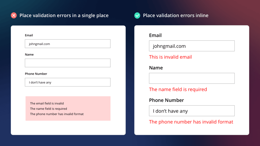
There are two main principles of showing validation errors: inline and after the user submits the form.
In the case of inline validation, the error messages are shown next to the input fields. While in the case «after the user submits the form» it may vary: you can show all validation errors at once next to every input or show them in the beginning/at the end of the form.
The best place to show validation errors is inline. The reasons are obvious:
- User will notice it as soon as he makes a mistake
- He can fix it as soon as he notices it
- No need to scroll & find inputs which are filled incorrectly
When user types in a certain field, he is in the context of this field. So if we show him an inline validation error, we will not switch the context: he knows which field we are talking about.
While if we show him all errors at once, it will result in high interaction costs.
Compare these two approaches:
Inline:
- User types in email
- Gets validation error
- He knows that he has just typed his email, so he even doesn’t have to read the message. If he sees something red around email input, then he knows that something’s wrong with what he has just typed in
- Easily fixes it
All at once:
- User types in email
- User types in the name
- User types in the phone number
- Presses submit
- Gets few validation errors. He has to read them to understand what he has typed wrongly
It’s clear that in the second case, we ask much more effort from him than in the first case.
Validation modes
One is the most important part of the validation process if when to trigger validation errors.
Here I love how vee-validate handles this: https://logaretm.github.io/vee-validate/guide/interaction-and-ux.html.
So there are basically four modes:
-
Aggressive: Triggered when the user presses a key on input.
-
Passive: Triggered when the form is submitted.
-
Lazy: Triggered when the user leaves the input (on blur or change).
-
Eager: This is a combination of aggressive and lazy, as it first validates when the user leaves the input (on blur or change), then if the input is invalid, it will behave aggressively until the input is valid again, and it will go back to being lazy.
Now, let’s consider these modes from the UX point of view.
Aggressive
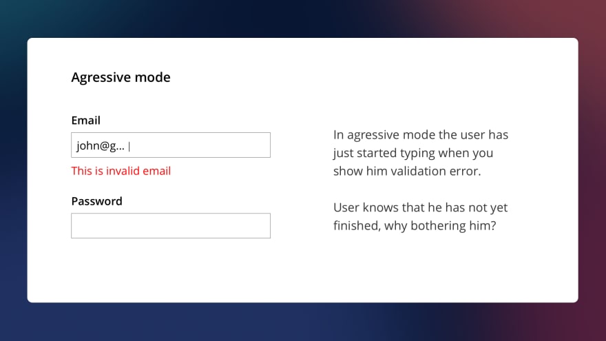
This is one of the worst.
In this case, when the user has just started typing, you immediately validate the input. Which in 99% of cases leads to the error being shown.
But the user might actually know how to fill the input correctly. He can’t do this instantly.
In most cases, I wouldn’t recommend this approach.
Passive

This one is better.
In this case, you show validation errors when the user presses submit. I believe for simple forms that contain a couple of inputs it may be applicable.
But if you have a large form containing multiple inputs divided into different groups, don’t use this mode.
Imagine the user has copied bank account information from a paper to the form, as well as email, password, random other fields. And then after submitting the form, he gets a dozen errors? Looks scary.
Lazy

In Lazy mode, the validation is triggered when the user leaves the input.
It is much less annoying than aggressive mode and, in my opinion, is pretty nice.
The user finished typing, decided that he has typed everything correctly, and then switched to the next input.
But this approach has one significant drawback. In case the user made a mistake and returned to the input to correct it, the validation will trigger only when he switches to the next input.
Imagine the user typed the wrong email, returned to the input to correct it, corrected it but hasn’t yet switched to another input and still sees the error. That’s not nice.
Eager
The eager mode is a combination of aggressive and lazy, as it first validates when the user leaves the input.
If the input is invalid, it will behave aggressively until the input is valid again and will go back to being lazy.
So, how it works:
- User typed an email. While he was typing it, we do not validate his data
- User switched to another input. If he made a mistake in an email, we show him an error (like in lazy mode) and turn the input in aggressive mode.
- User returned to the email input and started fixing his mistake. As soon as he fixed the error, we remove the validation message. We don’t wait till he leaves input as in lazy mode. We’re in aggressive mode.
- Now, the input in lazy mode again.
Looks pretty good.
Help your users to fill the form correctly

You should help your users to fill the form as much as you can. What can you do?
- Break large forms into groups of inputs
- Indicate which fields are required
- Pre-fill inputs when possible
- Provide masks when possible (e.g., phone number format, dates, etc.)
- Provide hints. For example, when the user types in a password, which should have some complexity, you can always show the user how well he does.
Consider showing the user that he has filled an input correctly.
For tiny forms, like the login form, it might not be necessary. However, if the form is complex, it might be a good idea to show users right away that he’s doing well.
Another example: you have a signup form. Your site is popular, so there is a high probability that the email is already taken.
The user has entered the email and switched to the password field. And nothing happened. He might be a bit worried if the email is taken or not.
To reduce possible stress, you can show right away if the email is acceptable or not.
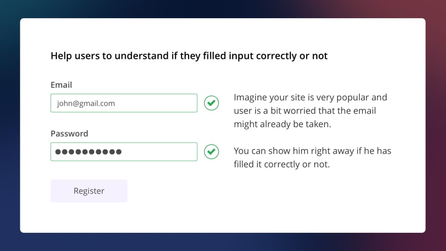
Practical examples
I’m not that good at writing. Instead, I’d better show some examples of poorly designed validation forms I found on the Internet.
Facebook
Here is the Facebook signup form.
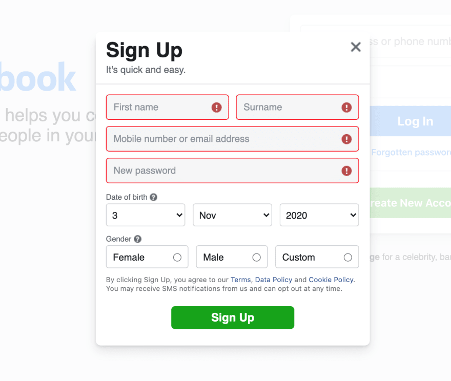
Apart from making labels inside inputs, which is generally considered a bad practice, Facebook also hid validation error messages under icons.
So to understand what I’ve done wrong, I need to click (not even hover) the icon.
Instead, it’d be better to show the messages explicitly.
Next, Facebook has special rules for user passwords. In case the user didn’t follow the rules, he’ll get the next error: «Enter a combination of at least six numbers, letters and punctuation marks (such as ! and &).»
However, it’d be better to show how the user is doing when he’s typing the password. Something like this:
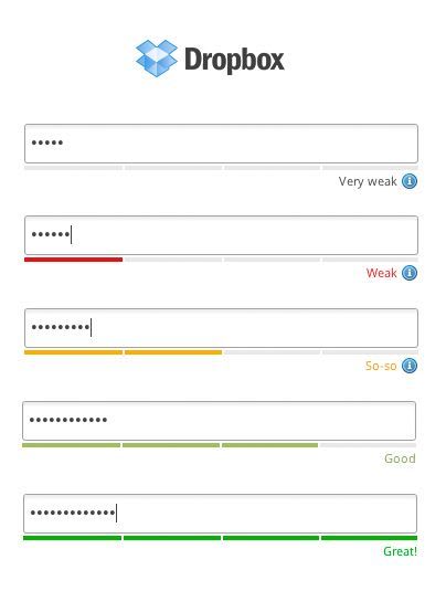
Steam
Let’s check out Steam’s register form:
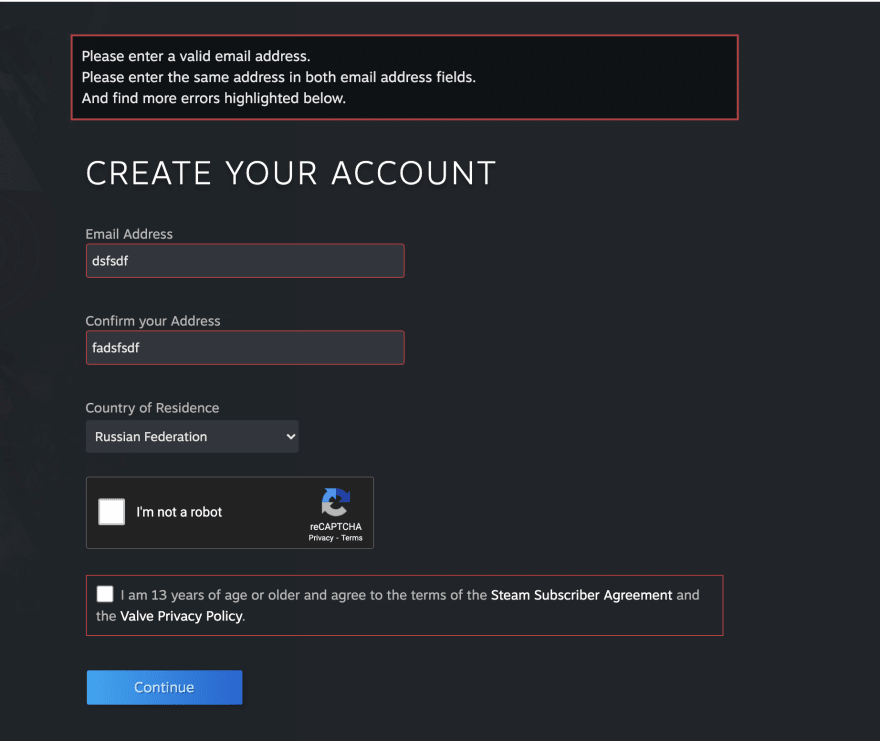
Okay, so, a simple sign up form took the whole screen…🤔
- Why not tell me that I’ve typed the wrong email as soon as I did this?
- Why should I confirm the email address if, after submitting the form, you’ll send me a verification link? It looks like I should verify my email twice for you?
- All errors are placed at the top in a single message. It takes time for me to look up at the error alert and then figure out what fields are wrong.
- «And find more errors highlighted below.» Okay, you’re a machine, why you require me to do the work of finding errors? Tell me right away. I understand that you highlighted the fields, but still…
- By the way, you haven’t highlighted the captcha
Name.com
Honestly, I got no idea what’s the site is about. I’ve just typed in «create your account» on google, and it seems like it’s a popular site 
But it has quite a few validation errors.
So, let’s take a look at the form.

Woah, your form looks really big. It’s okay. Sometimes we have to ask the user a lot of questions. But again, why not show validation errors as soon as I’ve filled an input?
See, I’ve made so many mistakes: wrong phone number, wrong email, wrong zip code. After I click the submit button, you don’t even bother to scroll me to the first invalid input!
By the way, this is awesome hint: if the user clicks submit and some inputs are wrong, scroll him to the first error! There are plenty of solutions:
https://github.com/logaretm/vee-validate/issues/2395
https://stackoverflow.com/questions/60870424/vuetify-vee-validate-scroll-to-the-first-validation-error
But back to the form. Here is a list of mistakes:
- Show errors inline, as soon as the user has finished entering data in an input
- Provide masks for phone number/zip code. If possible.
- My own preference: I’d make the form more compact, way too large.
Good thing you show me how good I am at entering my password though!
Afterword
The main thing you should take from this article: always follow common sense. EVERY rule can be broke. There are really MANY circumstances which you should consider.
Your users are developers who are using vim for writing their essays? They use the console browser, maybe lynx? Oh well…
Or maybe your users are old citizens? Then make your inputs BIGGER. They might not have a good vision.
Or maybe your users are children? Then make your inputs colorful. They will entertain them!
Just think about who your users are and research how they might use your app.
Thank you, Victor
P.S. I tweet about UI/UX stuff from time to time https://twitter.com/vponamariov 😊