On windows 8 or 10 this is proper WPF way without redesign the Combobox and 100% customizable.
Just copy paste and test! 
Click here to see how look the ComboBox
  <Window
    xmlns="http://schemas.microsoft.com/winfx/2006/xaml/presentation"
    xmlns:x="http://schemas.microsoft.com/winfx/2006/xaml"
    xmlns:d="http://schemas.microsoft.com/expression/blend/2008"
    xmlns:mc="http://schemas.openxmlformats.org/markup-compatibility/2006"
    xmlns:local="clr-namespace:Test_Combo_Custom"
    xmlns:Themes="clr-namespace:Microsoft.Windows.Themes;assembly=PresentationFramework.Aero2" x:Class="Test_Combo_Custom.MainWindow"
    mc:Ignorable="d"
    Title="MainWindow" Height="450" Width="800">


<Window.Resources>
    <Style x:Key="FocusVisual">
        <Setter Property="Control.Template">
            <Setter.Value>
                <ControlTemplate>
                    <Rectangle Margin="2" SnapsToDevicePixels="true" Stroke="{DynamicResource {x:Static SystemColors.ControlTextBrushKey}}" StrokeThickness="1" StrokeDashArray="1 2"/>
                </ControlTemplate>
            </Setter.Value>
        </Setter>
    </Style>
    <SolidColorBrush x:Key="ComboBox.Static.Background" Color="Yellow"/>
    <SolidColorBrush x:Key="ComboBox.MouseOver.Background" Color="#FFFF0C00"/>
    <SolidColorBrush x:Key="ComboBox.Static.Border" Color="#FFACACAC"/>
    <SolidColorBrush x:Key="ComboBox.Static.Editable.Background" Color="#FFFB0F0F"/>
    <SolidColorBrush x:Key="ComboBox.Static.Editable.Border" Color="#FFABADB3"/>
    <SolidColorBrush x:Key="ComboBox.Static.Editable.Button.Background" Color="Transparent"/>
    <SolidColorBrush x:Key="ComboBox.Static.Editable.Button.Border" Color="Transparent"/>
    <SolidColorBrush x:Key="ComboBox.MouseOver.Glyph" Color="#FF000000"/>
    <SolidColorBrush x:Key="ComboBox.MouseOver.Border" Color="#FF7EB4EA"/>
    <SolidColorBrush x:Key="ComboBox.MouseOver.Editable.Background" Color="#FF88E00A"/>
    <SolidColorBrush x:Key="ComboBox.MouseOver.Editable.Border" Color="#FF7EB4EA"/>
    <SolidColorBrush x:Key="ComboBox.MouseOver.Editable.Button.Background" Color="#FF7EB4EA"/>
    <SolidColorBrush x:Key="ComboBox.MouseOver.Editable.Button.Border" Color="#FF7EB4EA"/>
    <SolidColorBrush x:Key="ComboBox.Pressed.Glyph" Color="#FF000000"/>
    <SolidColorBrush x:Key="ComboBox.Pressed.Background" Color="#FF000000"/>
    <SolidColorBrush x:Key="ComboBox.Pressed.Border" Color="#FF569DE5"/>
    <SolidColorBrush x:Key="ComboBox.Pressed.Editable.Background" Color="#FF00FFC5"/>
    <SolidColorBrush x:Key="ComboBox.Pressed.Editable.Border" Color="#FF569DE5"/>
    <SolidColorBrush x:Key="ComboBox.Pressed.Editable.Button.Background" Color="#FF569DE5"/>
    <SolidColorBrush x:Key="ComboBox.Pressed.Editable.Button.Border" Color="#FF569DE5"/>
    <SolidColorBrush x:Key="ComboBox.Disabled.Glyph" Color="#FFBFBFBF"/>
    <SolidColorBrush x:Key="ComboBox.Disabled.Background" Color="#FF101AEC"/>
    <SolidColorBrush x:Key="ComboBox.Disabled.Border" Color="#FFD9D9D9"/>
    <SolidColorBrush x:Key="ComboBox.Disabled.Editable.Background" Color="#FFC91355"/>
    <SolidColorBrush x:Key="ComboBox.Disabled.Editable.Border" Color="#FFBFBFBF"/>
    <SolidColorBrush x:Key="ComboBox.Disabled.Editable.Button.Background" Color="Transparent"/>
    <SolidColorBrush x:Key="ComboBox.Disabled.Editable.Button.Border" Color="Transparent"/>
    <SolidColorBrush x:Key="ComboBox.Static.Glyph" Color="#FF606060"/>


    <Style x:Key="ComboBoxToggleButton2" TargetType="{x:Type ToggleButton}">
        <Setter Property="OverridesDefaultStyle" Value="true"/>
        <Setter Property="IsTabStop" Value="false"/>
        <Setter Property="Focusable" Value="false"/>
        <Setter Property="ClickMode" Value="Press"/>
        <Setter Property="Template">
            <Setter.Value>
                <ControlTemplate TargetType="{x:Type ToggleButton}">
                    <Border x:Name="templateRoot" BorderBrush="{StaticResource ComboBox.Static.Border}" BorderThickness="{TemplateBinding BorderThickness}" Background="{StaticResource ComboBox.Static.Background}" SnapsToDevicePixels="true">
                        <Border x:Name="splitBorder" BorderBrush="Transparent" BorderThickness="1" HorizontalAlignment="Right" Margin="0" SnapsToDevicePixels="true" Width="{DynamicResource {x:Static SystemParameters.VerticalScrollBarWidthKey}}">
                            <Path x:Name="arrow" Data="F1 M 0,0 L 2.667,2.66665 L 5.3334,0 L 5.3334,-1.78168 L 2.6667,0.88501 L0,-1.78168 L0,0 Z" Fill="{StaticResource ComboBox.Static.Glyph}" HorizontalAlignment="Center" Margin="0" VerticalAlignment="Center"/>
                        </Border>
                    </Border>
                    <ControlTemplate.Triggers>
                        <MultiDataTrigger>
                            <MultiDataTrigger.Conditions>
                                <Condition Binding="{Binding IsEditable, RelativeSource={RelativeSource AncestorType={x:Type ComboBox}}}" Value="true"/>
                                <Condition Binding="{Binding IsMouseOver, RelativeSource={RelativeSource Self}}" Value="false"/>
                                <Condition Binding="{Binding IsPressed, RelativeSource={RelativeSource Self}}" Value="false"/>
                                <Condition Binding="{Binding IsEnabled, RelativeSource={RelativeSource Self}}" Value="true"/>
                            </MultiDataTrigger.Conditions>
                            <Setter Property="Background" TargetName="templateRoot" Value="{StaticResource ComboBox.Static.Editable.Background}"/>
                            <Setter Property="BorderBrush" TargetName="templateRoot" Value="{StaticResource ComboBox.Static.Editable.Border}"/>
                            <Setter Property="Background" TargetName="splitBorder" Value="{StaticResource ComboBox.Static.Editable.Button.Background}"/>
                            <Setter Property="BorderBrush" TargetName="splitBorder" Value="{StaticResource ComboBox.Static.Editable.Button.Border}"/>
                        </MultiDataTrigger>
                        <Trigger Property="IsMouseOver" Value="true">
                            <Setter Property="Fill" TargetName="arrow" Value="{StaticResource ComboBox.MouseOver.Glyph}"/>
                        </Trigger>
                        <MultiDataTrigger>
                            <MultiDataTrigger.Conditions>
                                <Condition Binding="{Binding IsMouseOver, RelativeSource={RelativeSource Self}}" Value="true"/>
                                <Condition Binding="{Binding IsEditable, RelativeSource={RelativeSource AncestorType={x:Type ComboBox}}}" Value="false"/>
                            </MultiDataTrigger.Conditions>
                            <Setter Property="Background" TargetName="templateRoot" Value="{StaticResource ComboBox.MouseOver.Background}"/>
                            <Setter Property="BorderBrush" TargetName="templateRoot" Value="{StaticResource ComboBox.MouseOver.Border}"/>
                        </MultiDataTrigger>
                        <MultiDataTrigger>
                            <MultiDataTrigger.Conditions>
                                <Condition Binding="{Binding IsMouseOver, RelativeSource={RelativeSource Self}}" Value="true"/>
                                <Condition Binding="{Binding IsEditable, RelativeSource={RelativeSource AncestorType={x:Type ComboBox}}}" Value="true"/>
                            </MultiDataTrigger.Conditions>
                            <Setter Property="Background" TargetName="templateRoot" Value="{StaticResource ComboBox.MouseOver.Editable.Background}"/>
                            <Setter Property="BorderBrush" TargetName="templateRoot" Value="{StaticResource ComboBox.MouseOver.Editable.Border}"/>
                            <Setter Property="Background" TargetName="splitBorder" Value="{StaticResource ComboBox.MouseOver.Editable.Button.Background}"/>
                            <Setter Property="BorderBrush" TargetName="splitBorder" Value="{StaticResource ComboBox.MouseOver.Editable.Button.Border}"/>
                        </MultiDataTrigger>
                        <Trigger Property="IsPressed" Value="true">
                            <Setter Property="Fill" TargetName="arrow" Value="{StaticResource ComboBox.Pressed.Glyph}"/>
                        </Trigger>
                        <MultiDataTrigger>
                            <MultiDataTrigger.Conditions>
                                <Condition Binding="{Binding IsPressed, RelativeSource={RelativeSource Self}}" Value="true"/>
                                <Condition Binding="{Binding IsEditable, RelativeSource={RelativeSource AncestorType={x:Type ComboBox}}}" Value="false"/>
                            </MultiDataTrigger.Conditions>
                            <Setter Property="Background" TargetName="templateRoot" Value="{StaticResource ComboBox.Pressed.Background}"/>
                            <Setter Property="BorderBrush" TargetName="templateRoot" Value="{StaticResource ComboBox.Pressed.Border}"/>
                        </MultiDataTrigger>
                        <MultiDataTrigger>
                            <MultiDataTrigger.Conditions>
                                <Condition Binding="{Binding IsPressed, RelativeSource={RelativeSource Self}}" Value="true"/>
                                <Condition Binding="{Binding IsEditable, RelativeSource={RelativeSource AncestorType={x:Type ComboBox}}}" Value="true"/>
                            </MultiDataTrigger.Conditions>
                            <Setter Property="Background" TargetName="templateRoot" Value="{StaticResource ComboBox.Pressed.Editable.Background}"/>
                            <Setter Property="BorderBrush" TargetName="templateRoot" Value="{StaticResource ComboBox.Pressed.Editable.Border}"/>
                            <Setter Property="Background" TargetName="splitBorder" Value="{StaticResource ComboBox.Pressed.Editable.Button.Background}"/>
                            <Setter Property="BorderBrush" TargetName="splitBorder" Value="{StaticResource ComboBox.Pressed.Editable.Button.Border}"/>
                        </MultiDataTrigger>
                        <Trigger Property="IsEnabled" Value="false">
                            <Setter Property="Fill" TargetName="arrow" Value="{StaticResource ComboBox.Disabled.Glyph}"/>
                        </Trigger>
                        <MultiDataTrigger>
                            <MultiDataTrigger.Conditions>
                                <Condition Binding="{Binding IsEnabled, RelativeSource={RelativeSource Self}}" Value="false"/>
                                <Condition Binding="{Binding IsEditable, RelativeSource={RelativeSource AncestorType={x:Type ComboBox}}}" Value="false"/>
                            </MultiDataTrigger.Conditions>
                            <Setter Property="Background" TargetName="templateRoot" Value="{StaticResource ComboBox.Disabled.Background}"/>
                            <Setter Property="BorderBrush" TargetName="templateRoot" Value="{StaticResource ComboBox.Disabled.Border}"/>
                        </MultiDataTrigger>
                        <MultiDataTrigger>
                            <MultiDataTrigger.Conditions>
                                <Condition Binding="{Binding IsEnabled, RelativeSource={RelativeSource Self}}" Value="false"/>
                                <Condition Binding="{Binding IsEditable, RelativeSource={RelativeSource AncestorType={x:Type ComboBox}}}" Value="true"/>
                            </MultiDataTrigger.Conditions>
                            <Setter Property="Background" TargetName="templateRoot" Value="{StaticResource ComboBox.Disabled.Editable.Background}"/>
                            <Setter Property="BorderBrush" TargetName="templateRoot" Value="{StaticResource ComboBox.Disabled.Editable.Border}"/>
                            <Setter Property="Background" TargetName="splitBorder" Value="{StaticResource ComboBox.Disabled.Editable.Button.Background}"/>
                            <Setter Property="BorderBrush" TargetName="splitBorder" Value="{StaticResource ComboBox.Disabled.Editable.Button.Border}"/>
                        </MultiDataTrigger>
                    </ControlTemplate.Triggers>
                </ControlTemplate>
            </Setter.Value>
        </Setter>
    </Style>
    <ControlTemplate x:Key="ComboBoxTemplate" TargetType="{x:Type ComboBox}">
        <Grid x:Name="templateRoot" SnapsToDevicePixels="true">
            <Grid.ColumnDefinitions>
                <ColumnDefinition Width="*"/>
                <ColumnDefinition MinWidth="{DynamicResource {x:Static SystemParameters.VerticalScrollBarWidthKey}}" Width="0"/>
            </Grid.ColumnDefinitions>
            <Popup x:Name="PART_Popup" AllowsTransparency="true" Grid.ColumnSpan="2" IsOpen="{Binding IsDropDownOpen, Mode=TwoWay, RelativeSource={RelativeSource TemplatedParent}}" Margin="1" PopupAnimation="{DynamicResource {x:Static SystemParameters.ComboBoxPopupAnimationKey}}" Placement="Bottom">
                <Themes:SystemDropShadowChrome x:Name="shadow" Color="Transparent" MaxHeight="{TemplateBinding MaxDropDownHeight}" MinWidth="{Binding ActualWidth, ElementName=templateRoot}">
                    <Border x:Name="dropDownBorder" BorderBrush="{DynamicResource {x:Static SystemColors.WindowFrameBrushKey}}" BorderThickness="1" Background="{DynamicResource {x:Static SystemColors.WindowBrushKey}}">
                        <ScrollViewer x:Name="DropDownScrollViewer">
                            <Grid x:Name="grid" RenderOptions.ClearTypeHint="Enabled">
                                <Canvas x:Name="canvas" HorizontalAlignment="Left" Height="0" VerticalAlignment="Top" Width="0">
                                    <Rectangle x:Name="opaqueRect" Fill="{Binding Background, ElementName=dropDownBorder}" Height="{Binding ActualHeight, ElementName=dropDownBorder}" Width="{Binding ActualWidth, ElementName=dropDownBorder}"/>
                                </Canvas>
                                <ItemsPresenter x:Name="ItemsPresenter" KeyboardNavigation.DirectionalNavigation="Contained" SnapsToDevicePixels="{TemplateBinding SnapsToDevicePixels}"/>
                            </Grid>
                        </ScrollViewer>
                    </Border>
                </Themes:SystemDropShadowChrome>
            </Popup>
            <ToggleButton x:Name="toggleButton" BorderBrush="{TemplateBinding BorderBrush}" BorderThickness="{TemplateBinding BorderThickness}" Background="{TemplateBinding Background}" Grid.ColumnSpan="2" IsChecked="{Binding IsDropDownOpen, Mode=TwoWay, RelativeSource={RelativeSource TemplatedParent}}" Style="{StaticResource ComboBoxToggleButton2}"/>
            <ContentPresenter x:Name="contentPresenter" ContentTemplate="{TemplateBinding SelectionBoxItemTemplate}" ContentTemplateSelector="{TemplateBinding ItemTemplateSelector}" Content="{TemplateBinding SelectionBoxItem}" ContentStringFormat="{TemplateBinding SelectionBoxItemStringFormat}" HorizontalAlignment="{TemplateBinding HorizontalContentAlignment}" IsHitTestVisible="false" Margin="{TemplateBinding Padding}" SnapsToDevicePixels="{TemplateBinding SnapsToDevicePixels}" VerticalAlignment="{TemplateBinding VerticalContentAlignment}"/>
        </Grid>
        <ControlTemplate.Triggers>
            <Trigger Property="HasDropShadow" SourceName="PART_Popup" Value="true">
                <Setter Property="Margin" TargetName="shadow" Value="0,0,5,5"/>
                <Setter Property="Color" TargetName="shadow" Value="#71000000"/>
            </Trigger>
            <Trigger Property="HasItems" Value="false">
                <Setter Property="Height" TargetName="dropDownBorder" Value="95"/>
            </Trigger>
            <MultiTrigger>
                <MultiTrigger.Conditions>
                    <Condition Property="IsGrouping" Value="true"/>
                    <Condition Property="VirtualizingPanel.IsVirtualizingWhenGrouping" Value="false"/>
                </MultiTrigger.Conditions>
                <Setter Property="ScrollViewer.CanContentScroll" Value="false"/>
            </MultiTrigger>
            <Trigger Property="ScrollViewer.CanContentScroll" SourceName="DropDownScrollViewer" Value="false">
                <Setter Property="Canvas.Top" TargetName="opaqueRect" Value="{Binding VerticalOffset, ElementName=DropDownScrollViewer}"/>
                <Setter Property="Canvas.Left" TargetName="opaqueRect" Value="{Binding HorizontalOffset, ElementName=DropDownScrollViewer}"/>
            </Trigger>
        </ControlTemplate.Triggers>
    </ControlTemplate>
    <SolidColorBrush x:Key="TextBox.Static.Background" Color="#FFFFFFFF"/>
    <Style x:Key="ComboBoxEditableTextBox" TargetType="{x:Type TextBox}">
        <Setter Property="OverridesDefaultStyle" Value="true"/>
        <Setter Property="AllowDrop" Value="true"/>
        <Setter Property="MinWidth" Value="0"/>
        <Setter Property="MinHeight" Value="0"/>
        <Setter Property="FocusVisualStyle" Value="{x:Null}"/>
        <Setter Property="ScrollViewer.PanningMode" Value="VerticalFirst"/>
        <Setter Property="Stylus.IsFlicksEnabled" Value="False"/>
        <Setter Property="Template">
            <Setter.Value>
                <ControlTemplate TargetType="{x:Type TextBox}">
                    <ScrollViewer x:Name="PART_ContentHost" Background="Transparent" Focusable="false" HorizontalScrollBarVisibility="Hidden" VerticalScrollBarVisibility="Hidden"/>
                </ControlTemplate>
            </Setter.Value>
        </Setter>
    </Style>
    <ControlTemplate x:Key="ComboBoxEditableTemplate" TargetType="{x:Type ComboBox}">
        <Grid x:Name="templateRoot" SnapsToDevicePixels="true">
            <Grid.ColumnDefinitions>
                <ColumnDefinition Width="*"/>
                <ColumnDefinition MinWidth="{DynamicResource {x:Static SystemParameters.VerticalScrollBarWidthKey}}" Width="0"/>
            </Grid.ColumnDefinitions>
            <Popup x:Name="PART_Popup" AllowsTransparency="true" Grid.ColumnSpan="2" IsOpen="{Binding IsDropDownOpen, RelativeSource={RelativeSource TemplatedParent}}" PopupAnimation="{DynamicResource {x:Static SystemParameters.ComboBoxPopupAnimationKey}}" Placement="Bottom">
                <Themes:SystemDropShadowChrome x:Name="shadow" Color="Transparent" MaxHeight="{TemplateBinding MaxDropDownHeight}" MinWidth="{Binding ActualWidth, ElementName=templateRoot}">
                    <Border x:Name="dropDownBorder" BorderBrush="{DynamicResource {x:Static SystemColors.WindowFrameBrushKey}}" BorderThickness="1" Background="{DynamicResource {x:Static SystemColors.WindowBrushKey}}">
                        <ScrollViewer x:Name="DropDownScrollViewer">
                            <Grid x:Name="grid" RenderOptions.ClearTypeHint="Enabled">
                                <Canvas x:Name="canvas" HorizontalAlignment="Left" Height="0" VerticalAlignment="Top" Width="0">
                                    <Rectangle x:Name="opaqueRect" Fill="{Binding Background, ElementName=dropDownBorder}" Height="{Binding ActualHeight, ElementName=dropDownBorder}" Width="{Binding ActualWidth, ElementName=dropDownBorder}"/>
                                </Canvas>
                                <ItemsPresenter x:Name="ItemsPresenter" KeyboardNavigation.DirectionalNavigation="Contained" SnapsToDevicePixels="{TemplateBinding SnapsToDevicePixels}"/>
                            </Grid>
                        </ScrollViewer>
                    </Border>
                </Themes:SystemDropShadowChrome>
            </Popup>
            <ToggleButton x:Name="toggleButton" BorderBrush="{TemplateBinding BorderBrush}" BorderThickness="{TemplateBinding BorderThickness}" Background="{TemplateBinding Background}" Grid.ColumnSpan="2" IsChecked="{Binding IsDropDownOpen, Mode=TwoWay, RelativeSource={RelativeSource TemplatedParent}}" Style="{StaticResource ComboBoxToggleButton2}"/>
            <Border x:Name="border" Background="{StaticResource TextBox.Static.Background}" Margin="{TemplateBinding BorderThickness}">
                <TextBox x:Name="PART_EditableTextBox" HorizontalContentAlignment="{TemplateBinding HorizontalContentAlignment}" IsReadOnly="{Binding IsReadOnly, RelativeSource={RelativeSource TemplatedParent}}" Margin="{TemplateBinding Padding}" Style="{StaticResource ComboBoxEditableTextBox}" VerticalContentAlignment="{TemplateBinding VerticalContentAlignment}"/>
            </Border>
        </Grid>
        <ControlTemplate.Triggers>
            <Trigger Property="IsEnabled" Value="false">
                <Setter Property="Opacity" TargetName="border" Value="0.56"/>
            </Trigger>
            <Trigger Property="IsKeyboardFocusWithin" Value="true">
                <Setter Property="Foreground" Value="Black"/>
            </Trigger>
            <Trigger Property="HasDropShadow" SourceName="PART_Popup" Value="true">
                <Setter Property="Margin" TargetName="shadow" Value="0,0,5,5"/>
                <Setter Property="Color" TargetName="shadow" Value="#71000000"/>
            </Trigger>
            <Trigger Property="HasItems" Value="false">
                <Setter Property="Height" TargetName="dropDownBorder" Value="95"/>
            </Trigger>
            <MultiTrigger>
                <MultiTrigger.Conditions>
                    <Condition Property="IsGrouping" Value="true"/>
                    <Condition Property="VirtualizingPanel.IsVirtualizingWhenGrouping" Value="false"/>
                </MultiTrigger.Conditions>
                <Setter Property="ScrollViewer.CanContentScroll" Value="false"/>
            </MultiTrigger>
            <Trigger Property="ScrollViewer.CanContentScroll" SourceName="DropDownScrollViewer" Value="false">
                <Setter Property="Canvas.Top" TargetName="opaqueRect" Value="{Binding VerticalOffset, ElementName=DropDownScrollViewer}"/>
                <Setter Property="Canvas.Left" TargetName="opaqueRect" Value="{Binding HorizontalOffset, ElementName=DropDownScrollViewer}"/>
            </Trigger>
        </ControlTemplate.Triggers>
    </ControlTemplate>
    <Style x:Key="ComboBoxStyleCustom" TargetType="{x:Type ComboBox}">
        <Setter Property="FocusVisualStyle" Value="{StaticResource FocusVisual}"/>
        <Setter Property="Background" Value="{StaticResource ComboBox.Static.Background}"/>
        <Setter Property="BorderBrush" Value="{StaticResource ComboBox.Static.Border}"/>
        <Setter Property="Foreground" Value="{DynamicResource {x:Static SystemColors.WindowTextBrushKey}}"/>
        <Setter Property="BorderThickness" Value="1"/>
        <Setter Property="ScrollViewer.HorizontalScrollBarVisibility" Value="Auto"/>
        <Setter Property="ScrollViewer.VerticalScrollBarVisibility" Value="Auto"/>
        <Setter Property="Padding" Value="6,3,5,3"/>
        <Setter Property="ScrollViewer.CanContentScroll" Value="true"/>
        <Setter Property="ScrollViewer.PanningMode" Value="Both"/>
        <Setter Property="Stylus.IsFlicksEnabled" Value="False"/>
        <Setter Property="Template" Value="{StaticResource ComboBoxTemplate}"/>
        <Style.Triggers>
            <Trigger Property="IsEditable" Value="true">
                <Setter Property="IsTabStop" Value="false"/>
                <Setter Property="Padding" Value="2"/>
                <Setter Property="Template" Value="{StaticResource ComboBoxEditableTemplate}"/>
            </Trigger>
        </Style.Triggers>
    </Style>
</Window.Resources>


<Grid>
    <ComboBox HorizontalAlignment="Left" Margin="317.429,194.428,0,0" VerticalAlignment="Top" Width="120" Style="{DynamicResource ComboBoxStyleCustom}">
        <ComboBox.Resources>
            <!-- color of ComboBoxItem -->
            <SolidColorBrush x:Key="{x:Static SystemColors.WindowBrushKey}" Color="#FF17FF00" />
        </ComboBox.Resources>
        <ComboBoxItem>One</ComboBoxItem>
        <ComboBoxItem>Two</ComboBoxItem>
        <ComboBoxItem>Three</ComboBoxItem>
    </ComboBox>

</Grid>
</Window>
Table of Contents
- Introduction
- ComboBox Style
- ComboBoxItem Style
- See Also
Introduction
This post explains how to change the colors of a ComboBox in a WPF application by overriding the control’s default template in XAML using Visual Studio 2012 or 2013.
To change the background color of a ComboBox in a WPF application running on Windows 7, you can simply set its Background property to a Brush object or a color string in XAML and to change the colors of the visual ComboBoxItem objects that represents the different
options in the ComboBox, you can just override some system defined brushes by adding your own Brush objects with the corresponding x:Key attributes to the ComboBox’s resources section:
<ComboBox
Background="Yellow">
<ComboBox.Resources>
<!-- color of ComboBoxItem -->
<SolidColorBrush
x:Key="{x:Static SystemColors.WindowBrushKey}"
Color="Yellow"
/>
<!-- Mouse over color of ComboBoxItem -->
<SolidColorBrush
x:Key="{x:Static SystemColors.HighlightBrushKey}"
Color="Red"
/>
</ComboBox.Resources>
<ComboBoxItem>One</ComboBoxItem>
<ComboBoxItem>Two</ComboBoxItem>
<ComboBoxItem>Three</ComboBoxItem>
</ComboBox>
ComboBox Style
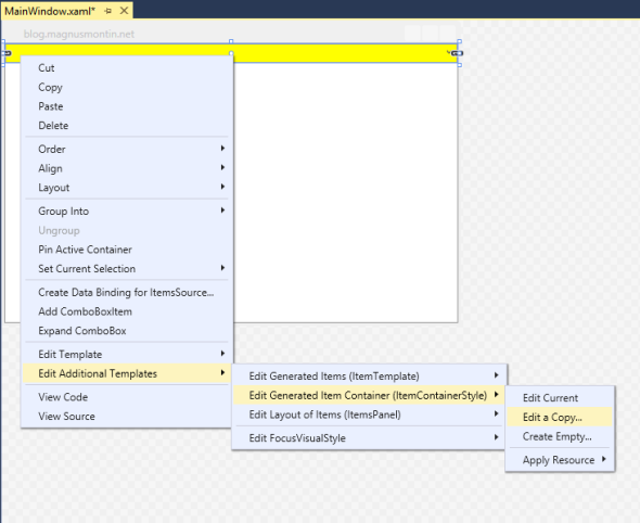
On Windows 8, this solution doesn’t work. This is because the default template for the ComboBox control differs between the different versions of Windows. To be able to change the background color of a ComboBox in a WPF application running on Windows 8, you
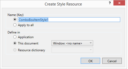
have to modify its default control template. To do this, you can right-click on the ComboBox element in design mode in Visual Studio 2012 or 2013 and select the “Edit template” option and then the “Edit a copy…” option. This will bring up a dialog that lets
you specify the name and location of a style resource that is created for you when you click the “OK” button in the dialog:

You can then modify the generated template as per your requirements. To just change the background color of the ComboBox, you should look for a ToggleButton Style with the x:Key attribute “ComboBoxToggleButton” – you can search in the XAML markup using the
CTRL+F keyboard shortcut in Visual Studio – and change the Background property of the root Border in its ControlTemplate. It is set to a LinearGradientBrush resource with the x:Key attribute “ComboBox.Static.Background” by default. You could either replace
this resource with your own Brush resource:
<!-- Default LinearGradientBrush commented out -->
<!--<LinearGradientBrush
x:Key="ComboBox.Static.Background"
EndPoint="0,1"
StartPoint="0,0">
<GradientStop
Color="#FFF0F0F0"
Offset="0.0"/>
<GradientStop
Color="#FFE5E5E5"
Offset="1.0"/>
</LinearGradientBrush>-->
<SolidColorBrush
x:Key="ComboBox.Static.Background"
Color="Yellow"/>
…or just replace the {StaticResource ComboBox.Static.Background} markup extension with a TemplateBinding to the Background property of the ComboBox in the ControlTemplate for the ToggleButton (x:Key=”ComboBoxToggleButton”):
<ControlTemplate
TargetType="{x:Type ToggleButton}">
<Border
x:Name="templateRoot"
BorderBrush="{StaticResource ComboBox.Static.Border}"
BorderThickness="{TemplateBinding BorderThickness}"
Background="{TemplateBinding Background}"
SnapsToDevicePixels="true">
<Border
x:Name="splitBorder"
BorderBrush="Transparent"
BorderThickness="1"
HorizontalAlignment="Right"
Margin="0"
SnapsToDevicePixels="true"
Width="{DynamicResource {x:Static SystemParameters.VerticalScrollBarWidthKey}}">
<Path
x:Name="arrow"
Data="F1 M 0,0 L 2.667,2.66665 L 5.3334,0 L 5.3334,-1.78168
L 2.6667,0.88501 L0,-1.78168 L0,0 Z"
Fill="{StaticResource ComboBox.Static.Glyph}"
HorizontalAlignment="Center"
Margin="0"
VerticalAlignment="Center"/>
</Border>
</Border>
<ControlTemplate.Triggers>
...
</ControlTemplate.Triggers>
</ControlTemplate>
<ComboBox
Background="Yellow"
Style="{DynamicResource ComboBoxStyle1}">
<ComboBoxItem
Content="One"/>
<ComboBoxItem
Content="Two"/>
<ComboBoxItem
Content="Three"/>
</ComboBox>
ComboBoxItem Style
To change the background color of the options in the ComboBox that are represented by ComboBoxItem elements – this is true even if the ComboBox’s ItemsSource property is bound to some source collection by the way – you can define an ItemContainerStyle for the
ComboBox and set the Background and BorderBrush properties of the ComboBoxItem elements:
<ComboBox
Background="Yellow"
Style="{DynamicResource ComboBoxStyle1}">
<ComboBox.ItemContainerStyle>
<Style
TargetType="ComboBoxItem">
<Setter
Property="Background"
Value="Yellow"/>
<Setter
Property="BorderBrush"
Value="Yellow"/>
</Style>
</ComboBox.ItemContainerStyle>
<ComboBoxItem
Content="One"/>
<ComboBoxItem
Content="Two"/>
<ComboBoxItem
Content="Three"/>
</ComboBox>

If you want to change the color that appears when the mouse pointer is located over a ComboBoxItem you will have to change its default template in the same way that you change the default template for the ComboBox itself. Right click on the ComboBox element
in the design view in Visual Studio again and then select the “Edit Additional Templates” option followed by the “Edit Generated Item Container (ItemContainerStyle)” and “Edit a copy…” options.
This will copy the default XAML markup for a ComboBoxItem into the location of your choice, i.e. Windows.Resources, Application.Resources or a custom ResourceDictionary. Then it is simply a matter of finding and changing the value of the Color property of the
following SolidColorBrush resources:
<SolidColorBrush
x:Key="ComboBoxItem.ItemsviewHoverFocus.Background"
Color="#5426A0DA"/>
<SolidColorBrush
x:Key="ComboBoxItem.ItemsviewHoverFocus.Border"
Color="#FF26A0DA"/>
There are also a bunch of other resources that is used within the ControlTemplate of a ComboBoxItem that you can modify as you wish. The colors of the currently selected item is for example define by the following resources, all having an x:Key attribute value
that starts with ComboBoxItem.ItemsviewSelected*:
<SolidColorBrush
x:Key="ComboBoxItem.ItemsviewSelected.Background"
Color="#3D26A0DA"/>
<SolidColorBrush
x:Key="ComboBoxItem.ItemsviewSelected.Border"
Color="#FF26A0DA"/>
<SolidColorBrush
x:Key="ComboBoxItem.ItemsviewSelectedHover.Background"
Color="#2E0080FF"/>
<SolidColorBrush
x:Key="ComboBoxItem.ItemsviewSelectedHover.Border"
Color="#99006CD9"/>
<SolidColorBrush
x:Key="ComboBoxItem.ItemsviewSelectedNoFocus.Background"
Color="#3DDADADA"/>
<SolidColorBrush
x:Key="ComboBoxItem.ItemsviewSelectedNoFocus.Border"
Color="#FFDADADA"/>
Note that if you copy and modify the default ItemContainerStyle according to the procedure mentioned above, you should not define your own inline ItemContainerStyle for the ComboBox. Instead of doing this, you could just set the values of the Background and
BorderBrush properties inside the style resource:
<Style
x:Key="ComboBoxItemStyle1"
TargetType="{x:Type ComboBoxItem}">
<Setter
Property="SnapsToDevicePixels"
Value="True"/>
<Setter
Property="Padding"
Value="4,1"/>
<Setter
Property="HorizontalContentAlignment"
Value="{Binding HorizontalContentAlignment, RelativeSource={RelativeSource AncestorType={x:Type ItemsControl}}}"/>
<Setter
Property="VerticalContentAlignment"
Value="{Binding VerticalContentAlignment, RelativeSource={RelativeSource AncestorType={x:Type ItemsControl}}}"/>
<Setter
Property="Background"
Value="Yellow"/>
<!-- Custom value -->
<Setter
Property="BorderBrush"
Value="Yellow"/>
<!-- Custom value -->
<Setter
Property="BorderThickness"
Value="1"/>
<Setter
Property="FocusVisualStyle"
Value="{StaticResource FocusVisual}"/>
<Setter
Property="Template">
...
</Setter>
</Style>
<ComboBox
Background="Yellow"
Style="{DynamicResource ComboBoxStyle1}"
ItemContainerStyle="{DynamicResource ComboBoxItemStyle1}">
<ComboBoxItem
Content="One"/>
<ComboBoxItem
Content="Two"/>
<ComboBoxItem
Content="Three"/>
</ComboBox>
Finally, if you want to change the color that appears when the mouse pointer is located over a not yet opened ComboBox you should look for resources with the x:Key attributes “ComboBox.MouseOver.Border” and “ComboBox.MouseOver.Background” and modify these:
<LinearGradientBrush
x:Key="ComboBox.MouseOver.Background"
EndPoint="0,1"
StartPoint="0,0">
<GradientStop
Color="#FFECF4FC"
Offset="0.0"/>
<GradientStop
Color="#FFDCECFC"
Offset="1.0"/>
</LinearGradientBrush>
<SolidColorBrush
x:Key="ComboBox.MouseOver.Border"
Color="#FF7EB4EA"/>
Note that the built-in templates use different resources depending on the current values of various properties. For example, the ComboBox doesn’t use the above two resources when its IsEditable property is set to true. Triggers (and MultiDataTriggers) in the
control template of a control decide which resources that are applied and under which conditions they are applied.
See Also
Styling and Templating:
http://msdn.microsoft.com/en-us/library/ms745683(v=vs.110).aspx#styling_triggers
If you want to change the background colour of the ComboBox in Windows 8, you need to modify its default ControlTemplate. You can get Visual Studio 2012/2013 to render the default control template by right-click on the ComboBox control in design mode and
select «Edit a template»->»Edit a copy».
You can then replace the LinearGradientBrush with the x:Key attribute «ComboBox.Static.Background» that gets added to your XAML with a SolidColorBrush and set its Color property to whatever colour you want:
<Window.Resources>
<Style x:Key="FocusVisual">
<Setter Property="Control.Template">
<Setter.Value>
<ControlTemplate>
<Rectangle Margin="2" SnapsToDevicePixels="true" Stroke="{DynamicResource {x:Static SystemColors.ControlTextBrushKey}}" StrokeThickness="1" StrokeDashArray="1 2"/>
</ControlTemplate>
</Setter.Value>
</Setter>
</Style>
<SolidColorBrush x:Key="ComboBox.Static.Background" Color="Yellow"/>
<SolidColorBrush x:Key="ComboBox.Static.Border" Color="#FFACACAC"/>
<SolidColorBrush x:Key="ComboBox.Static.Editable.Background" Color="#FFFFFFFF"/>
<SolidColorBrush x:Key="ComboBox.Static.Editable.Border" Color="#FFABADB3"/>
<SolidColorBrush x:Key="ComboBox.Static.Editable.Button.Background" Color="Transparent"/>
<SolidColorBrush x:Key="ComboBox.Static.Editable.Button.Border" Color="Transparent"/>
<SolidColorBrush x:Key="ComboBox.MouseOver.Glyph" Color="#FF000000"/>
<LinearGradientBrush x:Key="ComboBox.MouseOver.Background" EndPoint="0,1" StartPoint="0,0">
<GradientStop Color="#FFECF4FC" Offset="0.0"/>
<GradientStop Color="#FFDCECFC" Offset="1.0"/>
</LinearGradientBrush>
<SolidColorBrush x:Key="ComboBox.MouseOver.Border" Color="#FF7EB4EA"/>
<SolidColorBrush x:Key="ComboBox.MouseOver.Editable.Background" Color="#FFFFFFFF"/>
<SolidColorBrush x:Key="ComboBox.MouseOver.Editable.Border" Color="#FF7EB4EA"/>
<LinearGradientBrush x:Key="ComboBox.MouseOver.Editable.Button.Background" EndPoint="0,1" StartPoint="0,0">
<GradientStop Color="#FFEBF4FC" Offset="0.0"/>
<GradientStop Color="#FFDCECFC" Offset="1.0"/>
</LinearGradientBrush>
<SolidColorBrush x:Key="ComboBox.MouseOver.Editable.Button.Border" Color="#FF7EB4EA"/>
<SolidColorBrush x:Key="ComboBox.Pressed.Glyph" Color="#FF000000"/>
<LinearGradientBrush x:Key="ComboBox.Pressed.Background" EndPoint="0,1" StartPoint="0,0">
<GradientStop Color="#FFDAECFC" Offset="0.0"/>
<GradientStop Color="#FFC4E0FC" Offset="1.0"/>
</LinearGradientBrush>
<SolidColorBrush x:Key="ComboBox.Pressed.Border" Color="#FF569DE5"/>
<SolidColorBrush x:Key="ComboBox.Pressed.Editable.Background" Color="#FFFFFFFF"/>
<SolidColorBrush x:Key="ComboBox.Pressed.Editable.Border" Color="#FF569DE5"/>
<LinearGradientBrush x:Key="ComboBox.Pressed.Editable.Button.Background" EndPoint="0,1" StartPoint="0,0">
<GradientStop Color="#FFDAEBFC" Offset="0.0"/>
<GradientStop Color="#FFC4E0FC" Offset="1.0"/>
</LinearGradientBrush>
<SolidColorBrush x:Key="ComboBox.Pressed.Editable.Button.Border" Color="#FF569DE5"/>
<SolidColorBrush x:Key="ComboBox.Disabled.Glyph" Color="#FFBFBFBF"/>
<SolidColorBrush x:Key="ComboBox.Disabled.Background" Color="#FFF0F0F0"/>
<SolidColorBrush x:Key="ComboBox.Disabled.Border" Color="#FFD9D9D9"/>
<SolidColorBrush x:Key="ComboBox.Disabled.Editable.Background" Color="#FFFFFFFF"/>
<SolidColorBrush x:Key="ComboBox.Disabled.Editable.Border" Color="#FFBFBFBF"/>
<SolidColorBrush x:Key="ComboBox.Disabled.Editable.Button.Background" Color="Transparent"/>
<SolidColorBrush x:Key="ComboBox.Disabled.Editable.Button.Border" Color="Transparent"/>
<SolidColorBrush x:Key="ComboBox.Static.Glyph" Color="#FF606060"/>
<Style x:Key="ComboBoxToggleButton" TargetType="{x:Type ToggleButton}">
<Setter Property="OverridesDefaultStyle" Value="true"/>
<Setter Property="IsTabStop" Value="false"/>
<Setter Property="Focusable" Value="false"/>
<Setter Property="ClickMode" Value="Press"/>
<Setter Property="Template">
<Setter.Value>
<ControlTemplate TargetType="{x:Type ToggleButton}">
<Border x:Name="templateRoot" BorderBrush="{StaticResource ComboBox.Static.Border}" BorderThickness="{TemplateBinding BorderThickness}" Background="{StaticResource ComboBox.Static.Background}" SnapsToDevicePixels="true">
<Border x:Name="splitBorder" BorderBrush="Transparent" BorderThickness="1" HorizontalAlignment="Right" Margin="0" SnapsToDevicePixels="true" Width="{DynamicResource {x:Static SystemParameters.VerticalScrollBarWidthKey}}">
<Path x:Name="arrow" Data="F1 M 0,0 L 2.667,2.66665 L 5.3334,0 L 5.3334,-1.78168 L 2.6667,0.88501 L0,-1.78168 L0,0 Z" Fill="{StaticResource ComboBox.Static.Glyph}" HorizontalAlignment="Center" Margin="0" VerticalAlignment="Center"/>
</Border>
</Border>
<ControlTemplate.Triggers>
<MultiDataTrigger>
<MultiDataTrigger.Conditions>
<Condition Binding="{Binding IsEditable, RelativeSource={RelativeSource AncestorType={x:Type ComboBox}}}" Value="true"/>
<Condition Binding="{Binding IsMouseOver, RelativeSource={RelativeSource Self}}" Value="false"/>
<Condition Binding="{Binding IsPressed, RelativeSource={RelativeSource Self}}" Value="false"/>
<Condition Binding="{Binding IsEnabled, RelativeSource={RelativeSource Self}}" Value="true"/>
</MultiDataTrigger.Conditions>
<Setter Property="Background" TargetName="templateRoot" Value="{StaticResource ComboBox.Static.Editable.Background}"/>
<Setter Property="BorderBrush" TargetName="templateRoot" Value="{StaticResource ComboBox.Static.Editable.Border}"/>
<Setter Property="Background" TargetName="splitBorder" Value="{StaticResource ComboBox.Static.Editable.Button.Background}"/>
<Setter Property="BorderBrush" TargetName="splitBorder" Value="{StaticResource ComboBox.Static.Editable.Button.Border}"/>
</MultiDataTrigger>
<Trigger Property="IsMouseOver" Value="true">
<Setter Property="Fill" TargetName="arrow" Value="{StaticResource ComboBox.MouseOver.Glyph}"/>
</Trigger>
<MultiDataTrigger>
<MultiDataTrigger.Conditions>
<Condition Binding="{Binding IsMouseOver, RelativeSource={RelativeSource Self}}" Value="true"/>
<Condition Binding="{Binding IsEditable, RelativeSource={RelativeSource AncestorType={x:Type ComboBox}}}" Value="false"/>
</MultiDataTrigger.Conditions>
<Setter Property="Background" TargetName="templateRoot" Value="{StaticResource ComboBox.MouseOver.Background}"/>
<Setter Property="BorderBrush" TargetName="templateRoot" Value="{StaticResource ComboBox.MouseOver.Border}"/>
</MultiDataTrigger>
<MultiDataTrigger>
<MultiDataTrigger.Conditions>
<Condition Binding="{Binding IsMouseOver, RelativeSource={RelativeSource Self}}" Value="true"/>
<Condition Binding="{Binding IsEditable, RelativeSource={RelativeSource AncestorType={x:Type ComboBox}}}" Value="true"/>
</MultiDataTrigger.Conditions>
<Setter Property="Background" TargetName="templateRoot" Value="{StaticResource ComboBox.MouseOver.Editable.Background}"/>
<Setter Property="BorderBrush" TargetName="templateRoot" Value="{StaticResource ComboBox.MouseOver.Editable.Border}"/>
<Setter Property="Background" TargetName="splitBorder" Value="{StaticResource ComboBox.MouseOver.Editable.Button.Background}"/>
<Setter Property="BorderBrush" TargetName="splitBorder" Value="{StaticResource ComboBox.MouseOver.Editable.Button.Border}"/>
</MultiDataTrigger>
<Trigger Property="IsPressed" Value="true">
<Setter Property="Fill" TargetName="arrow" Value="{StaticResource ComboBox.Pressed.Glyph}"/>
</Trigger>
<MultiDataTrigger>
<MultiDataTrigger.Conditions>
<Condition Binding="{Binding IsPressed, RelativeSource={RelativeSource Self}}" Value="true"/>
<Condition Binding="{Binding IsEditable, RelativeSource={RelativeSource AncestorType={x:Type ComboBox}}}" Value="false"/>
</MultiDataTrigger.Conditions>
<Setter Property="Background" TargetName="templateRoot" Value="{StaticResource ComboBox.Pressed.Background}"/>
<Setter Property="BorderBrush" TargetName="templateRoot" Value="{StaticResource ComboBox.Pressed.Border}"/>
</MultiDataTrigger>
<MultiDataTrigger>
<MultiDataTrigger.Conditions>
<Condition Binding="{Binding IsPressed, RelativeSource={RelativeSource Self}}" Value="true"/>
<Condition Binding="{Binding IsEditable, RelativeSource={RelativeSource AncestorType={x:Type ComboBox}}}" Value="true"/>
</MultiDataTrigger.Conditions>
<Setter Property="Background" TargetName="templateRoot" Value="{StaticResource ComboBox.Pressed.Editable.Background}"/>
<Setter Property="BorderBrush" TargetName="templateRoot" Value="{StaticResource ComboBox.Pressed.Editable.Border}"/>
<Setter Property="Background" TargetName="splitBorder" Value="{StaticResource ComboBox.Pressed.Editable.Button.Background}"/>
<Setter Property="BorderBrush" TargetName="splitBorder" Value="{StaticResource ComboBox.Pressed.Editable.Button.Border}"/>
</MultiDataTrigger>
<Trigger Property="IsEnabled" Value="false">
<Setter Property="Fill" TargetName="arrow" Value="{StaticResource ComboBox.Disabled.Glyph}"/>
</Trigger>
<MultiDataTrigger>
<MultiDataTrigger.Conditions>
<Condition Binding="{Binding IsEnabled, RelativeSource={RelativeSource Self}}" Value="false"/>
<Condition Binding="{Binding IsEditable, RelativeSource={RelativeSource AncestorType={x:Type ComboBox}}}" Value="false"/>
</MultiDataTrigger.Conditions>
<Setter Property="Background" TargetName="templateRoot" Value="{StaticResource ComboBox.Disabled.Background}"/>
<Setter Property="BorderBrush" TargetName="templateRoot" Value="{StaticResource ComboBox.Disabled.Border}"/>
</MultiDataTrigger>
<MultiDataTrigger>
<MultiDataTrigger.Conditions>
<Condition Binding="{Binding IsEnabled, RelativeSource={RelativeSource Self}}" Value="false"/>
<Condition Binding="{Binding IsEditable, RelativeSource={RelativeSource AncestorType={x:Type ComboBox}}}" Value="true"/>
</MultiDataTrigger.Conditions>
<Setter Property="Background" TargetName="templateRoot" Value="{StaticResource ComboBox.Disabled.Editable.Background}"/>
<Setter Property="BorderBrush" TargetName="templateRoot" Value="{StaticResource ComboBox.Disabled.Editable.Border}"/>
<Setter Property="Background" TargetName="splitBorder" Value="{StaticResource ComboBox.Disabled.Editable.Button.Background}"/>
<Setter Property="BorderBrush" TargetName="splitBorder" Value="{StaticResource ComboBox.Disabled.Editable.Button.Border}"/>
</MultiDataTrigger>
</ControlTemplate.Triggers>
</ControlTemplate>
</Setter.Value>
</Setter>
</Style>
<ControlTemplate x:Key="ComboBoxTemplate" TargetType="{x:Type ComboBox}">
<Grid x:Name="templateRoot" SnapsToDevicePixels="true">
<Grid.ColumnDefinitions>
<ColumnDefinition Width="*"/>
<ColumnDefinition MinWidth="{DynamicResource {x:Static SystemParameters.VerticalScrollBarWidthKey}}" Width="0"/>
</Grid.ColumnDefinitions>
<Popup x:Name="PART_Popup" AllowsTransparency="true" Grid.ColumnSpan="2" IsOpen="{Binding IsDropDownOpen, Mode=TwoWay, RelativeSource={RelativeSource TemplatedParent}}" Margin="1" PopupAnimation="{DynamicResource {x:Static SystemParameters.ComboBoxPopupAnimationKey}}" Placement="Bottom">
<Themes:SystemDropShadowChrome x:Name="shadow" Color="Transparent" MaxHeight="{TemplateBinding MaxDropDownHeight}" MinWidth="{Binding ActualWidth, ElementName=templateRoot}">
<Border x:Name="dropDownBorder" BorderBrush="{DynamicResource {x:Static SystemColors.WindowFrameBrushKey}}" BorderThickness="1" Background="{DynamicResource {x:Static SystemColors.WindowBrushKey}}">
<ScrollViewer x:Name="DropDownScrollViewer">
<Grid x:Name="grid" RenderOptions.ClearTypeHint="Enabled">
<Canvas x:Name="canvas" HorizontalAlignment="Left" Height="0" VerticalAlignment="Top" Width="0">
<Rectangle x:Name="opaqueRect" Fill="{Binding Background, ElementName=dropDownBorder}" Height="{Binding ActualHeight, ElementName=dropDownBorder}" Width="{Binding ActualWidth, ElementName=dropDownBorder}"/>
</Canvas>
<ItemsPresenter x:Name="ItemsPresenter" KeyboardNavigation.DirectionalNavigation="Contained" SnapsToDevicePixels="{TemplateBinding SnapsToDevicePixels}"/>
</Grid>
</ScrollViewer>
</Border>
</Themes:SystemDropShadowChrome>
</Popup>
<ToggleButton x:Name="toggleButton" BorderBrush="{TemplateBinding BorderBrush}" BorderThickness="{TemplateBinding BorderThickness}" Background="{TemplateBinding Background}" Grid.ColumnSpan="2" IsChecked="{Binding IsDropDownOpen, Mode=TwoWay, RelativeSource={RelativeSource TemplatedParent}}" Style="{StaticResource ComboBoxToggleButton}"/>
<ContentPresenter x:Name="contentPresenter" ContentTemplate="{TemplateBinding SelectionBoxItemTemplate}" ContentTemplateSelector="{TemplateBinding ItemTemplateSelector}" Content="{TemplateBinding SelectionBoxItem}" ContentStringFormat="{TemplateBinding SelectionBoxItemStringFormat}" HorizontalAlignment="{TemplateBinding HorizontalContentAlignment}" IsHitTestVisible="false" Margin="{TemplateBinding Padding}" SnapsToDevicePixels="{TemplateBinding SnapsToDevicePixels}" VerticalAlignment="{TemplateBinding VerticalContentAlignment}"/>
</Grid>
<ControlTemplate.Triggers>
<Trigger Property="HasDropShadow" SourceName="PART_Popup" Value="true">
<Setter Property="Margin" TargetName="shadow" Value="0,0,5,5"/>
<Setter Property="Color" TargetName="shadow" Value="#71000000"/>
</Trigger>
<Trigger Property="HasItems" Value="false">
<Setter Property="Height" TargetName="dropDownBorder" Value="95"/>
</Trigger>
<MultiTrigger>
<MultiTrigger.Conditions>
<Condition Property="IsGrouping" Value="true"/>
<Condition Property="VirtualizingPanel.IsVirtualizingWhenGrouping" Value="false"/>
</MultiTrigger.Conditions>
<Setter Property="ScrollViewer.CanContentScroll" Value="false"/>
</MultiTrigger>
<Trigger Property="ScrollViewer.CanContentScroll" SourceName="DropDownScrollViewer" Value="false">
<Setter Property="Canvas.Top" TargetName="opaqueRect" Value="{Binding VerticalOffset, ElementName=DropDownScrollViewer}"/>
<Setter Property="Canvas.Left" TargetName="opaqueRect" Value="{Binding HorizontalOffset, ElementName=DropDownScrollViewer}"/>
</Trigger>
</ControlTemplate.Triggers>
</ControlTemplate>
<SolidColorBrush x:Key="TextBox.Static.Background" Color="#FFFFFFFF"/>
<Style x:Key="ComboBoxEditableTextBox" TargetType="{x:Type TextBox}">
<Setter Property="OverridesDefaultStyle" Value="true"/>
<Setter Property="AllowDrop" Value="true"/>
<Setter Property="MinWidth" Value="0"/>
<Setter Property="MinHeight" Value="0"/>
<Setter Property="FocusVisualStyle" Value="{x:Null}"/>
<Setter Property="ScrollViewer.PanningMode" Value="VerticalFirst"/>
<Setter Property="Stylus.IsFlicksEnabled" Value="False"/>
<Setter Property="Template">
<Setter.Value>
<ControlTemplate TargetType="{x:Type TextBox}">
<ScrollViewer x:Name="PART_ContentHost" Background="Transparent" Focusable="false" HorizontalScrollBarVisibility="Hidden" VerticalScrollBarVisibility="Hidden"/>
</ControlTemplate>
</Setter.Value>
</Setter>
</Style>
<ControlTemplate x:Key="ComboBoxEditableTemplate" TargetType="{x:Type ComboBox}">
<Grid x:Name="templateRoot" SnapsToDevicePixels="true">
<Grid.ColumnDefinitions>
<ColumnDefinition Width="*"/>
<ColumnDefinition MinWidth="{DynamicResource {x:Static SystemParameters.VerticalScrollBarWidthKey}}" Width="0"/>
</Grid.ColumnDefinitions>
<Popup x:Name="PART_Popup" AllowsTransparency="true" Grid.ColumnSpan="2" IsOpen="{Binding IsDropDownOpen, RelativeSource={RelativeSource TemplatedParent}}" PopupAnimation="{DynamicResource {x:Static SystemParameters.ComboBoxPopupAnimationKey}}" Placement="Bottom">
<Themes:SystemDropShadowChrome x:Name="shadow" Color="Transparent" MaxHeight="{TemplateBinding MaxDropDownHeight}" MinWidth="{Binding ActualWidth, ElementName=templateRoot}">
<Border x:Name="dropDownBorder" BorderBrush="{DynamicResource {x:Static SystemColors.WindowFrameBrushKey}}" BorderThickness="1" Background="{DynamicResource {x:Static SystemColors.WindowBrushKey}}">
<ScrollViewer x:Name="DropDownScrollViewer">
<Grid x:Name="grid" RenderOptions.ClearTypeHint="Enabled">
<Canvas x:Name="canvas" HorizontalAlignment="Left" Height="0" VerticalAlignment="Top" Width="0">
<Rectangle x:Name="opaqueRect" Fill="{Binding Background, ElementName=dropDownBorder}" Height="{Binding ActualHeight, ElementName=dropDownBorder}" Width="{Binding ActualWidth, ElementName=dropDownBorder}"/>
</Canvas>
<ItemsPresenter x:Name="ItemsPresenter" KeyboardNavigation.DirectionalNavigation="Contained" SnapsToDevicePixels="{TemplateBinding SnapsToDevicePixels}"/>
</Grid>
</ScrollViewer>
</Border>
</Themes:SystemDropShadowChrome>
</Popup>
<ToggleButton x:Name="toggleButton" BorderBrush="{TemplateBinding BorderBrush}" BorderThickness="{TemplateBinding BorderThickness}" Background="{TemplateBinding Background}" Grid.ColumnSpan="2" IsChecked="{Binding IsDropDownOpen, Mode=TwoWay, RelativeSource={RelativeSource TemplatedParent}}" Style="{StaticResource ComboBoxToggleButton}"/>
<Border x:Name="border" Background="{StaticResource TextBox.Static.Background}" Margin="{TemplateBinding BorderThickness}">
<TextBox x:Name="PART_EditableTextBox" HorizontalContentAlignment="{TemplateBinding HorizontalContentAlignment}" IsReadOnly="{Binding IsReadOnly, RelativeSource={RelativeSource TemplatedParent}}" Margin="{TemplateBinding Padding}" Style="{StaticResource ComboBoxEditableTextBox}" VerticalContentAlignment="{TemplateBinding VerticalContentAlignment}"/>
</Border>
</Grid>
<ControlTemplate.Triggers>
<Trigger Property="IsEnabled" Value="false">
<Setter Property="Opacity" TargetName="border" Value="0.56"/>
</Trigger>
<Trigger Property="IsKeyboardFocusWithin" Value="true">
<Setter Property="Foreground" Value="Black"/>
</Trigger>
<Trigger Property="HasDropShadow" SourceName="PART_Popup" Value="true">
<Setter Property="Margin" TargetName="shadow" Value="0,0,5,5"/>
<Setter Property="Color" TargetName="shadow" Value="#71000000"/>
</Trigger>
<Trigger Property="HasItems" Value="false">
<Setter Property="Height" TargetName="dropDownBorder" Value="95"/>
</Trigger>
<MultiTrigger>
<MultiTrigger.Conditions>
<Condition Property="IsGrouping" Value="true"/>
<Condition Property="VirtualizingPanel.IsVirtualizingWhenGrouping" Value="false"/>
</MultiTrigger.Conditions>
<Setter Property="ScrollViewer.CanContentScroll" Value="false"/>
</MultiTrigger>
<Trigger Property="ScrollViewer.CanContentScroll" SourceName="DropDownScrollViewer" Value="false">
<Setter Property="Canvas.Top" TargetName="opaqueRect" Value="{Binding VerticalOffset, ElementName=DropDownScrollViewer}"/>
<Setter Property="Canvas.Left" TargetName="opaqueRect" Value="{Binding HorizontalOffset, ElementName=DropDownScrollViewer}"/>
</Trigger>
</ControlTemplate.Triggers>
</ControlTemplate>
<Style x:Key="ComboBoxStyle1" TargetType="{x:Type ComboBox}">
<Setter Property="FocusVisualStyle" Value="{StaticResource FocusVisual}"/>
<Setter Property="Background" Value="{StaticResource ComboBox.Static.Background}"/>
<Setter Property="BorderBrush" Value="{StaticResource ComboBox.Static.Border}"/>
<Setter Property="Foreground" Value="{DynamicResource {x:Static SystemColors.WindowTextBrushKey}}"/>
<Setter Property="BorderThickness" Value="1"/>
<Setter Property="ScrollViewer.HorizontalScrollBarVisibility" Value="Auto"/>
<Setter Property="ScrollViewer.VerticalScrollBarVisibility" Value="Auto"/>
<Setter Property="Padding" Value="6,3,5,3"/>
<Setter Property="ScrollViewer.CanContentScroll" Value="true"/>
<Setter Property="ScrollViewer.PanningMode" Value="Both"/>
<Setter Property="Stylus.IsFlicksEnabled" Value="False"/>
<Setter Property="Template" Value="{StaticResource ComboBoxTemplate}"/>
<Style.Triggers>
<Trigger Property="IsEditable" Value="true">
<Setter Property="IsTabStop" Value="false"/>
<Setter Property="Padding" Value="2"/>
<Setter Property="Template" Value="{StaticResource ComboBoxEditableTemplate}"/>
</Trigger>
</Style.Triggers>
</Style>
</Window.Resources>
<ComboBox Style="{DynamicResource ComboBoxStyle1}">
<ComboBoxItem Content="2"/>
</ComboBox>
-
Proposed as answer by
Shreeharsh Ambli
Monday, April 14, 2014 2:06 PM -
Marked as answer by
trainguy1
Wednesday, April 16, 2014 6:26 PM
here are several thing which in my opinion can help you:
- Remove the Background definition from the ComboBox declaration(Background=»#ffffff»).
- Move the combo items declaration to the combo holding Grid because of the fact that ItemTemplate and ItemTemplateSelector are ignored for items already of the ItemsControl’s container.
- Implement the data template selector to support data templates of combo (one for selected item, second for the items to select).
Here is the XAML code
 <Grid>
    <Grid.Resources>
        <x:Array Type="{x:Type system:String}" x:Key="MyRoomsArray">
            <system:String>1 - Room</system:String>
            <system:String>2 - Rooms</system:String>
            <system:String>3 - Rooms</system:String>
            <system:String>4 - Rooms</system:String>
            <system:String>5+ - Rooms</system:String>
        </x:Array>
    </Grid.Resources>
    <ComboBox Padding="7" Height="34" SelectedIndex="0" ItemsSource="{StaticResource MyRoomsArray}">
        <ComboBox.Resources>
            <DataTemplate x:Key="ItemToSelect">
                <Grid HorizontalAlignment="Stretch" VerticalAlignment="Stretch">
                    <Border HorizontalAlignment="Stretch" VerticalAlignment="Stretch"
                            Background="Red"
                            BorderBrush="{Binding RelativeSource={RelativeSource Mode=FindAncestor, AncestorType=ComboBox}, Path=BorderBrush, UpdateSourceTrigger=PropertyChanged}"
                            BorderThickness ="{Binding RelativeSource={RelativeSource Mode=FindAncestor, AncestorType=ComboBox}, Path=BorderThickness, UpdateSourceTrigger=PropertyChanged}">
                        <TextBlock HorizontalAlignment="Stretch" VerticalAlignment="Stretch" Text="{Binding }" />
                    </Border>
                </Grid>
            </DataTemplate>
            <DataTemplate x:Key="SelectedItem">
                <Grid HorizontalAlignment="Stretch" VerticalAlignment="Stretch">
                    <Border HorizontalAlignment="Stretch" VerticalAlignment="Stretch"
                            Background="{Binding RelativeSource={RelativeSource Mode=FindAncestor, AncestorType=ComboBox}, Path=Background, UpdateSourceTrigger=PropertyChanged}"
                            BorderBrush="Transparent"
                            BorderThickness ="{Binding RelativeSource={RelativeSource Mode=FindAncestor, AncestorType=ComboBox}, Path=BorderThickness, UpdateSourceTrigger=PropertyChanged}">
                        <TextBlock HorizontalAlignment="Stretch" VerticalAlignment="Stretch" Text="{Binding }" />
                    </Border>
                </Grid>
            </DataTemplate>
            <wpfComboBAckground:ComboDataTemplateSelector x:Key="ComboDataTemplateSelector" Selected="{StaticResource SelectedItem}" ItemToSelect="{StaticResource ItemToSelect}"/>
            <Style TargetType="ComboBox">
                <Setter Property="HorizontalContentAlignment" Value="Stretch"/>
                <Setter Property="VerticalContentAlignment" Value="Stretch"/>
                <Setter Property="Background" Value="Red" />
                <Setter Property="BorderThickness" Value="1" />
                <Setter Property="BorderBrush" Value="Black" />
                <Setter Property="ItemTemplateSelector" Value="{StaticResource ComboDataTemplateSelector}"/>
                <Style.Triggers>
                    <Trigger Property="IsMouseOver" Value="True">
                        <Setter Property="Background" Value="Transparent"></Setter>
                    </Trigger>
                    <Trigger Property="IsMouseOver" Value="False">
                        <Setter Property="Background" Value="Red"></Setter>
                    </Trigger>
                </Style.Triggers>
            </Style>
        </ComboBox.Resources>
    </ComboBox>
</Grid>
Here is the data template selector
public class ComboDataTemplateSelector : DataTemplateSelector
{
    public override DataTemplate SelectTemplate(object item, DependencyObject container)
    {
        var selected = false;
        // container is the ContentPresenter
        FrameworkElement fe = container as FrameworkElement;
        if (fe == null) return ItemToSelect;
        var cbo = fe.TemplatedParent as ComboBox;

        if (cbo != null)
            selected = true;

        return selected ? Selected : ItemToSelect;
    }

    public DataTemplate Selected { get; set; }

    public DataTemplate ItemToSelect { get; set; }
}
How it looks like:

Regards.
here are several thing which in my opinion can help you:
- Remove the Background definition from the ComboBox declaration(Background=»#ffffff»).
- Move the combo items declaration to the combo holding Grid because of the fact that ItemTemplate and ItemTemplateSelector are ignored for items already of the ItemsControl’s container.
- Implement the data template selector to support data templates of combo (one for selected item, second for the items to select).
Here is the XAML code
 <Grid>
    <Grid.Resources>
        <x:Array Type="{x:Type system:String}" x:Key="MyRoomsArray">
            <system:String>1 - Room</system:String>
            <system:String>2 - Rooms</system:String>
            <system:String>3 - Rooms</system:String>
            <system:String>4 - Rooms</system:String>
            <system:String>5+ - Rooms</system:String>
        </x:Array>
    </Grid.Resources>
    <ComboBox Padding="7" Height="34" SelectedIndex="0" ItemsSource="{StaticResource MyRoomsArray}">
        <ComboBox.Resources>
            <DataTemplate x:Key="ItemToSelect">
                <Grid HorizontalAlignment="Stretch" VerticalAlignment="Stretch">
                    <Border HorizontalAlignment="Stretch" VerticalAlignment="Stretch"
                            Background="Red"
                            BorderBrush="{Binding RelativeSource={RelativeSource Mode=FindAncestor, AncestorType=ComboBox}, Path=BorderBrush, UpdateSourceTrigger=PropertyChanged}"
                            BorderThickness ="{Binding RelativeSource={RelativeSource Mode=FindAncestor, AncestorType=ComboBox}, Path=BorderThickness, UpdateSourceTrigger=PropertyChanged}">
                        <TextBlock HorizontalAlignment="Stretch" VerticalAlignment="Stretch" Text="{Binding }" />
                    </Border>
                </Grid>
            </DataTemplate>
            <DataTemplate x:Key="SelectedItem">
                <Grid HorizontalAlignment="Stretch" VerticalAlignment="Stretch">
                    <Border HorizontalAlignment="Stretch" VerticalAlignment="Stretch"
                            Background="{Binding RelativeSource={RelativeSource Mode=FindAncestor, AncestorType=ComboBox}, Path=Background, UpdateSourceTrigger=PropertyChanged}"
                            BorderBrush="Transparent"
                            BorderThickness ="{Binding RelativeSource={RelativeSource Mode=FindAncestor, AncestorType=ComboBox}, Path=BorderThickness, UpdateSourceTrigger=PropertyChanged}">
                        <TextBlock HorizontalAlignment="Stretch" VerticalAlignment="Stretch" Text="{Binding }" />
                    </Border>
                </Grid>
            </DataTemplate>
            <wpfComboBAckground:ComboDataTemplateSelector x:Key="ComboDataTemplateSelector" Selected="{StaticResource SelectedItem}" ItemToSelect="{StaticResource ItemToSelect}"/>
            <Style TargetType="ComboBox">
                <Setter Property="HorizontalContentAlignment" Value="Stretch"/>
                <Setter Property="VerticalContentAlignment" Value="Stretch"/>
                <Setter Property="Background" Value="Red" />
                <Setter Property="BorderThickness" Value="1" />
                <Setter Property="BorderBrush" Value="Black" />
                <Setter Property="ItemTemplateSelector" Value="{StaticResource ComboDataTemplateSelector}"/>
                <Style.Triggers>
                    <Trigger Property="IsMouseOver" Value="True">
                        <Setter Property="Background" Value="Transparent"></Setter>
                    </Trigger>
                    <Trigger Property="IsMouseOver" Value="False">
                        <Setter Property="Background" Value="Red"></Setter>
                    </Trigger>
                </Style.Triggers>
            </Style>
        </ComboBox.Resources>
    </ComboBox>
</Grid>
Here is the data template selector
public class ComboDataTemplateSelector : DataTemplateSelector
{
    public override DataTemplate SelectTemplate(object item, DependencyObject container)
    {
        var selected = false;
        // container is the ContentPresenter
        FrameworkElement fe = container as FrameworkElement;
        if (fe == null) return ItemToSelect;
        var cbo = fe.TemplatedParent as ComboBox;

        if (cbo != null)
            selected = true;

        return selected ? Selected : ItemToSelect;
    }

    public DataTemplate Selected { get; set; }

    public DataTemplate ItemToSelect { get; set; }
}
How it looks like:
Regards.
Posted: April 30, 2014 | Filed under: WPF, XAML | Tags: Visual Studio, WPF, XAML |
This post explains how to change the colours of a ComboBox in a WPF application by overriding the control’s default template in XAML using Visual Studio 2012 or 2013.
To change the background colour of a ComboBox in a WPF application running on Windows 7, you can simply set its Background property to a Brush object or a colour string in XAML and to change the colours of the visual ComboBoxItem objects that represents the different options in the ComboBox, you can just override some system defined brushes by adding your own Brush objects with the corresponding x:Key attributes to the ComboBox’s resources section:
<ComboBox Background="Yellow">
    <ComboBox.Resources>
        <!-- Colour of ComboBoxItem -->
        <SolidColorBrush x:Key="{x:Static SystemColors.WindowBrushKey}" Color="Yellow" />
        <!-- Mouse over colour of ComboBoxItem -->
        <SolidColorBrush x:Key="{x:Static SystemColors.HighlightBrushKey}" Color="Red" />
    </ComboBox.Resources>
    <ComboBoxItem>One</ComboBoxItem>
    <ComboBoxItem>Two</ComboBoxItem>
    <ComboBoxItem>Three</ComboBoxItem>
</ComboBox>
On Windows 8, this solution doesn’t work. This is because the default template for the ComboBox control differs between the different versions of Windows. To be able to change the background colour of a ComboBox in a WPF application running on Windows 8, you have to modify its default control template. To do this, you can right-click on the ComboBox element in design mode in Visual Studio 2012 or 2013 and select the “Edit template” option and then the “Edit a copy…” option. This will bring up a dialog that lets you specify the name and location of a style resource that is created for you when you click the “OK” button in the dialog:

You can then modify the generated template as per your requirements. To just change the background colour of the ComboBox, you should look for a ToggleButton Style with the x:Key attribute “ComboBoxToggleButton” – you can search in the XAML markup using the CTRL+F keyboard shortcut in Visual Studio – and change the Background property of the root Border in its ControlTemplate. It is set to a LinearGradientBrush resource with the x:Key attribute “ComboBox.Static.Background” by default. You could either replace this resource with your own Brush resource:
        <!-- Default LinearGradientBrush commented out  -->
        <!--<LinearGradientBrush x:Key="ComboBox.Static.Background" EndPoint="0,1" StartPoint="0,0">
            <GradientStop Color="#FFF0F0F0" Offset="0.0"/>
            <GradientStop Color="#FFE5E5E5" Offset="1.0"/>
        </LinearGradientBrush>-->
        <SolidColorBrush x:Key="ComboBox.Static.Background" Color="Yellow"/>
…or just replace the {StaticResource ComboBox.Static.Background} markup extension with a TemplateBinding to the Background property of the ComboBox in the ControlTemplate for the ToggleButton (x:Key=”ComboBoxToggleButton”):
<ControlTemplate TargetType="{x:Type ToggleButton}">
    <Border x:Name="templateRoot" BorderBrush="{StaticResource ComboBox.Static.Border}"
            BorderThickness="{TemplateBinding BorderThickness}"
            Background="{TemplateBinding Background}" SnapsToDevicePixels="true">
        <Border x:Name="splitBorder" BorderBrush="Transparent" BorderThickness="1" HorizontalAlignment="Right"
                Margin="0" SnapsToDevicePixels="true"
                Width="{DynamicResource {x:Static SystemParameters.VerticalScrollBarWidthKey}}">
            <Path x:Name="arrow"
                  Data="F1 M 0,0 L 2.667,2.66665 L 5.3334,0 L 5.3334,-1.78168 L 2.6667,0.88501 L0,-1.78168 L0,0 Z"
                  Fill="{StaticResource ComboBox.Static.Glyph}" HorizontalAlignment="Center"
                  Margin="0" VerticalAlignment="Center"/>
        </Border>
    </Border>
    <ControlTemplate.Triggers>
	...
    </ControlTemplate.Triggers>
</ControlTemplate>
<ComboBox Background="Yellow" Style="{DynamicResource ComboBoxStyle1}">
	<ComboBoxItem Content="One"/>
        <ComboBoxItem Content="Two"/>
        <ComboBoxItem Content="Three"/>
</ComboBox>
To change the background colour of the options in the ComboBox that are represented by ComboBoxItem elements – this is true even if the ComboBox’s ItemsSource property is bound to some source collection by the way – you can define an ItemContainerStyle for the ComboBox and set the Background and BorderBrush properties of the ComboBoxItem elements:
<ComboBox Background="Yellow" Style="{DynamicResource ComboBoxStyle1}">
            <ComboBox.ItemContainerStyle>
                <Style TargetType="ComboBoxItem">
                    <Setter Property="Background" Value="Yellow"/>
                    <Setter Property="BorderBrush" Value="Yellow"/>
                </Style>
            </ComboBox.ItemContainerStyle>
            <ComboBoxItem Content="One"/>
            <ComboBoxItem Content="Two"/>
            <ComboBoxItem Content="Three"/>
</ComboBox>

If you want to change the colour that appears when the mouse pointer is located over a ComboBoxItem you will have to change its default template in the same way that you change the default template for the ComboBox itself. Right click on the ComboBox element in the design view in Visual Studio again and then select the “Edit Additional Templates” option followed by the “Edit Generated Item Container (ItemContainerStyle)” and “Edit a copy…” options.


This will copy the default XAML markup for a ComboBoxItem into the location of your choice, i.e. Windows.Resources, Application.Resources or a custom ResourceDictionary. Then it is simply a matter of finding and changing the value of the Color property of the following SolidColorBrush resources:
<SolidColorBrush x:Key="ComboBoxItem.ItemsviewHoverFocus.Background" Color="#5426A0DA"/>
<SolidColorBrush x:Key="ComboBoxItem.ItemsviewHoverFocus.Border" Color="#FF26A0DA"/>
There are also a bunch of other resources that is used within the ControlTemplate of a ComboBoxItem that you can modify as you wish. The colours of the currently selected item is for example define by the following resources, all having an x:Key attribute value that starts with ComboBoxItem.ItemsviewSelected*:
<SolidColorBrush x:Key="ComboBoxItem.ItemsviewSelected.Background" Color="#3D26A0DA"/>
<SolidColorBrush x:Key="ComboBoxItem.ItemsviewSelected.Border" Color="#FF26A0DA"/>
<SolidColorBrush x:Key="ComboBoxItem.ItemsviewSelectedHover.Background" Color="#2E0080FF"/>
<SolidColorBrush x:Key="ComboBoxItem.ItemsviewSelectedHover.Border" Color="#99006CD9"/>
<SolidColorBrush x:Key="ComboBoxItem.ItemsviewSelectedNoFocus.Background" Color="#3DDADADA"/>
<SolidColorBrush x:Key="ComboBoxItem.ItemsviewSelectedNoFocus.Border" Color="#FFDADADA"/>
Note that if you copy and modify the default ItemContainerStyle according to the procedure mentioned above, you should not define your own inline ItemContainerStyle for the ComboBox. Instead of doing this, you could just set the values of the Background and BorderBrush properties inside the style resource:
<Style x:Key="ComboBoxItemStyle1" TargetType="{x:Type ComboBoxItem}">
    <Setter Property="SnapsToDevicePixels" Value="True"/>
    <Setter Property="Padding" Value="4,1"/>
    <Setter Property="HorizontalContentAlignment" Value="{Binding HorizontalContentAlignment, RelativeSource={RelativeSource AncestorType={x:Type ItemsControl}}}"/>
    <Setter Property="VerticalContentAlignment" Value="{Binding VerticalContentAlignment, RelativeSource={RelativeSource AncestorType={x:Type ItemsControl}}}"/>
    <Setter Property="Background" Value="Yellow"/> <!-- Custom value -->
    <Setter Property="BorderBrush" Value="Yellow"/> <!-- Custom value -->
    <Setter Property="BorderThickness" Value="1"/>
    <Setter Property="FocusVisualStyle" Value="{StaticResource FocusVisual}"/>
    <Setter Property="Template">
        ...
    </Setter>
</Style>
<ComboBox Background="Yellow" Style="{DynamicResource ComboBoxStyle1}"
          ItemContainerStyle="{DynamicResource ComboBoxItemStyle1}">
    <ComboBoxItem Content="One"/>
    <ComboBoxItem Content="Two"/>
    <ComboBoxItem Content="Three"/>
</ComboBox>
Finally, if you want to change the colour that appears when the mouse pointer is located over a not yet opened ComboBox you should look for resources with the x:Key attributes “ComboBox.MouseOver.Border” and “ComboBox.MouseOver.Background” and modify these:
<LinearGradientBrush x:Key="ComboBox.MouseOver.Background" EndPoint="0,1" StartPoint="0,0">
    <GradientStop Color="#FFECF4FC" Offset="0.0"/>
    <GradientStop Color="#FFDCECFC" Offset="1.0"/>
</LinearGradientBrush>
<SolidColorBrush x:Key="ComboBox.MouseOver.Border" Color="#FF7EB4EA"/>
Note that the built-in templates use different resources depending on the current values of various properties. For example, the ComboBox doesn’t use the above two resources when its IsEditable property is set to true. Triggers (and MultiDataTriggers) in the control template of a control decide which resources that are applied and under which conditions they are applied.
See Also
Styling and Templating: http://msdn.microsoft.com/en-us/library/ms745683(v=vs.110).aspx#styling_triggers
A ComboBox control is an items control that works as a ListBox control but only one item from the collection is visible at a time and clicking on the ComboBox makes the collection visible and allows users to pick an item from the collection. Unlike a ListBox control, a ComboBox does not have multiple item selection. A ComboBox control is a combination of three controls — A Button, a Popup, and a TextBox. The Button control is used to show or hide available items and Popup control displays items and lets user select one item from the list. The TextBox control then displays the selected item.
This article demonstrates how to create and use a ComboBox control in WPF.
Introduction
The ComboBox element represents a ComboBox control in XAML.
- <ComboBox></ComboBox>
The Width and Height properties represent the width and the height of a ComboBox. The x:Name property represents the name of the control, which is a unique identifier of a control. The Margin property sets the location of a ComboBox on the parent control. The HorizontalAlignment and VerticalAlignment properties are used to set horizontal and vertical alignments.
The code snippet in Listing 1 creates a ComboBox control and sets the name, height, and width of a ComboBox control. The code also sets the vertical and horizontal alignment of the ComboBox and sets the margin.
- <ComboBox Name=«ComboBox1» Width=«200» Height=«30» VerticalAlignment=«Top» HorizontalAlignment=«Left» Margin=«10,10,0,0»>
- </ComboBox>
Listing 1
The output looks like Figure 1.

Figure 1
The IsSelected property of the ComboBox control sets an item as currently selected item in the ComboBox. The following code snippet sets the IsSelected property of a ComboBox.
- <ComboBoxItem Content=«Coffie» IsSelected=«True» />
Adding ComboBox Items
A ComboBox control hosts a collection of ComboBoxItem.
The code snippet in Listing 2 adds items to a ComboBox control at design-time using XAML.
- <ComboBox Margin=«10,10,0,13» Name=«ComboBox1» HorizontalAlignment=«Left» VerticalAlignment=«Top» Width=«194» Height=«30»>
- <ComboBoxItem Content=«Coffie»></ComboBoxItem>
- <ComboBoxItem Content=«Tea»></ComboBoxItem>
- <ComboBoxItem Content=«Orange Juice»></ComboBoxItem>
- <ComboBoxItem Content=«Milk»></ComboBoxItem>
- <ComboBoxItem Content=«Iced Tea»></ComboBoxItem>
- <ComboBoxItem Content=«Mango Shake»></ComboBoxItem>
- </ComboBox>
Listing 2
The above code generates Figure 2.
Figure 2
Adding and Deleting ComboBox Items at Run-time
In the previous section, we saw how to add items to a ComboBox at design-time from XAML. Now we will add items to a ComboBox at run-time.
The Items property of the ComboBox represents ComboBox items, which is an ItemsCollection object. To add and remove items from the collection, we use Add and Remove or RemoveAt methods of the ItemsCollection.
Let’s change our UI and add a TextBox and a button control to the page. The XAML code in Listing 3 adds a TextBox and a Button controls to UI.
- <TextBox Name=«TextBox1» Height=«25» Margin=«219,12,158,225» />
- <Button Name=«AddButton» Width=«80» Height=«25» Content=«Add Item» Margin=«351,10,72,227» />
Listing 3
The final UI looks like Figure 3.

Figure 3
On button click event handler, we add the content of TextBox to the ComboBox by calling ComboBox.Items.Add method. The code in Listing 4 adds TextBox contents to the ComboBox items.
- private void AddButton_Click(object sender, RoutedEventArgs e)
- {
- ComboBox1.Items.Add(TextBox1.Text);
- }
Listing 4
On button click event handler, we add the content of TextBox to the ComboBox by calling ComboBox.Items.Add method.
Now if you enter text in the TextBox and click Add Item button, it will add contents of the TextBox to the ComboBox. See Figure 4.
Figure 4
We can use ComboBox.Items.Remove or ComboBox.Items.RemoveAt method to delete an item from the collection of items in the ComboBox. The RemoveAt method takes the index of the item in the collection.
Now, we modify our application and add a new button called Delete Item. The XAML code for this button is listed in Listing 5.
- <Button Name=«DeleteButton» Click=«DeleteButton_Click» Content=«Delete Item» Height=«30» Margin=«405,14,12,0» VerticalAlignment=«Top» />
Listing 5
The new page looks like Figure 5.

Figure 5
The button click event handler looks like Listing 6. On this button click, we find the index of the selected item and call ComboBox.Items.RemoveAt method and pass the selected item of the ComboBox. Now if you click on the Delete button click, the selected item will be removed from the ComboBox items.
- private void DeleteButton_Click(object sender, RoutedEventArgs e)
- {
- ComboBox1.Items.RemoveAt(ComboBox1.Items.IndexOf(ComboBox1.SelectedItem));
- }
Listing 6
Formatting and Styling ComboBox Items
The Foreground and Background attributes of ComboBoxItem represents the background and foreground colors of the item. The following code snippet sets background and foreground color of a ComboBoxItem.
- <ComboBoxItem Background=«LightCoral» Foreground=«Red» Content=«Coffie»></ComboBoxItem>
The FontFamily, FontSize, and FontWeight are used to set a font of a ComboBoxItem. The following code snippet sets font verdana, size 12, and bold of a ComboBoxItem.
- <ComboBoxItem Background=«LightCoral» Foreground=«Red» Content=«Coffie» FontFamily=«Verdana» FontSize=«12» FontWeight=«Bold»></ComboBoxItem>
The code in Listing 7 sets the formatting of the ComboBox items.
- <ComboBoxItem Background=«LightCoral» Foreground=«Red» Content=«Coffie» FontFamily=«Verdana» FontSize=«12» FontWeight=«Bold» IsSelected=«True»></ComboBoxItem>
- <ComboBoxItem Background=«LightGray» Foreground=«Black» Content=«Tea» FontFamily=«Georgia» FontSize=«14» FontWeight=«Bold»></ComboBoxItem>
- <ComboBoxItem Background=«LightBlue» Foreground=«Purple» Content=«Orange Juice» FontFamily=«Verdana» FontSize=«12» FontWeight=«Bold»></ComboBoxItem>
- <ComboBoxItem Background=«LightGreen» Foreground=«Green» Content=«Milk» FontFamily=«Georgia» FontSize=«14» FontWeight=«Bold»></ComboBoxItem>
- <ComboBoxItem Background=«LightBlue» Foreground=«Blue» Content=«Iced Tea» FontFamily=«Verdana» FontSize=«12» FontWeight=«Bold»></ComboBoxItem>
- <ComboBoxItem Background=«LightSlateGray» Foreground=«Orange» Content=«Mango Shake» FontFamily=«Georgia» FontSize=«14» FontWeight=«Bold»></ComboBoxItem>
Listing 7.
The new ComboBox looks like Figure 6.
Figure 6
Display Image in ComboBox Items
We can put any controls inside a ComboBoxItem such as an image and text. To display an image side by side some text, we add an Image and TextBlock control within a StackPanel. The Image.Source property takes the name of the image you would like to display in the Image control and TextBlock.Text property takes a string that you would like to display in the TextBlock.
The code snippet in Listing 8 adds an image and text to a ComboBoxItem.
- <ComboBoxItem Background=«LightCoral» Foreground=«Red» FontFamily=«Verdana» FontSize=«12» FontWeight=«Bold»>
- <StackPanel Orientation=«Horizontal»>
- <Image Source=«coffie.jpg» Height=«30»></Image>
- <TextBlock Text=«Coffie»></TextBlock>
- </StackPanel>
- </ComboBoxItem>
Listing 8
The ComboBox item with an image looks like Figure 7.
Figure 7
Adding CheckBoxes to the ComboBox Items
If you put a CheckBox control inside ComboBoxItems, you generate a ComboBox control with checkboxes in it. The CheckBox can host controls within it as well. For instance, we can put an image and text block as content of a CheckBox.
The code snippet in Listing 9 adds a CheckBox with an image and text to a ComboBoxItem.
- <ComboBoxItem Background=«LightCoral» Foreground=«Red» FontFamily=«Verdana» FontSize=«12» FontWeight=«Bold»>
- <CheckBox Name=«CoffieCheckBox»>
- <StackPanel Orientation=«Horizontal»>
- <Image Source=«coffie.jpg» Height=«30»></Image>
- <TextBlock Text=«Coffie»></TextBlock>
- </StackPanel>
- </CheckBox>
- </ComboBoxItem>
Listing 9
Now we can change the code of ComboBoxItems and add CheckBox and images to all the items as shown in Listing 10. As you may see, we set the name of the CheckBoxes using Name property. If you need to access these CheckBoxes, you may access them in the code using their Name property.
- <ComboBoxItem Background=«LightCoral» Foreground=«Red» FontFamily=«Verdana» FontSize=«12» FontWeight=«Bold»>
- <CheckBox Name=«CoffieCheckBox»>
- <StackPanel Orientation=«Horizontal»>
- <Image Source=«coffie.jpg» Height=«30»></Image>
- <TextBlock Text=«Coffie»></TextBlock>
- </StackPanel>
- </CheckBox>
- </ComboBoxItem>
- <ComboBoxItem Background=«LightGray» Foreground=«Black» FontFamily=«Georgia» FontSize=«14» FontWeight=«Bold»>
- <CheckBox Name=«TeaCheckBox»>
- <StackPanel Orientation=«Horizontal»>
- <Image Source=«tea.jpg» Height=«30»></Image>
- <TextBlock Text=«Tea»></TextBlock>
- </StackPanel>
- </CheckBox>
- </ComboBoxItem>
- <ComboBoxItem Background=«LightBlue» Foreground=«Purple» FontFamily=«Verdana» FontSize=«12» FontWeight=«Bold»>
- <CheckBox Name=«OrangeJuiceCheckBox»>
- <StackPanel Orientation=«Horizontal»>
- <Image Source=«OrangeJuice.jpg» Height=«40»></Image>
- <TextBlock Text=«OrangeJuice»></TextBlock>
- </StackPanel>
- </CheckBox>
- </ComboBoxItem>
- <ComboBoxItem Background=«LightGreen» Foreground=«Green» FontFamily=«Georgia» FontSize=«14» FontWeight=«Bold»>
- <CheckBox Name=«MilkCheckBox»>
- <StackPanel Orientation=«Horizontal»>
- <Image Source=«Milk.jpg» Height=«30»></Image>
- <TextBlock Text=«Milk»></TextBlock>
- </StackPanel>
- </CheckBox>
- </ComboBoxItem>
- <ComboBoxItem Background=«LightBlue» Foreground=«Blue» FontFamily=«Verdana» FontSize=«12» FontWeight=«Bold»>
- <CheckBox Name=«IcedTeaCheckBox»>
- <StackPanel Orientation=«Horizontal»>
- <Image Source=«IcedTea.jpg» Height=«30»></Image>
- <TextBlock Text=«Iced Tea»></TextBlock>
- </StackPanel>
- </CheckBox>
- </ComboBoxItem>
- <ComboBoxItem Background=«LightSlateGray» Foreground=«Orange» FontFamily=«Georgia» FontSize=«14» FontWeight=«Bold»>
- <CheckBox Name=«MangoShakeCheckBox»>
- <StackPanel Orientation=«Horizontal»>
- <Image Source=«MangoShake.jpg» Height=«30»></Image>
- <TextBlock Text=«Mango Shake»></TextBlock>
- </StackPanel>
- </CheckBox>
- </ComboBoxItem>
Listing 10
Now, the new ComboBox looks like Figure 8.
Figure 8
Data Binding
The ItemsSource property of ComboBox is used to bind a collection of IEnuemerable such as an Array. The code listed in Listing 11 creates an array of strings.
- private string[] LoadComboBoxData() {
- string[] strArray = {
- «Coffie»,
- «Tea»,
- «Orange Juice»,
- «Milk»,
- «Mango Shake»,
- «Iced Tea»,
- «Soda»,
- «Water»
- };
- return strArray;
- }
Listing 11
The following line of code sets the ItemsSource property of a ComboBox to the array.
- ComboBox1.ItemsSource = LoadComboBoxData();
Creating ComboBox Dynamically
The ComboBox class in WPF represents a ComboBox control. The code snippet in Listing 12 creates a ComboBox at run-time and adds a few items to the ComboBox.
- private void CreateDynamicComboBox() {
- ComboBox cbx = new ComboBox();
- cbx.Name = «ComboBox1»;
- cbx.Width = 194;
- cbx.Height = 30;
- ComboBoxItem item = new ComboBoxItem();
- item.Content = «Coffie»;
- cbx.Items.Add(item);
- cbx.Items.Add(«Tea»);
- cbx.Items.Add(«Orange»);
- cbx.Items.Add(«Milk»);
- cbx.Items.Add(«Iced Tea»);
- cbx.Items.Add(«Mango Shake»);
- RootLayout.Children.Add(cbx);
- }
Listing 12
Selected and Current Item
Text property of ComboBox represents the text of the current selected item in a ComboBox.
SelectedItem represents the first item in the currently selected items in a ComboBox.
SelectedValue represents the value of the currently selected item in a ComboBox.
SelectedIndex represents the index of first item in the currently selected items in a ComboBox.
List 13 shows how to use these properties.
- string str = ComboBox1.Text;
- ComboBoxItem cbi = (ComboBoxItem)ComboBox1.SelectedItem;
- string str1 = cbi.Content.ToString();
- string val = ComboBox1.SelectedValue.ToString();
Listing 13
Summary
In this article, I discussed how to create and use a ComboBox control available in Silverlight. We saw how we can add items to a ComboBox, change item properties, add images add check boxes. At the end of this article, we saw how data binding works in ComboBox.