
Популярный плагин Contact form 7 не отличается особой красотой своей стандартной формы, по этому для многих пользователей встает вопрос, как изменить внешний вид. Именно этим мы сейчас и займемся, я попытаюсь дать вам универсальный вариант, который подойдет для любого сайта.
Ранее я уже рассказывал о том как установить и настроить Contact Form 7, сейчас не будем об этом говорить, а сразу перейдем к необходимым изменениям дизайна.
Для начала нам нужен доступ к админке и файлу style.css, его можно найти во вкладке «Внешний вид»/»Редактор». По умолчанию, именно нужный файл вам и откроется. Рекомендую открыть несколько вкладок в браузере:
- Вкладка Contact Form 7 для правки формы.
- Страницу на сайте с формой обратной связи.
- Редактор с открытым файлом CSS.
Вкладки открыты приступим к внесению изменений, для начала немного подправим нашу форму.
- Добавляем классы к форме Contact Form 7.
- Стилизация формы Contact Form 7, работа с файлом style.css
Добавляем классы к форме Contact Form 7.
Когда мы откроем форму для правки мы увидим примерно следующую картину:


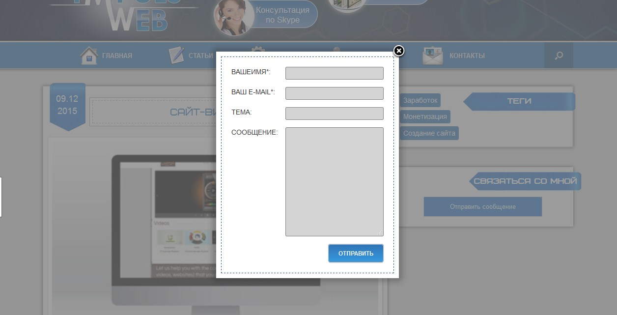
Такая форма обратной связи будет выглядеть примерно так:

Скучно, не пропорционально, скажем прямо не красиво.
Для изменения внешнего вида формы нужно немного поработать со стилями, но для начала добавим несколько классов в шаблон формы. Для этого открываем форму для правки (как на картинке выше) и дописываем следующие классы:

Писать мало, поэтому ошибок наделать трудно. В сети вы наверное находили советы без применения и добавления классов. Все дело в том что без добавления классов может возникнуть несколько проблем. К примеру вы захотите добавить сразу несколько форм на сайт, все они примут идентичный вид, а это не всегда удобно, по этому стоит использовать именно предложенный мной вариант.
Классы добавлены, пока ничего не изменилось, следующим шагом будет определение id формы.
Определяем ID формы на странице.
Для начала нужно понять что одна и та же форма будет иметь разные id на разных страницах сайта, так устроен плагин, он добавляет дополнительный параметр при каждом вызове формы. Сейчас разберем поподробнее.
Для правки формы нужно ее добавить на страницу или в запись, в необходимом месте, то-есть вставить шорткод. После этого переходим на эту страницу и кликаем по форме правой кнопкой мыши и выбираем пункт «Просмотреть код» это для браузера Chrome, если у вас другой, то там примерно такой же текст.

В открывшемся коде ищем начало нашей формы, выглядит это так:

Именно это и будет id формы. Возвращаясь назад, покажу какой id имеет эта же форма на другой странице.

Как видим, идентификатор отличается всего несколькими цифрами. По этому для начала нужно определиться на какой странице будет расположена форма, а уж затем приступать к правке стилей.
Ну что, очередной шаг сделан, мы определили id, прописали наши классы, теперь приступим непосредственно к изменению внешнего вида.
Стилизация формы Contact Form 7, работа с файлом style.css
Забегая вперед скажу что предложенный мной вариант навряд покажется вам идеальным. Дело в том что каждый кто читает эти строки хочет видеть свою форму именно такой какой он ее представляет. Я не телепат, и не смогу угодить всем, но постараюсь дать вам наводку где и в каком месте искать информацию и что изменять. Так что простите сразу за возможное разочарование, панацеи нет, придется и вам немного поработать.
Изменяем цвет фона, отступы, шрифт формы.
После проделанной работы переходим к стилям. Сперва изменим (если это нужно) фоновый цвет формы, подгоним наши отступы, подберем необходимый шрифт и цвет текста. Все эти настройки будем проводить заранее зная ID. Как его узнать, мы рассматривали выше.
Сперва обратимся к файлу style.css, добавим первые правила для ID формы (добавлять нужно в самом низу файла), в моем случае это wpcf7-f172-p34-o1, вам же нужно подставить ваш идентификатор:
#wpcf7-f172-p34-o1 { margin: 5px; padding: 10px; background: #B3AFAF; font-family: Georgia, "Times New Roman", Times, serif; color: #000; }
Теперь разберем все подробнее:
- Вначале займемся отступами. Внешние отступы (от края до начала формы) — margin: 5px, внутренние отступы (от начала формы до внутренних элементов) —padding: 10px.
- Заливка формы или ее фон определяется свойством background: #B3AFAF, цвет можете подбирать какой угодно, просто заменив значение.
- Определяемся с семейством шрифта, если менять не хотите можно не прописывать это правило (font-family: Georgia, «Times New Roman», Times, serif).
- Цвет текста определяет свойство color, которое сейчас стоит в черном цвете (color: #000).
С данными параметрами можете экспериментировать сами, подбирать отступы, цвета и шрифты. Для этого нужно лишь изменить значение, сохранить новый вариант, обновить страницу и посмотреть изменения. Не бойтесь экспериментов, тут вы не сможете поломать ничего, в крайнем случае стили просто не сработают и вы легко все исправите как было.
Определяем отступы между полями, изменяем рамку.
Переходим к нашим полям, добавим отступов:
#wpcf7-f172-p34-o1 p{ margin:5px; }
Это отступы по краям полей, что бы текст и блоки не сливались в одно целое.
Следующим этапом будут рамки, я дам свой вариант, а вы сможете найти в сети множество вариантов которые вам понравятся и заменить их.
#wpcf7-f172-p34-o1 input,textarea { border: 3px double #000; }
О рамках немного подробнее. Значение в 3px это ширина рамки, double двойное использование (если не нужно, можно удалить это слово), #000 цвет рамки так же можете подобрать свой.
Можете сохранить изменения и посмотреть на то что у вас получилось. Далее перейдем непосредственно к полям и изменению их размеров и расположения.
Меняем ширину полей и их расположение.
Ранее мы немного изменили нашу форму и добавили классы, именно сейчас это и пригодится. По умолчанию ширина всех полей одинакова и это не очень красиво и удобно. Сейчас мы это исправим. Добавляем к нашему файлу стилей следующие правила:
.name-cf { float:left; padding: 2px; } .name-cf input { width: 270px; } .thems-cf input { width: 100%; } .clear-cf { clear: both; } .text-cf textarea { width: 100%; }
Теперь разберем все поподробнее:
- Первый класс к которому мы обратимся name-cf он принадлежит полям с именем и емейлом. Для них задаем отступ в 2px (padding: 2px) и обтекание (float:left), что бы выровнять два поля в один ряд.
- Далее подправим ширину полей задав им оптимальный (для моего шаблона) размер в 270px (.name-cf input { width: 270px; }). Если у вас поля все еще в одну строчку или же слишком маленький размер, подберите свой вариант.
- Поле с названием темы сделаем на всю ширину формы, так как текста там может быть больше (.thems-cf input { width: 100%;}). Если вы хотите свое, точное значение укажите его в пикселях.
- Следующий блок который мы добавили к форме предназначен для отмены обтекания (.thems-cf input {width: 100%; }).
- Так же как и в предыдущем случае, поле с текстом сообщения делаем на всю ширину (text-cf textarea {width: 100%;}).
Можно обновить файл стилей и посмотреть на изменения, если нужно, подогнать размеры под ваши нужды.
Выравниваем кнопку «Отправить» по центру, изменяем фон и ширину.
Переходим к нашей кнопке, выровняем по центру и добавим фон:
.submit-cf { width: 200px; /*ширина блока*/ height: 25px; /*высота*/ margin: 0 auto; /* Отступ слева и справа */ } .submit-cf input { width: 200px; background:#96B195; }
Традиционно объясняю что к чему:
- Первым правилом мы определяем ширину и высоту блока в котором будет размещена кнопка и ставим ее по центру формы.
- Вторым правилом задаем цвет фона кнопки (background:#96B195, если не указать будет такого же цвета как и все остальные поля), устанавливаем ширину кнопки (width: 200px, желательно что бы была такого же размера, как ширина блока, что бы кнопка не двигалась в стороны).
Сохраняем наши настройки и смотрим что у нас получилось:

Соглашусь далеко не шик, но зато адекватно смотрится в целом, ниже форма по умолчанию, думаю эффект очевиден. В любом случае мы научились изменять внешний вид формы Contact Form 7.
Надеюсь для вас статья была полезной, если же что-то не так или возникли проблемы оставьте свой комментарий и я постараюсь ответить (подправить).
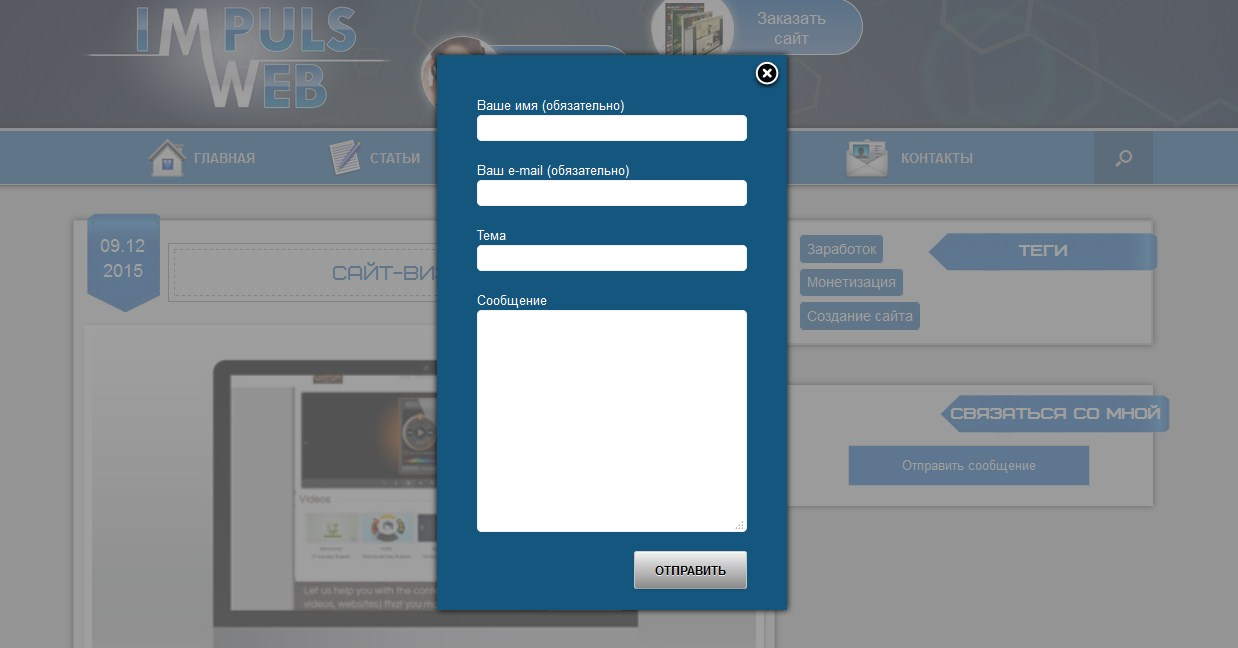
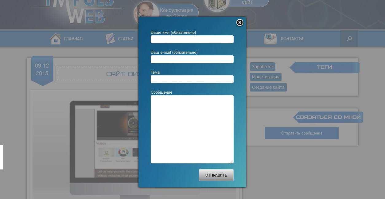
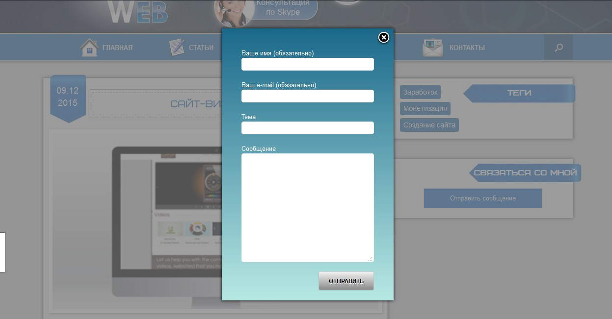
Приветствую вас дорогой читатель моего блога!
Сегодня я хочу поделиться с вами некоторыми своими наработками и заготовками для придания более приятного вида форме обратной связи, созданной при помощи плагина Contact Form 7.
К сожалению, по умолчанию оформление этой формы выглядит довольно невзрачно.
Смотрите сами:
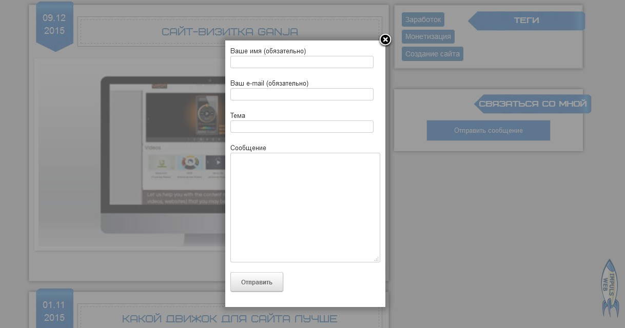
Выглядит не очень. Не правда ли?
К счастью всё это можно легко исправить и подогнать под дизайн Вашего сайта
Я предлагаю вам 3 варианта готовых стилей для Contact Form 7
Куда вносить изменения?
Перед тем как править стили нужно определиться куда вносить изменения.
Мы можем прописать новые стили прямо в файл стилей плагина, но после обновления этот файл заменится и Ваша работа пойдёт коту … ну вы сами знаете куда.
Более надёжным вариантом будет внесение изменений прямо в файл стилей вашей темы. Однако если вы и тему регулярно обновляете и не используете дочернюю тему то и в этом случае файл стилей заменится. Помните об этом и как минимум делайте себе резервные копии вашей темы и сайта в целом.

Для этого варианта нам не нужно будет ничего менять в самой форме, достаточно будет просто приписать стили в файл style.css вашей темы.
Для тех кто не помнит в какой папке он лежит вот путь:
Ваш_домен.ru/wp-content/themes/НАЗВАНИЕ ВАШЕЙ ТЕМЫ/style.css
Для того чтобы получить такой результат как на картинке выше приписываем в самом конце файла style.css следующие стили:
|
1 2 3 4 5 6 7 8 9 10 11 12 13 14 15 16 17 18 19 20 21 22 23 24 25 26 27 28 29 30 31 32 33 34 35 36 37 38 39 40 41 42 43 44 45 46 47 48 49 50 51 52 53 54 55 56 57 58 59 60 61 |
/*******Стили для Contact form 7 вариант1********/ #fancybox-wrap{ background:#15567E!important; -moz-box-shadow: 0 0 6px #000; -webkit-box-shadow: 0 0 6px #000; box-shadow:0 0 6px #000; } #fancybox-outer{ background:none!important; } #fancybox-outer>div, #fancybox-content, #contact_form_pop_up{ background:none!important; border:none!important; } #contact_form_pop_up{ padding: 20px 0px 0px 20px!important; } .wpcf7 { color:#fff!important; background:#15567E!important; width:280px; /*ширину задаём такую, как нам нужно в случае с всплывающей формой можно вообще не задавать*/ padding:0px!important;/*нулевой отступ для всплывающей формы, а если форма на странице, то нужно задать 20px*/ overflow:hidden; } .wpcf7 input[type=»text»], .wpcf7 input[type=»email»], .wpcf7 textarea{ border:1px solid red; padding:4px!important; border-radius:5px; border:1px solid #f1f1f1; } .wpcf7 input[type=»text»]:focus, .wpcf7 input[type=»email»]:focus, .wpcf7 textarea:focus{ border:1px solid #fff; -moz-box-shadow: 0 0 6px #fff; -webkit-box-shadow: 0 0 6px #fff; box-shadow:0 0 6px #fff; } .wpcf7 input[type=»text»], .wpcf7 input[type=»email»], .wpcf7 textarea{ width:270px!important; } .wpcf7-submit{ background: linear-gradient(#f1f1f1, #8b8b8b), #f1f1f1!important; color:#000!important; text-transform:uppercase; float:right; margin-top:20px; } .wpcf7-submit:hover{ -moz-box-shadow: 0 0 6px #000; -webkit-box-shadow: 0 0 6px #000; box-shadow:0 0 6px #000; background-image: linear-gradient( #8b8b8b, #f1f1f1), #8b8b8b!important; } |
Обратите внимание! Что данные стили задаются для всплывающей формы, а если ваша форма просто размещена на странице, то некоторые свойства нужно подправить.
Необходимо увеличить внутренний отступ для .wpcf7. Вместо «padding:0px!important;» задать своё значение, например «padding:20px!important;»
Ширина формы также меняется на ваше усмотрение.
Вы можете изменить цвет фона на свой.
Делается этот вот здесь

Обратите внимание на правило !important — оно должно быть здесь обязательно иначе ваш цвет перебьют стили, которые прописаны в самом плагине. При помощи этого правила мы повышаем приоритет указанного стиля.
Вы также можете поставить на фон формы изображение или градиент.
Для того чтобы поставить изображение замените эту строку на следующую:
background: url(images/form.jpg)!important;
При этом не забудьте загрузить изображение фона в папку images вашей темы.
Ваш_домен.ru/wp-content/themes/НАЗВАНИЕ ВАШЕЙ ТЕМЫ/images/form.jpg
Вот пример с фоном.
Для градиента замените эту строку на следующую:
background: linear-gradient(#1B698B, #B8EAE4), #1B698B!important;
Здесь первое значение цвета это верхний цвет, второе это нижний и в конце задаётся однотонный фон на случай если браузер не поддерживает свойство linear-gradient.
Вот как выглядит этот градиент:
Для того чтобы при активации полей они подсвечивались мы приписали следующие стили:
|
.wpcf7 input[type=»text»]:focus, .wpcf7 input[type=»email»]:focus, .wpcf7 textarea:focus{ border:1px solid #fff; -moz-box-shadow: 0 0 6px #fff; -webkit-box-shadow: 0 0 6px #fff; box-shadow:0 0 6px #fff; } |
Второй вариант стилизации Contact Form7
Для того чтобы реализовать этот вариант помимо стилей нам ещё нужно будет немного доработать код, в котором задаются поля формы.
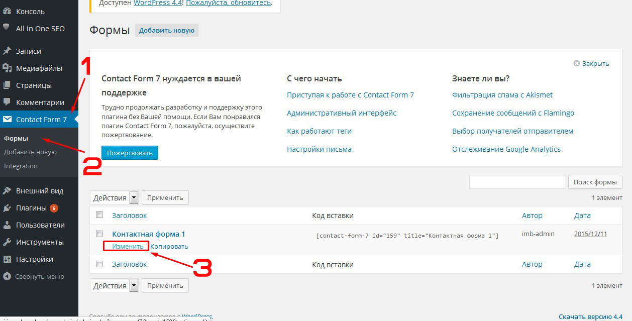
Для этого переходим в административную часть сайта и открываем меню «Contact form 7» — «Формы» — находим нашу форму и нажимаем «Изменить»
Далее удаляем тот код что там есть и вставляем следующий:
|
<div class=«cf-left»>Вашеимя*:</div> <div class=«cf-right»> [text* your-name] </div> <div class=«clear»></div> <div class=«cf-left»>Ваш e-mail*:</div> <div class=«cf-right»> [email* your-email]</div> <div class=«clear»></div> <div class=«cf-left»>Тема:</div> <div class=«cf-right»>[text your-subject] </div> <div class=«clear»></div> <div class=«cf-left»>Сообщение:</div> <div class=«cf-right»>[textarea your-message] </div> <div class=«clear»></div> <p>[submit «Отправить»]</p> |
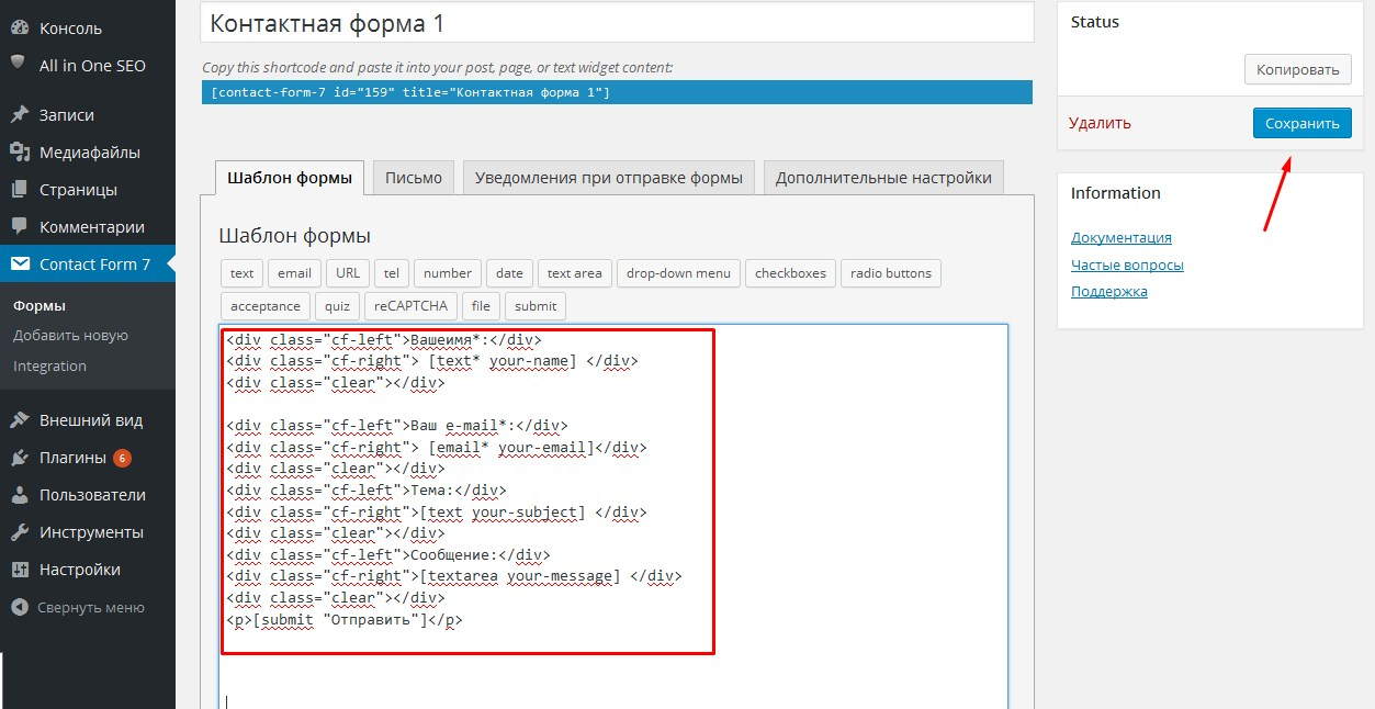
Обратите внимание что здесь используются стандартные шоткоды Contact Form7, то есть если вы добавляли свои поля, то вам нужно будет заменить соответствующие шоткоды.
После добавления кода не забываем сохранить изменения. Теперь в файл стилей дописываем:
|
1 2 3 4 5 6 7 8 9 10 11 12 13 14 15 16 17 18 19 20 21 22 23 24 25 26 27 28 29 30 31 32 33 34 35 36 37 38 39 40 41 42 43 44 45 46 47 48 49 50 51 52 53 |
/***Стили для CF7 вариант2***/ .wpcf7 { border:1px dashed #225384; /*цвет границы*/ padding:20px 20px 20px 0px!important; text-transform:uppercase; } .cf-left, .cf-right{ float:left; margin-bottom:15px; } .clear{ clear:both; } /*Стилти для блока с заголовками полей*/ .cf-left{ width:50%; padding-left:20px; max-width:120px; font-size:1.1em; } /*Стилти для блока полей формы*/ .cf-right{ width:60%; } .cf-right input, .cf-right textarea{ width: 100%; max-width:300px; padding:4px; background:#d4d4d4; /*фон полей формы*/ border:1px solid #8a8a8a; } .wpcf7-submit{ background: linear-gradient(#2F73B6, #399ADF), #2F73B6!important; /*фон кнопки*/ color:#fff!important; /*цвет шрифта кнопки*/ text-transform:uppercase; float:right; margin-left: 20px!important; border-radius:5px!important; text-shadow:none!important; } .wpcf7-submit:hover{ -moz-box-shadow: 0 0 6px #000; -webkit-box-shadow: 0 0 6px #000; box-shadow:0 0 6px #000; background-image: linear-gradient( #399ADF, #2F73B6), #399ADF!important; /*фон кнопки при наведении*/ } |
Я внесла код комментарии где можно поменять фон и т.д.
Если возникает необходимость поменять ширину формы, то это делается так:
Третий вариант стилей для Contact Form7
Теперь давайте рассмотрим ещё один вариант оформления стилей для Contact Form7 c использованием подписи полей внутри самого поля (placeholder)
Для этого открываем нашу форму для редактирования и удаляем все поля кроме кнопки отправки сообщения.
Далее добавляем 2 поля типа «text» при этом в поле «Значение по умолчанию» введём Значение нашего поля, например, «Ваше имя»
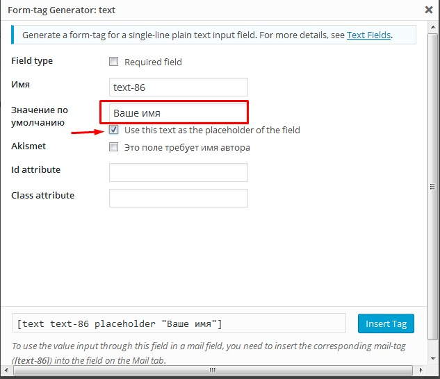
И сразу под этим полем нужно поставить галочку «Use this text as the placeholder of the field»
Если нужно чтобы поле было обязательным для заполнения то ставим галочку возле «Required field»
После этого нужно не забыть перейти на вкладку «Письмо» и подставить значения новых полей в письмо, которое будет приходить администратору.
В моём случае это выглядит так:
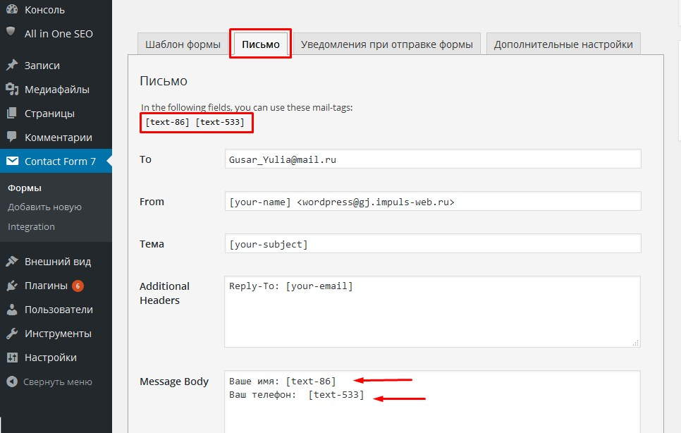
У вас будут другие значения шоткодов.
Для того чтобы придать этой форме более аккуратный вид допишем следующие стили:
|
1 2 3 4 5 6 7 8 9 10 11 12 13 14 15 16 17 18 19 20 21 22 23 24 25 26 27 28 29 30 31 32 33 34 35 36 37 38 39 40 |
/***Стили для CF7 вариант3***/ .wpcf7 { background:#f1f1f1; /*цвет границы*/ padding:20px 20px 20px 20px!important; text-align:center; border:1px solid #ccc; font-size:17px; } .wpcf7 h2{ text-transform:uppercase; font-size:20px; color:#750000; margin-bottom:15px; } .wpcf7-text{ margin-bottom:10px; padding:5px; border:1px solid #6e6e6e; } .wpcf7-text:focus{ -moz-box-shadow: 0 0 6px #004080!important; -webkit-box-shadow: 0 0 6px #004080!important; box-shadow:0 0 6px #004080!important; } .wpcf7-submit{ background: linear-gradient(#f20000, #750000)!important; color:#fff!important; text-shadow:none!important; text-transform:uppercase; border-radius:10px!important; -moz-box-shadow: 0 0 6px #000!important; -webkit-box-shadow: 0 0 6px #000!important; box-shadow:0 0 6px #000!important; margin-top:20px; } |

Стили для вывода сообщений
Ещё один момент это вывод сообщений об ошибках и отправке сообщения.
Для того чтобы стилизовать их нам понадобятся классы «wpcf7-not-valid» для задания стилей тексту, который выводится под полем формы и «wpcf7-response-output» — отвечает за стиль сообщений внизу формы.
Я добавила красную рамку для неправильно заполненных или пустых полей а так же тень и закруглённые углы для выводящихся сообщений. Вы можете дописать в эти классы всё на что хватит вашей фантазии.
|
.wpcf7-not-valid{ border:1px solid red!important; } .wpcf7-response-output{ background:#fff; border-radius:10px!important; -moz-box-shadow: 0 0 6px #000; -webkit-box-shadow: 0 0 6px #000; box-shadow:0 0 6px #000; } |
Вот результат:
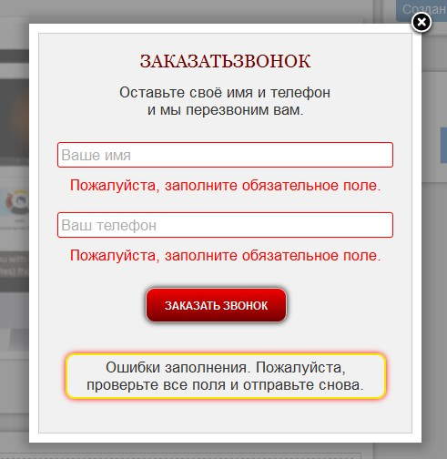
Помните что если стили заданы в плагине по умолчанию, то они применятся только после того как вы повысите приоритет свойства приписав к нему правило «!important»
Видеоинструкция
На этом у меня всё. Надеюсь что смысл дописания своих стилей Вам понятен. Желаю вам удачи в подгонке стилей под дизайн вашего сайта и терпения. Уверена что у вас всё получится.
Если что пишите в комментарии. Всегда рада на них ответить.
С уважением Юлия Гусарь
На чтение 3 мин Опубликовано 02.01.2019
Привет! Сегодня я покажу вам очень полезный плагин WordPress для настройки внешнего вида контактной формы Contact form 7. Вы можете очень просто и быстро изменить CSS стили формы обратной связи. Можно изменить цвет текста, фона, кнопки, границ, установить фото на фон и т.д. Смотрите инструкцию далее и пишите комментарии, если вам что-то не понятно. Поехали!
Установить плагин CF7 Customizer вы можете прямо из админ-панели WordPress. Перейдите на страницу: Плагины — Добавить новый, введите название плагина в форму поиска, установите и активируйте плагин.

Далее, в админ-панели, слева в боковой панели, перейдите на страницу: Внешний вид — Настроить.
Обратите внимание. На вашем сайте, уже должен быть установлен плагин Contact form 7. Форма должна отображаться на сайте.

Далее, слева у вас откроется окно с настройками. Нажмите на вкладку CF7 Customizer. Справа на сайте откройте страницу где стоит форма связи, чтобы вы могли сразу видеть все изменения.

Здесь вы можете выбрать, какие стили вы хотите изменить. Ниже разберём всё по порядку.

Form Text & BG Colors
- Text Color, цвет текста обозначения полей;
- Background Color, цвет фона текста названия полей;
- Background Image, изображение в виде фона;
- Font Size, размер шрифта, текста.

Обратите внимание. Фото будет фоном только для области, где отображаются названия полей.

Form Padding, Margin & Border
- Padding, отступ в пикселях от полей формы;
- Margin, можно расширить границы (форма станет меньше);
- Border, увеличить размер бордюра;
- Border Radius, изменить радиус бордюра;
- Border Color, цвет бордюра, границы.

Input Fields Styling
- Make input fields full width? Сделать поля ввода на всю ширину?
- Input Text Color, изменить цвет текста ввода;
- Input Background Color, изменить цвет фона текста ввода;
- Padding, отступы от полей ввода информации;
- Margin Between Input Fields, разница между полями ввода;
- Font Size, размер текста;
- Input Fields Border, граница полей ввода;
- Input Fields Border Radius, радиус границы полей ввода;
- Input Field Border Color, цвет границы полей ввода.

Button Styling
- Full Width Button, сделать кнопку на всю ширину?
- Button Text Color, цвет текста в кнопке;
- Button Background Color, цвет фона кнопки;
- Button Hover Text Color, цвет текста в кнопке при наведении;
- Button Hover Background Color, цвет фона кнопки при наведении;
- Border, бордюр, граница;
- Border Radius, радиус границ;
- Button Border Color, цвет границ кнопки;
- Button Border Hover Color, цвет границ кнопки при наведении.
После того как вы настроите внешний вид, нажмите вверху на кнопку Опубликовать, чтобы сохранить сделанные изменения.

Остались вопросы? Напиши комментарий! Удачи!
 Some users of Contact Form 7 prefer to use an image as their form button, instead of the default submit button. In this tutorial, we’ll walk you through how to accomplish this using Contact Form 7 and our popular Contact Form 7 Skins plugin.
But before we get started, there are a few things you need to know:
- Have a basic understanding of HTML and CSS. Learn more.
- Understand and know how to use developer tools such as Firefox Firebug or Chrome Developer Tools – Learn more.
By the end of this article you should be able to use a selected image as your submit button on a Contact Form 7 form.
Create Button Images
First of all, we need to create two button images, one will display as the button and the other will show up when hovered over with the mouse.
Creating the images might require some knowledge in using an image editing tool like Photoshop. However to make this article useful to most users, we shall use dabuttonfactory’s online tool to generate images for our buttons.
This tool is very simple and intuitive to use. In the Text field on the left, type the text you wish to display on your image. You can choose from several fonts available in dabuttonfactory.com, select the text color and background color that suits your theme.
Once you are done with your styling, select the image extension (.png .jpg) of your choice, click download and save the image on your local computer. In this article we’ll use the images below as our Contact Form 7 button.
Now you just need to upload those images to the WordPress Media Library and get the full URL of each file in your WordPress installation. In our case we have the following files:
- http://cf7skins.com/wp-content/uploads/button_main.png
- http://cf7skins.com/wp-content/uploads/button_hover.png
Create a CF7 Skins – Contact From 7 form
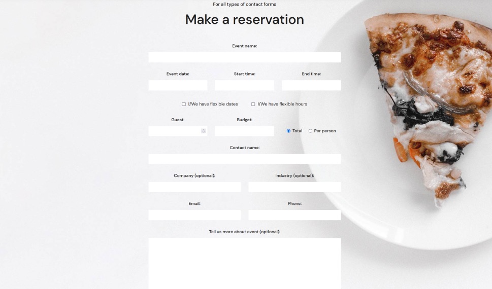
Now create a Contact Form 7 form and select the Contact Template CF7 Skins Templates are the structure of your form, providing the content and layout. They act as an easy to follow guide that can be adjusted to your particular needs. and Caspar Style When you select a CF7 Skins Style the aesthetic design (CSS code) is automatically created and applied to your form. as follows.
Tip: You can use Firebug or Chrome Dev Tools to see how we’ve styled this form.
There is no need to make any changes to the default Contact From 7 submit button tag – we’ll make all the changes we need using CSS only.
Modify the form’s CSS Styling
First we need to use Firebug or Chrome Dev Tools to examine the classes added to your form by the CF7 Skins Caspar Style.
Launch Firebug by right clicking the Submit button and selecting Inspect element with Firebug.

Initial Code
If you do this correctly you should see that the following CSS code is styling the Submit button:
.wpcf7 .wpcf7-form.cf7skins.cf7s-caspar input[type="submit"] {
    padding: 5px 15px;
    color: #1a1a1a;
    border: 1px solid #c3c3c3;
    background: #ededed;
}
Tip: See Using Firebug to inspect the form for step by step instructions on using Firebug.
Additional Code
To get the Submit button using the selected images we need to add the following CSS code:
.wpcf7 .wpcf7-form.cf7skins.cf7s-caspar input[type="submit"] {
  background-image: url(http://yoursite.com/wp-content/uploads/button_main.png);
  border: none;
  border-radius: 5px;
  width: 102px;
  height: 48px;
  color: transparent;
}

.wpcf7 .wpcf7-form.cf7s-caspar input[type="submit"]:hover {
  background-image: url(http://yoursite.com/wp-content/uploads/button_hover.png);
}
Tip: You only need to add CSS statements for those elements you wish to add or change.
Completed Form
When the code above is added using a custom CSS plugin or a Child Theme we get a form as shown below.
Tip: Use a custom CSS plugin or a Child Theme to add your CSS.
Have Questions or Need Help
If you are using the free version of CF7 Skins and have any questions, get in touch via the CF7 Skins community and also the Contact Form 7 Support forum.
If you are using the premium version, CF7 Skins Pro, then Premium Email Support is provided to deal with your questions and problems.
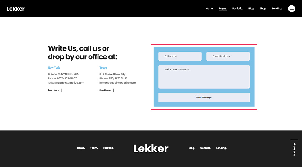
Плагин Contact Form 7 поможет организовать обратную связь на вашем сайте.
Скачать плагин Contact Form 7 можно на официальном сайте WordPress Скачать
Скачать плагин Really Simple CAPTCHA можно на официальном сайте WordPress Скачать
Как установить и подключить этот плагин мы рассмотрели в уроке «Форма обратной связи для сайта«, сейчас разберемся с дополнительными функциями плагина Contact Form 7. Форма корректно работает на мониторах, планшетах, телефонах и ноутбуках. Кстати если у вас сломался ноут, то есть сервис где делают ремонт ноутбуков HP.
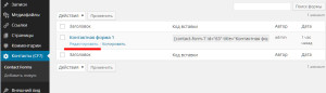
После того как вы скачали и активировали плагин зайдите в настройки плагина перейдя в новый раздел панели управления «Контакты».
Наведите мышкой на название формы и выберите «Редактировать»
Откроется окно изменения параметров формы
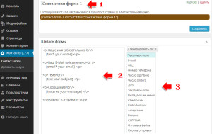
Так как на сайте может использоваться не одна, а несколько форм (форма отправки сообщения, форма заказа звонка, форма с анкетными данными), то чтобы не возникало путаницы какая форма за что отвечает, нужно изменить имя формы. Для этого кликните по названию формы 1.
В блоке №2 отображается то, что будет выводится на странице в форме. Сначала идет текст, название поля, после код этого поля. Вы можете изменить текст на тот который вам нужен.
Для добавления новых полей в форму нажмите на выпадающий список №3 — «Сгенерировать тэг» и из выпадающего списка выберите необходимый элемент.
- Текстовое поле
- URL
- Номер телефона
- Число (spinbox)
- Число (slider)
- Дата
- Текстовое поле
- Выпадающее меню
- Checkboxes
- Radio buttons
- Acceptance
- Вопрос
- CAPTCHA
- Отправка файла
- Кнопка отправки
Подсказки и поля формы по умолчанию располагаются так: вверху подсказка, внизу элемент. Если хотите расположить описание и элемент в одну строку — уберите после текста тэг <br />
. Весь блок с описанием и элементов должен быть в одну строку и находиться внутри тэга <p>.
Текстовое поле
Из выпадающего списка выберем элемент «Текстовое поле»
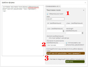
Если любая функция которую добавляете обязательна — поставьте галочку 1 и не забудьте от этом написать в описании.
Можно в поле ввода добавить дополнительную информацию, чтобы сделать более понятным заполнение формы. Отметьте галочкой пункт 2 «Использовать как заполнитель (placeholder)?» и рядом в поле впишите подсказку. При заполнении этого поля в форме текст подсказки исчезнет. Дальше следуйте подсказкам плагина. В результате получится такое вот поле в готовой форме:
Обязательно вставьте код в шаблон письма, иначе данные из этого поля не передадутся на почту! Это касается не только текстовых полей но и любых других элементов.
Используется для передачи в форму адреса почтового ящика отправителя
URL
Позволяет добавить в форму адрес сайта.
Номер телефона
В это поле возможно вписать только цифры
Число (spinbox)
Поле, в котором можно установить количество чего-либо, например товара. Количество устанавливается стрелками вверх/вниз.
Дата

Вставляет в форму календарь с возможностью выбора даты. Например используется для резервации номеров в отеле. Дата заезда, дата отбытия.
Текстовое поле

Да, не удивляйтесь 🙂 Еще одно текстовое поле. На этот раз, это поле имеет большие размеры и позволяет писать в него много текста. Например отзывы, комментарии.
Выпадающее меню
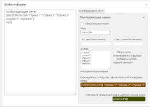
Когда много вариантов чего-либо и необходимо выбрать какой то пункт из большого списка, например список городов, улиц, товаров.
Список необходимо разместить в поле Выбор, каждый пункт с новой строки.
Checkboxes
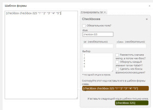
Флажком, или на жаргоне разработчиков чекбоксом, называется элемент, который создает поле для проставления галочки. Это поле имеет два состояния — отмечена галочка или нет. Возможен множественный выбор. Располагаются только в ряд, если отметить галочкой «Сделать чек-боксы взаимоисключающими?» то будет возможен выбор только одного параметра.
Radio buttons
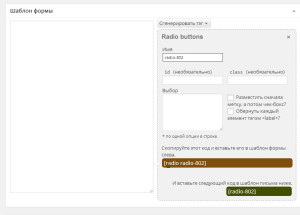
Переключатели (жарг. радиокнопки) используют, когда необходимо выбрать один единственный вариант из нескольких предложенных. Отметив галочкой пункт » Разместить сначала метку, а потом чек-бокс?» меняется расположение метки и поля выбора, по умолчанию сначала выбор, потом метка.
Acceptance
Подтверждение чего-либо. Допустим соглашение принятия условий описанных выше.
Вопрос
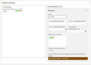 Это первая линия обороны от спама, самая элементарная. В настройка пишите какой то вопрос, можно цифрами, можно буквами или и так и так, и указываете правильный ответ. Если ответ при заполнении формы будет правильным, то форма отправится. Зеленым отмечено какая часть этой формулы будет отображаться на сайте перед полем ввода ответа, красным — ответ. Правильный ответ в формуле пишется после знака | (вертикальной черты)
CAPTCHA
Добавляет в форму защиту от спама.
Для работы этой функции необходим еще один плагин Really Simple CAPTCHA. Скачивайте, устанавливаете, активируйте плагин.
Далее возвращаемся к редактированию формы и добавляем функцию CAPTCHA.
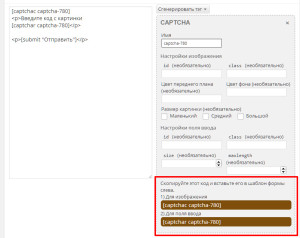
Настройки можно не менять, копируете и вставляете 2 строчки перед кнопкой отправить.
Отправка файла
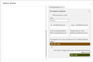
К форме отправки сообщения можно прикрепить файл. В настройках можно указать максимальный размер в байтах, и разрешенные форматы для загрузки, например .jpg .tiff .doc
Кнопка отправки
Отправка формы. В настройках в разделе «Ярлык» — можно дать название кнопки (Отправить, ответить, послать 🙂 )
Настройка внешнего вида Contact Form 7
Так как плагины имеют свойства обновляться, изменения внешнего вида формы будем производить в файле стилей темы сайта style.css
За отображение формы, ее полей и прочих элементов отвечает код:
.wpcf7 { background-color:#ddd;	} /*цвет фона формы */
.wpcf7 input,
.wpcf7 textarea{

padding:5px;
color:#1D1D1D;
font-family:Arial, Helvetica, sans-serif;
font-size:16px;
line-height: 20px;

border: 1px solid #C7C7C7;

box-shadow: inset 2px 2px 8px #F9F9F9;

-webkit-transition: all 0.2s ease;
-moz-transition: all 0.2s ease;
-o-transition: all 0.2s ease;
transition: all 0.2s ease;

}

.wpcf7 .wpcf7-list-item{
padding-left: 0;
margin-left: 0;
margin-right: 25px;
}

.wpcf7 .wpcf7-list-item input{
border: none;
padding-left: 0;
margin-left: 0;
}

.wpcf7 select{
outline: none;
font-size:16px;
font-family:Arial, Helvetica, sans-serif;
}

.wpcf7 input:hover,
.wpcf7 input:focus,
.wpcf7 input:active,
.wpcf7 textarea:hover,
.wpcf7 textarea:focus,
.wpcf7 textarea:active {

background: #FDFDFD;

outline: none;
}
Что есть тут что.
.wpcf7 input, .wpcf7 textarea — стиль поля ввода (текстового поля)
- padding — задает отступ от содержимого до границы элемента. Здесь — отступ от вводимого в поле текста до границы поля. Устанавливается значение в пикселях Xpx, где X количество пикселей. Пример: padding: 5px 3px 6px 8px;
- color — цвет текста.
- font-family — шрифт полей ввода.
- font-size — размер шрифта
- line-height — высота строки
- border — рамка вокруг поля ввода
- box-shadow — тень блока. inset указывает на то, что тень внутренняя. Если нужна внешняя тень, пропустите это значение. Второе и третье значения 2px 2px указывают на смешение тени по горизонтали и вертикали соответственно. Четвертое значение 8px задает радиус размытия тени. Пятое — #F9F9F9 — цвет тени.
Настройка кнопки Contact Form 7
.buttons_form {
     padding: 0px;
     height: 30px;
     width: 150px !important;
     border: none !important;
     cursor: pointer;
     color: #fff;
     -webkit-border-radius: .5em;
     -moz-border-radius: .5em;
     border-radius: .5em;
     color: #faddde;
     border: solid 1px #980c10;
     background: #d81b21;
     background: -webkit-gradient(linear, left top, left bottom, from(#ed1c24), to(#aa1317));
     background: -moz-linear-gradient(top,  #ed1c24,  #aa1317);
     filter:  progid:DXImageTransform.Microsoft.gradient(startColorstr='#ed1c24', endColorstr='#aa1317');
}
Стиль уведомлений Contact Form 7
Он отвечает за сообщения об ошибках или успешной отправке
.wpcf7 .wpcf7-validation-errors{
border:none;
background-color:#246416;
color:#fff;
margin:0;
padding:20px;

-webkit-border-radius: 10px;
-moz-border-radius: 10px;
border-radius: 10px;
}

.wpcf7 .wpcf7-mail-sent-ok{
border:none;
background-color:#7ad33f;
margin:0;
padding:20px;

-webkit-border-radius: 10px;
-moz-border-radius: 10px;
border-radius: 10px;
}

.wpcf7 .wpcf7-mail-sent-ng{
border:none;
background-color:#349622;
margin:0;
padding:20px;

-webkit-border-radius: 10px;
-moz-border-radius: 10px;
border-radius: 10px;

color: white;
}

.wpcf7 span.wpcf7-not-valid-tip{
border:none;
background-color:#349622;
padding:5px;
padding-left: 5px;
padding-right: 5px;
border-radius:10px;
width: 290px;
color: white;

/* Drop shadow */
-webkit-box-shadow: 3px 3px 3px rgba(0,0,0,0.3);
-moz-box-shadow: 3px 3px 3px rgba(0,0,0,0.3);
box-shadow: 3px 3px 3px rgba(0,0,0,0.3);
}
А теперь для удобства весь код целиком с комментариями:
.wpcf7 { background-color:#ddd;	} /*цвет фона формы */
.wpcf7 input,
.wpcf7 textarea{ /* Данная часть кода отвечает за стиль полей ввода, текстовые области */

padding:5px; /* Устанавливает отступ от полей элемента до его содержимого, можно поставить любое знаниче, например 10px */

color:#1D1D1D; /* Цвет текста в полях ввода */

font-family:Arial, Helvetica, sans-serif; /* Шрифт текста в полях ввода */

font-size:16px; /* Размер текста в полях ввода */

line-height: 20px; /* Высота стоки в полях ввода */

border: 1px solid #C7C7C7; /* Рамка вокруг полей. Первое значение - ширина в пикселах, второе - стиль рамки, третье - ее цвет */

box-shadow: inset 2px 2px 8px #F9F9F9; /* Тень от полей ввода. 2px - сдвиг по оси x, 2px - сдвиг по оси y, 8px - радиус размытия тени, #F9F9F9 - цвет тени */

-webkit-transition: all 0.2s ease;
-moz-transition: all 0.2s ease;
-o-transition: all 0.2s ease;
transition: all 0.2s ease;

}

.wpcf7 .wpcf7-list-item{
padding-left: 0;
margin-left: 0;
margin-right: 25px;
}

.wpcf7 .wpcf7-list-item input{
border: none;
padding-left: 0;
margin-left: 0;
}

.wpcf7 select{
outline: none;
font-size:16px;
font-family:Arial, Helvetica, sans-serif;
}

.wpcf7 input:hover,
.wpcf7 input:focus,
.wpcf7 input:active,
.wpcf7 textarea:hover,
.wpcf7 textarea:focus,
.wpcf7 textarea:active { /* Данная часть отвечает за стиль полей ввода при наведении на них указателя мыши */

background: #FDFDFD; /* Фон поля ввода при наведении указателя мыши на него */

outline: none; /* Внешняя граница поля ввода текста */
}

.wpcf7 input.wpcf7-submit{/* Данная часть кода отвечает за стиль кнопки Отправить в форме */

-webkit-transition: 0;
-moz-transition: 0;
-o-transition: 0;
transition: 0;

border: none; /* Рамка вокруг кнопки */
position: relative;

color: #fff; /* Цвет текста */

text-transform: uppercase; /* Преобразование текста (uppercase значит, что текст на кнопке будет отображаться заглавными буквами) */

/* Скругление углов кнопки. Значения следующих трех свойств должны быть одинаковы, так как это одно и то же, только для разных браузеров */

-webkit-border-radius: 6px; /* Скругление углов для Chrome */
-moz-border-radius: 6px; /* Скругление углов для Mozilla FireFox */
border-radius: 6px; /* Скругление углов для всех остальных браузеров, в том числе мобильных */

font-size: 14px; /* Размер текста кнопки */
font-weight: bold; /* Стиль текста (bold значит жирный) */
padding-top: 11px; /* Отступ сверху от края элемента до его содержимого */
padding-bottom: 10px; /* Отступ снизу от края элемента до его содержимого */
padding-left: 35px; /* Отступ слева от края элемента до его содержимого */
padding-right: 35px; /* Отступ справа от края элемента до его содержимого */

/* Gradient background - Градиентный фон кнопки */

background-color: #000000; /* Цвет фона кнопки, если градиент не поддерживается браузером */

/*В следующих свойствах цвета должны быть указаны одинаково, так как это одно и то же, только для разных браузеров. Разберем первое свойство. Часть from(#676767), to(#3B3B3B) значит, что надо отобразить градиент, где от цвета #676767) идет переход к цвету #3B3B3B */

background: -webkit-gradient(linear, left top, left bottom, from(#676767), to(#3B3B3B));
background: -moz-linear-gradient(top, #349622, #246416);
filter: progid:DXImageTransform.Microsoft.gradient(startColorstr='#349622', endColorstr='#246416');
-ms-filter: "progid:DXImageTransform.Microsoft.gradient(startColorstr=#349622, endColorstr=#246416)";

/* Drop Shadow - Тень кнопки. Цвет тени указан в RGBA */
-webkit-box-shadow: 0 2px 5px rgba(0,0,0,0.3);
-moz-box-shadow: 0 2px 5px rgba(0,0,0,0.3);
box-shadow: 0 2px 5px rgba(0,0,0,0.3);

}

/* On hover - Стиль кнопки при наведении указателя мыши. Все почти то же самое, что и в предыдущем блоке */
.wpcf7 input.wpcf7-submit:hover{

cursor: pointer;
text-decoration: none;

background-color: #000000;

background: -webkit-gradient(linear, left top, left bottom, from(#246416), to(#349622));
background: -moz-linear-gradient(top, #246416, #349622);
filter: progid:DXImageTransform.Microsoft.gradient(startColorstr='#246416', endColorstr='#349622');
-ms-filter: "progid:DXImageTransform.Microsoft.gradient(startColorstr=#246416, endColorstr=#349622)";
}

/* On click - стиль кнопки при нажатии на нее се почти то же самое, что и в предыдущем блоке */
.wpcf7 input.wpcf7-submit:active{
top: 1px;

color: #d8c6e2; /* Цвет текста кнопки при нажатии на нее */

background-color: #000000;
background: -webkit-gradient(linear, left top, left bottom, from(#FF0000), to(#246416));
background: -moz-linear-gradient(top, #FF0000, #246416);
filter: progid:DXImageTransform.Microsoft.gradient(startColorstr='#FF0000', endColorstr='#246416');
-ms-filter: "progid:DXImageTransform.Microsoft.gradient(startColorstr=#FF0000, endColorstr=#246416)";

-webkit-box-shadow: none;
-moz-box-shadow: none;
box-shadow: none;
}

/* CF7 Messages - Стиль сообщений об успешной отправке, ошибках и т.д. */

.wpcf7 .wpcf7-validation-errors{ /* Стиль сообщений при ошибках валидации */
border:none; /* Рамка блока сообщения */
background-color:#246416; /* Фон */
color:#fff; /* Цвет текста */
margin:0; /* Внешний отступ */
padding:20px; /* Внутренний отступ */

/* Скругление углов для разных браузеров - следующие 3 свойства */
-webkit-border-radius: 10px;
-moz-border-radius: 10px;
border-radius: 10px;
}

.wpcf7 .wpcf7-mail-sent-ok{ /* Стиль сообщений об успешной отправке */
border:none; /* Рамка блока сообщения */
background-color:#7ad33f; /* Фон */
margin:0; /* Внешний отступ */
padding:20px; /* Внутренний отступ */

/* Скругление углов для разных браузеров - следующие 3 свойства */
-webkit-border-radius: 10px;
-moz-border-radius: 10px;
border-radius: 10px;
}

.wpcf7 .wpcf7-mail-sent-ng{
border:none;
background-color:#349622;
margin:0;
padding:20px;

-webkit-border-radius: 10px;
-moz-border-radius: 10px;
border-radius: 10px;

color: white;
}

.wpcf7 span.wpcf7-not-valid-tip{
border:none;
background-color:#349622;
padding:5px;
padding-left: 5px;
padding-right: 5px;
border-radius:10px;
width: 290px;
color: white;

/* Drop shadow */
-webkit-box-shadow: 3px 3px 3px rgba(0,0,0,0.3);
-moz-box-shadow: 3px 3px 3px rgba(0,0,0,0.3);
box-shadow: 3px 3px 3px rgba(0,0,0,0.3);
}

.wpcf7-form .fleft{
float: left;
}

.wpcf7-form .mright20{
margin-right: 20px;
}

.wpcf7-form .mright40{
margin-right: 40px;
}

.wpcf7-form .clear{
clear: both;
}
Even though contact forms are an essential method for engaging with visitors, most WordPress webmasters struggle to properly style them. In most cases, forms have a default styling, which is provided by the browser. Those forms tend to be sparsely stylized and can differ a lot from your site design. On the other hand, the WordPress theme you’re using could contain CSS code that stylizes the forms, which can help with your stylization problem. But, even a theme-specific style might clash with your website’s brand.
Therefore, it is up to you to properly style Contact Form 7 and make yours stand out from the crowd. And this article is here to help you do that. Within it, we will cover various aspects of creating the code necessary for form stylization. We focused on using a contact form created by the Contact Form 7 plugin as the showcase, but most of what we discuss can be applied to any form. Also, depending on your existing knowledge of CSS, you might need to do some additional reading to understand the code fully.
However, before we show you the CSS way of doing it, we would like to talk about two newbie-friendlier ways of styling a Contact Form 7 form using a plugin: our own Qi Addons for Elementor, and Qi Blocks for Gutenberg plugins.
How to Style Contact Form 7 Forms Using Qi Addons for Elementor
Our very own Qi Addons for Elementor plugin contains a wealth of beautiful, professionally designed widgets, and a Contact Form 7 widget is just one of them, available even in the free version of the plugin. To use them, you need to install the latest version of Elementor and the Qi Addons plugin, and you’re good to go. Elementor is a must; Qi Addons will not work with any other page editor. It will work with the free version of Elementor, though, so the whole package doesn’t need to cost you a penny.
You can see all the widget’s options in action in the video below. If you prefer your tutorials in text form, we will give you a brief overview below.
Qi Addons Contact Form 7 Placement
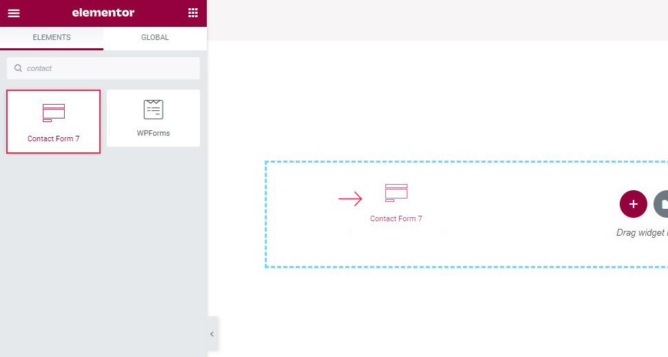
To create a form, simply drag the Qi Addons widget from the left hand side menu to where you want the form on the page.
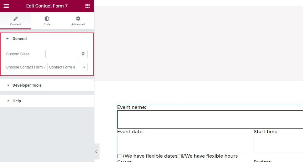
The content field, which should be open by default, lets you choose which of the forms you have saved will feature in the widget.
Qi Addons Contact Form 7 Label and Text Styling
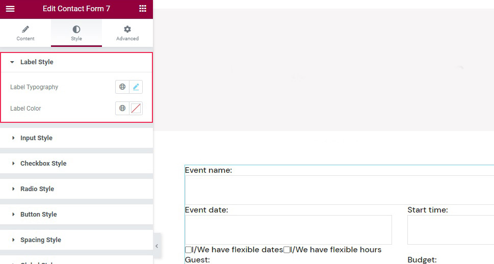
As far as styling goes, you need to switch to the Style tab of the widget. Once there, you will find styling controls organized into several sections. In the Label Style section, you can change the label typography, if you want to use a different style, as well as the label color.
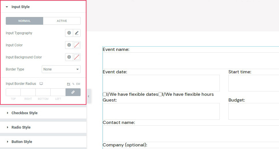
The Input Style sections has controls for input topography, text color, background color, and borders, and a Normal/Active tab which you can use to create different settings for the active and inactive fields, in case you wish to, say, choose a different background color for an active field in the name of accessibility and make it easier for your visitors to see which field they are entering text into.
Qi Addons Contact Form 7 Checkbox, Buttons, and Spacing Styling
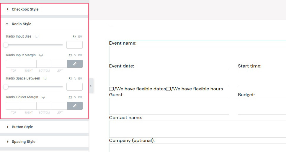
If you are using checkboxes or radio buttons in your form, you will find the controls to style them in the Checkbox Style and Radio Style sections of the Style tab. There, you can tweak their size and margins.
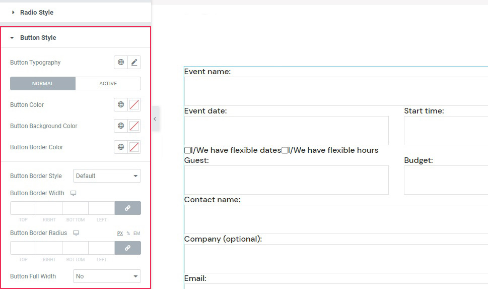
As for the buttons, you can find their styling options in the Button Style section. The buttons can be styled in the same Normal/Active modes, but also in terms of color, background color, size, and style.
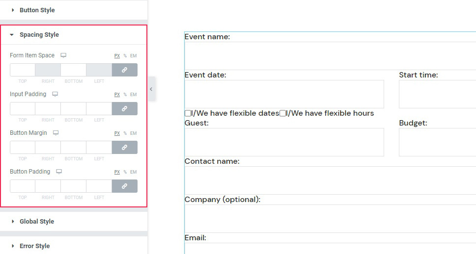
As for the Spacing Style, this section holds the controls for the margins of the widget as well as some parts of it.
Qi Addons Contact Form 7 General Styling
The Global Style section of the Style tab merely sets the alignment of the widget, between left, center and right. The Error Style section governs your settings of the error messages in case a visitor gets something wrong when filling out the form. Finally, the Response Style section is used to style the okay message that your visitor should get after filling out and submitting the form.
Now let’s see how you can style your Contact Form 7 forms using another one of our plugins, Qi Blocks for Gutenberg.
How to Style Contact Form 7 Forms Using Qi Blocks for Gutenberg
One of the things that make contact forms such a great tool is their versatility. Whether you’re adding them as popups or using them to express some innovative design ideas, they can easily find their place on any type of website and do their job well. And if you like to edit your website using the Gutenberg block editor, then Qi Blocks for Gutenberg should be your go-to choice for styling CF7 forms. The plugin features 81 different blocks, over half of which are available in the free version – including the Contact Form 7 Gutenberg block.
Before getting started, keep in mind that you’ll need to install the Contact Form 7 plugin, as well as Qi Blocks for Gutenberg. The Contact Form 7 Gutenberg block lets you add different forms you’ve created in the Contact Form 7 plugin – we’ve created the one we’re using in this example. We’ve also set up the page using the Advanced Columns and Section Title blocks, both of which are available with the free version of the plugin.
Adding the Contact Form 7 Block
We started by creating a new paragraph below the section title we’ll be using as a title for the contact form. The simplest way to add a new block would be to click on the “+” button on the right edge of the paragraph block and search for the Contact Form 7 block. Once you add the widget, the right-hand side block options menu will automatically open on Content options, where you choose the contact form you want to load with the block.
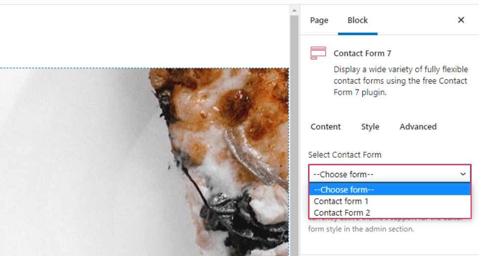
Contact Form 2 is the one we’ve made in the CF7 plugin, and choosing it loaded it in the block without any settings. To style the form, we went to the Style tab in the block options menu.
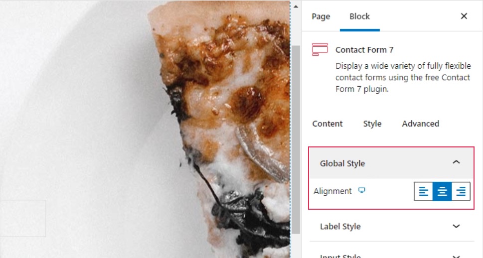
Styling the Form
The first two styling options are the Global Style and Label Style options. The first one lets you choose the alignment of the label text, while the second gives you all the typography and color options you need to style the label as you see fit. For our contact form, we only changed the alignment to center in the Global Style options.
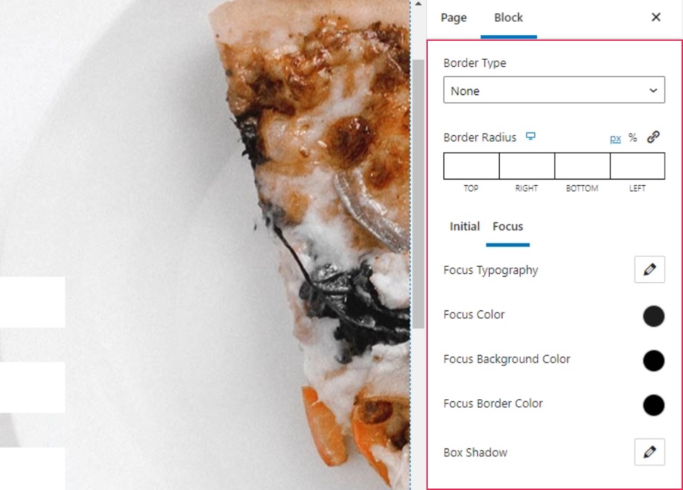
The next set of options, Input Style, lets you set up the border, as well as the style of the input fields and the text. You’ll get to choose typography, colors, and background colors, and you’ll be able to do it for both the initial state of a field and the one when the field is selected.
Our first step was to remove the border by choosing None under Border Type. For the Initial text color, we chose #c4c4c4, and we chose #ffffff as the background color. Under the Focus options, we again changed the text color to #1e1e1e.
Styling the Checkboxes and Radio Buttons
The Checkbox Style and Radio Style options let you style the checkboxes and radio buttons in your form. You can choose their sizes, margins, and spacing, and you can also set up custom typography options for the checkbox.
The one thing you should keep in mind is that the changes when styling the checkboxes and the radio buttons are only properly visible when you preview the page. In our case, the checkboxes and radio buttons were stacked vertically, while in the preview they appeared horizontally. Here’s what you’ll see in the editor.
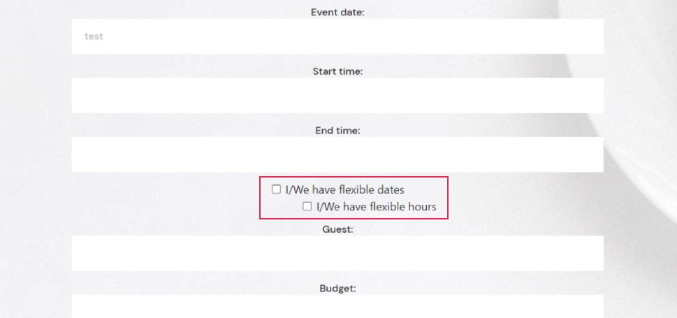
And here’s the preview that shows you what your website visitors will see.
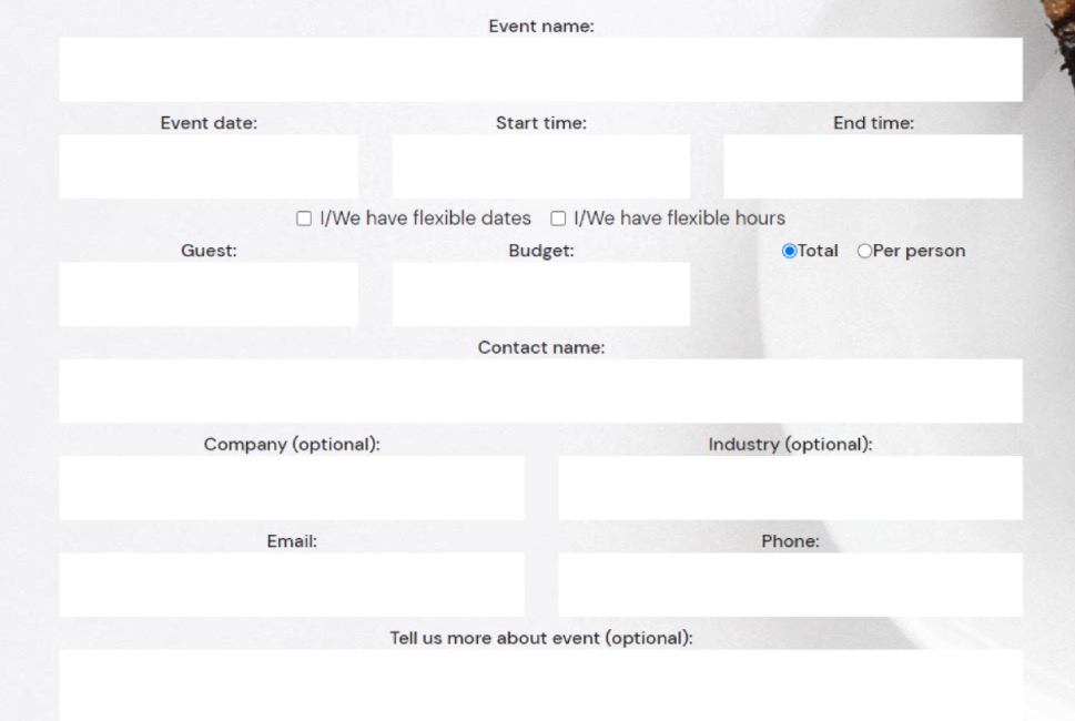
The settings we used for the checkboxes were 7px for the right checkbox input margin, 50px for the checkbox space between, -4px for the top checkbox holder margin and 5px for the top checkbox holder margin. For the Radio Style options, we used 7px for the right radio input margin, 24px for the radio space between, and 28px for the top radio holder margin.
Styling the Buttons and Spacing
Among the Button Style options, you’ll find the options to set the button typography, color, border, and shadows. You’ll also get to style the initial and the hover versions of the button separately.
We set the Initial color for the text to #ffffff, while we used #333333 for the background color. We also set the background color to #000000 on hover.
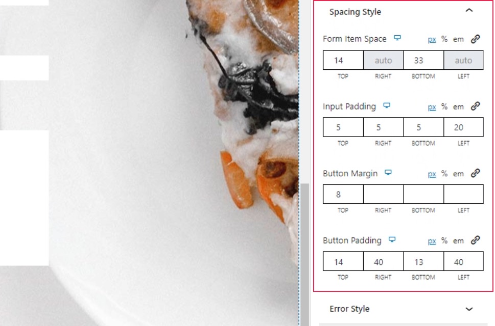
The Spacing Style lets you set all the various spacing, padding, and margins within the elements in the form. To make our form just right, we set 14px for the top and 33px for the bottom under the Form Item space. Under Input Padding, we set 5px everywhere except the final, left, value, which we set to 20px. We set the top Button Margin to 8px, and for the Button Padding, we used the following values: 14px, 40px, 13px, and 40px.
Styling the Error and Response Messages
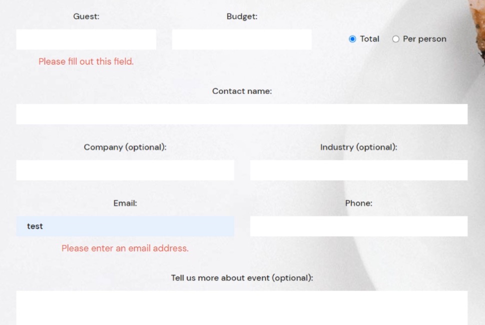
For the Error Style, you’ll get to choose the alignments of the messages, their typography options, color, and margins. Under the Typography options, we set the font size to 17px and the line height to 26px. We set the Color option to #e54848, and the top Error Margin to 9px.
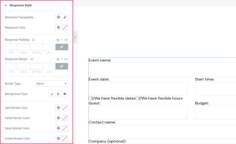
With the Response Style options, you get to style the message that appears after submitting the form. The options you have at your disposal include typography, color, padding and margins, border, and background options.
Under the typography options, we set the font size to 17px and the line height to 26px. We entered the following values under Response Padding: 16px, 25px, 19px, 25px. For the top Response Margin, we set the value at 40px. We choose the Solid border type and set the Border Width at 1px.
The block also lets you choose different border colors for different messages. We picked #61a73a for the sent border color, #f58e32 for the spam sent border, and #f1ce41 for invalid border color. And with that, we’ve finished styling our form.
Of course, there is a way to style your Contact Form 7 forms using CSS, and, to learn that, all you need to do is scroll down to the next section.
Styling Contact Form 7 Forms Using CSS
If, for whatever reason, you don’t use Elementor or don’t want to use our plugin (and we can’t think of a way why you wouldn’t want to), don’t fret. We got you covered. We will also cover how to create styles applicable to all your CF7 forms, as well as how to stylize a specific form using CSS. To follow along with this article, you will need to have the Contact Form 7 plugin installed and have at least one form on your website created with this plugin. Then, you will be able to use that form to apply the methods we discuss below.
Before we begin
In this article, we will cover how to create styles applicable to all your CF7 forms, as well as how to stylize a specific form. To follow along with this article, you will need to have the Contact Form 7 plugin installed and have at least one form on your website created with this plugin. Then, you will be able to use that form to apply the methods we discuss below.
Please note, the CSS you create during this process should be added inside Appearance > Customize > Additional CSS. If you aren’t comfortable with your current CSS skills, you should brush up on them beforehand as some CSS knowledge is necessary for grasping the topics in this article. Once you’ve done that, you can proceed to the main part of the article below.
Creating site-wide form styles
For this article, we created the following CSS, which would apply a specific style to all Contact Form 7 forms on your website.
.wpcf7 {
background-color: #6ec1e4;
padding: 30px;
}
.wpcf7 input[type="text"], .wpcf7 input[type="email"], .wpcf7 textarea {
font-size: 16px;
color: #000000e8;
background-color: #E9ECF5;
border: 1px solid #E9ECF5;
border-radius: 10px;
}
.wpcf7 .wpcf7-submit {
background-color: #E9ECF5;
border: 1px solid #E9ECF5;
color: #1f1f1f;
width: 100%;
}
That code would produce the following output.
However, this is merely an example of CSS you can use. So, you shouldn’t rush to copy and paste it to your website without understanding how it was made. Since the CSS for styling forms should be made on a case-by-case basis, you will most likely need to adapt this or create one from scratch to use on your CF7 forms. To help you do that, we will explain why and how we created the code above, going one part at a time.
One of the most important requirements for creating CSS code, in general, is knowing how to inspect an element using your browser’s developer tools. As such, we will cover that step first. There are several ways you can access the developer tools (e.g. using keyboard shortcuts) but the most universally applicable way would be using mouse clicks.
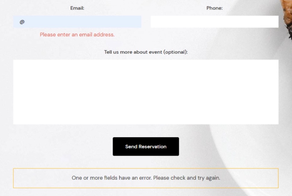
To inspect a certain element, right-click on it and select the Inspect option from the menu that appears. In the case of a Contact Form 7 form, clicking anywhere within the form will work.
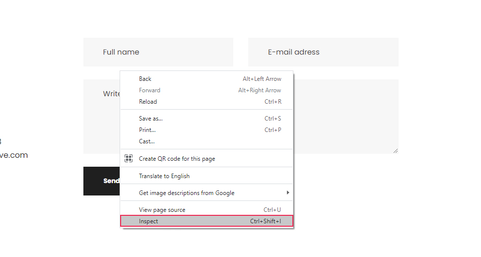
This will open your browser’s developer tools and place you within the Elements tab, where the HTML code of the element you clicked on will be highlighted. We will reference this process many times during the article, so you should get comfortable with inspecting page elements.
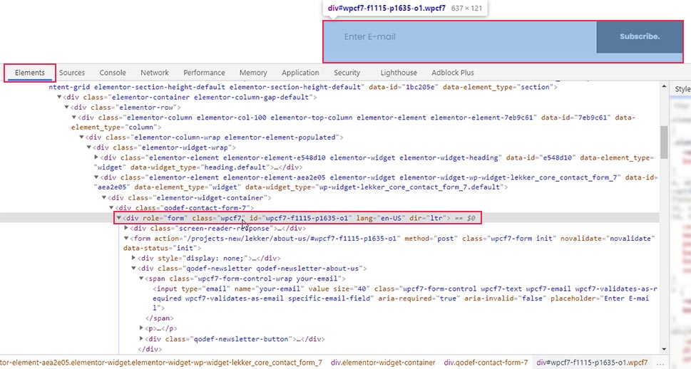
Once you’ve opened the developer tools, the first thing you should do is to look for the HTML element that corresponds to the whole form. Since Contact Form 7 forms have a well-known structure, you will be looking for an element that has the following starting HTML code:
<div role="form" class="wpcf7"
Also, when you hover over the HTML, the entire form should be highlighted.
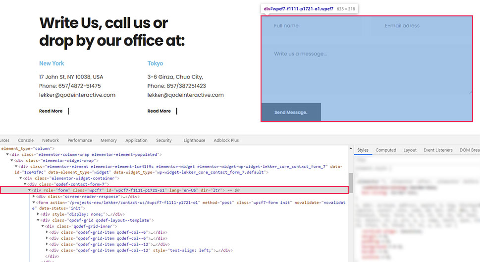
Furthermore, as you can see on the screenshot, the contact form element has a custom class and a unique ID. We will only use the class in this section and will touch on the ID later in the article. For now, we’re using the class because all Contact Form 7 forms share the wpcf7 class and, with it, we can create CSS code that will affect all your site forms in the same way.
.wpcf7 {
// CSS code goes here
}
You might recall that this is how the CSS we created for this article starts. The period used before the class name signifies that this is a CSS class selector. This means that the code that follows it will affect all of the CF7 forms on the website since they all share the same class.
In the code we created, the wpcf7 class is followed by CSS that will give your forms a background color and a padding of 30px on all sides.
.wpcf7 {
background-color: #6ec1e4;
padding: 30px;
}
Now let’s take a look at how corresponding CSS selectors for all the form fields were created.
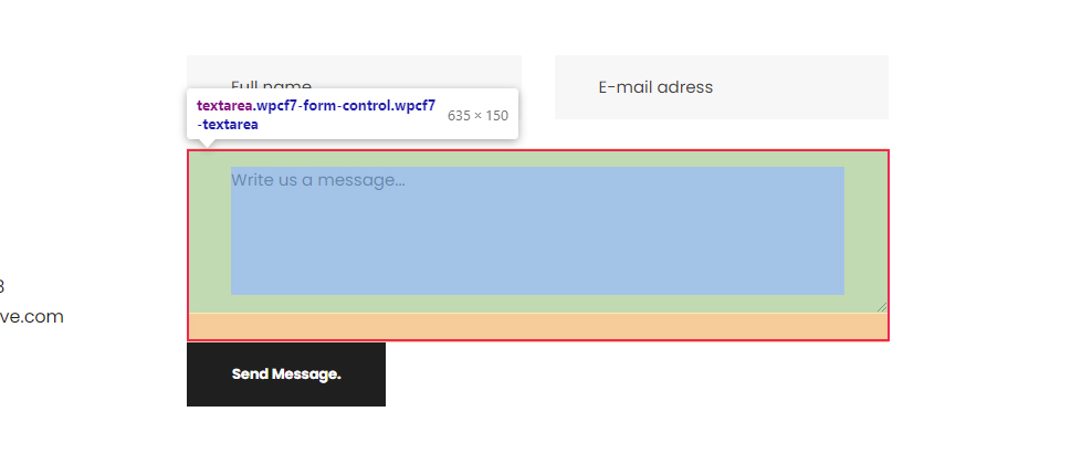
To create the CSS selector for the text field, inspect a text field as described above. In the screenshot below, you can see it is a simple textual input field.
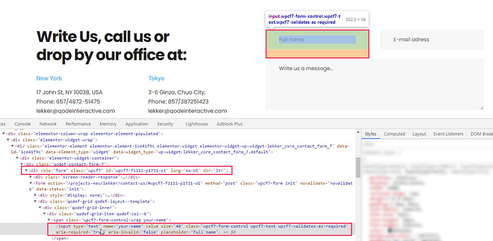
To reference it, you can use the following CSS selector – input[type=”text”]. However, this will select all textual inputs, including the ones that don’t belong to the form. To avoid that, you need to put the class selector for Contact Form 7 forms we previously mentioned before this. Meaning, you can create CSS code for textual form inputs in the following format:
.wpcf7 input[type="text"]{
// CSS rules go here
}
Similarly, you can find the equivalent pseudocode for email fields.
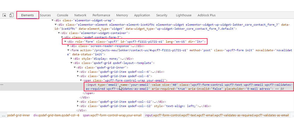
.wpcf7 input[type="email"]{
// CSS rules go here
}
As for the textual areas, they are simply referenced by their HTML element—textarea, preceded by the form class name.
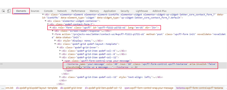
Meaning, if you want to target all CF7 form text areas, you can use the pseudocode given below.
.wpcf7 textarea{
// CSS rules go here
}
In our case, since we wanted to apply the same styles to the text and email fields, as well as the textual area, we used a compound CSS selector. This is done by using all three selectors separated by commas (.wpcf7 input[type=”text”], .wpcf7 input[type=”email”], .wpcf7 textarea). The styles that we added include setting a font size, and color for the text within the fields, as well as background color, border, and border-radius to the fields themselves making them slightly rounded on the edges.
.wpcf7 input[type="text"], .wpcf7 input[type="email"], .wpcf7 textarea {
font-size: 16px;
color: #000000e8;
background-color: #E9ECF5;
border: 1px solid #E9ECF5;
border-radius: 10px;
}
Finally, to figure out the appropriate CSS selector for the Send Message button, you need to inspect it.
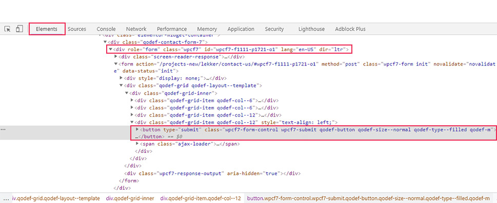
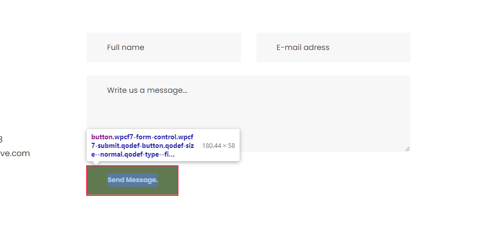
As you can see in the screenshot, this button has a custom class called wpcf7-submit, which is a Contact Form 7 specific class that you can use to reference the button. To make sure your CSS is highly specific, we advise using the form custom class—wpcf7 beforehand, as well. In that case, the pseudocode for targeting all CF7 form submit buttons could look like the following:
.wpcf7 .wpcf7-submit {
// CSS rules go here
}
In terms of the CSS we created for this article, we stylized the button to have a background and border, set the color of its text, and made it stretch across the full width of the form.
.wpcf7 .wpcf7-submit {
background-color: #E9ECF5;
border: 1px solid #E9ECF5;
color: #1f1f1f;
width: 100%;
}
With that being said, there are several other elements that can be used inside a contact form, which we chose to omit from our example. But if you decide to use them, you can create the appropriate CSS selector for all of them the same way we’ve described above.
Creating form-specific styles
In most cases, creating one type of CSS code to stylize your CF7 forms won’t be enough. Forms with different purposes will require different styles to stand out on your pages. As such, you will need to create additional CSS code for specific forms.
In this section, we will explain several tips on how to create form-specific styles. Since the hardest part in creating these styles lies in finding the appropriate CSS selectors that target specific forms or form fields, we will focus on that aspect the most.
The easiest way to create form-specific styles is to use the specific ID every form has instead of the custom class that is shared by all CF7 forms.
To find out the specific ID of a CF7 form, inspect it and navigate to the HTML element that wraps the form. The element will have the following HTML part:
<div role="form" class="wpcf7" id="form-ID-is-here"
You will find the ID within the quotation marks of the id attribute.
Then, to stylize a specific form with that ID, you will need to use the CSS code in the following format:
#form-id {
// CSS rules go here
}
For example, if we wanted to stylize the form shown on the screenshot above, we would use the following pseudocode:
#wpcf7-f1115-p1635-o1 {
// CSS rules go here
}
Furthermore, to reference the fields within that specific form, we would have to change the wpcf7 class with the wpcf7-f1115-p1635-o1 ID, as well. Meaning, if we wanted to apply the previously created CSS to this form only, then the code would look the like this:
#wpcf7-f1115-p1635-o1 {
background-color: #6ec1e4;
padding: 30px;
}
#wpcf7-f1115-p1635-o1 input[type="text"], #wpcf7-f1115-p1635-o1 input[type="email"], #wpcf7-f1115-p1635-o1 textarea {
font-size: 16px;
color: #000000e8;
background-color: #E9ECF5;
border: 1px solid #E9ECF5;
border-radius: 10px;
}
#wpcf7-f1115-p1635-o1 .wpcf7-submit {
background-color: #E9ECF5;
border: 1px solid #E9ECF5;
color: #1f1f1f;
width: 100%;
}
As we’ve mentioned before, the CSS in this article isn’t meant to be simply copy-pasted. CSS for form stylization should be created on a case-by-case basis. Also, when creating CSS for a specific form, you wouldn’t use the same CSS that is used for all other forms because that will make them identical. Generally speaking, you might use a part of the CSS from one form and edit it to fit another form. The point you need to remember is to use a form-specific ID to narrow down the scope of your CSS. Now that we clarified that, we can move on.
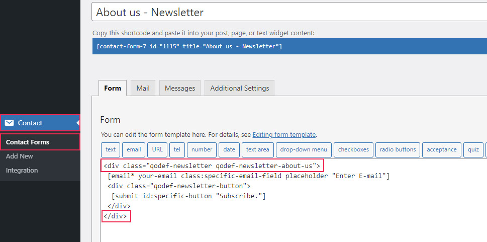
There are two other tricks you can use for creating form-specific styles. The first is to edit the HTML structure of the CF7 form by inserting the appropriate wrapping HTML elements. By adding specific classes or IDs to these HTML elements, you should find creating form-specific styles much easier.
For example, we wrapped fields of a newsletter subscription form with a div element and assigned two custom classes to it: qodef-newsletter and qodef-newsletter-about-us. You can use either of those classes (or even both) to reference that specific contact form.
To add a new custom class, you need to edit the structure of the contact form. To do so, navigate to Contact > Contact Forms, select the form you wish to edit, and wrap it with appropriate HTML elements.
You can then use the assigned classes or IDs to reference that specific form. In the example shown above, we used two custom classes, so you can choose between the following CSS selectors:
-
.qodef-newsletter
-
.qodef-newsletter-about-us
-
.qodef-newsletter.qodef-newsletter-about-us
Additionally, you can even use them in conjunction with the CF7 form class selector we previously discussed—wpcf7 or the form ID, to make them more precise. Doing this can prove useful if you have conflicting CSS that comes from your theme or plugins.
With that being said, the second trick we wanted to mention ties directly into the first one. If you look closely at the screenshot above, you can see that we wrapped the submit button with a div element and assigned a custom class to it—qodef-newsletter-button.
This goes to show that the approach mentioned above isn’t limited to forms only. You can reference specific fields within a specific form by wrapping them with appropriate HTML elements and using the assigned classes or IDs as CSS selectors. For example, to reference the submit button, you could use the following CSS selector .qodef-newsletter-button .wpcf7-submit.
The final thing we want to mention is that you can also add classes and IDs to the form fields directly instead of adding them to the wrapping HTML element. This is done by adding the class:class-name-here or id:id-name-here attributes to the form fields, with the appropriate class and ID names inserted. An example of both can be seen in the screenshot below.
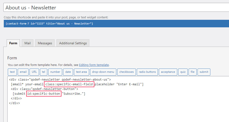
To reference those fields in your form-specific CSS, you would simply use those classes or IDs. For example, to reference the email field from the screenshot, you can use .specific-email-field as the CSS selector. To reference the submit button, you can use #specific-button as the selector.
This concludes the section on tips you can use to create a form-specific CSS selector. Now that you have a better grasp of this topic, you can style Contact Form 7 forms by applying common CSS rules to those specific selectors.
form-specific-selector {
// CSS rules go here
}
Final Thoughts
Having contact forms on your WordPress website is a crucial step in properly interacting with your visitors. However, styling those forms to seamlessly blend with your current brand is a challenge for any webmaster. This is where our article comes in—to provide you with the ideas needed to style any form. Within it, we explore how to use specific classes and IDs to target specific forms or form parts. As a practical example, we created CSS to style a Contact Form 7 form. Whether you’re using that plugin or any other contact form plugins, you will be able to use all the approaches we described to create a custom style for your form in a matter of minutes.
Do you want to customize your Contact Form 7 forms and change their style?
Contact Form 7 is one of the most popular contact form plugins for WordPress. However, the biggest downside is that the out-of-the-box forms you add are very plain-looking.
In this article, we will show you how to style contact form 7 forms in WordPress.

Why Style Your Contact Form 7 Forms?
Contact Form 7 is one of the most popular contact form plugins for WordPress. It’s free to use and lets you add a WordPress form using shortcode.
However, Contact Form 7 is very limited in features. One of the problems with Contact Form 7 is that the forms are styled plainly. Plus, the plugin doesn’t offer any built-in options to change the style of your forms.
This makes it difficult to match the contact form’s design with your website theme or if you want to edit the font and background color to make your form stand out.
If you want more customizable forms with advanced features, then we recommend WPForms, which is the most beginner-friendly contact form plugin. It comes with a drag and drop form builder, pre-built templates, and numerous customization options.
That said, let’s take a look at how to style a Contact Form 7 form in WordPress.
Getting Started with Contact Form 7
First, you’ll need to install and activate the Contact Form 7 plugin on your website. If you need help, then please see our guide on how to install a WordPress plugin.
Upon activation, you can head over to Contact » Add New from your WordPress dashboard.

You can now edit the form for your website and start by entering a title for your form.
The plugin will automatically add the form’s default name, email, subject, and message fields. However, you can also add more fields by simply dragging and dropping them where you want.
When you’re done, don’t forget to click the ‘Save’ button and copy the shortcode.

The next thing to do is add it to your blog post or page.
To do that, simply edit a post or add a new one. Once you’re in the WordPress editor, go ahead and click the ‘+’ sign at the top and then add a Shortcode block.

After that, simply enter the shortcode for your Contact Form 7 form in the shortcode block. It will look something like this:
Ошибка: Контактная форма не найдена.
Now, go ahead and publish your WordPress blog post to see the contact form in action. For the sake of this article, we have used the default contact form and added it to a WordPress page. This is how the contact form looked on our test site.

Now, are you ready to customize your Contact Form 7 form in WordPress?
Styling Contact Form 7 Forms in WordPress Using Custom CSS
Since Contact Form 7 doesn’t have built-in style options, you’ll need to use CSS to style your forms.
Contact Form 7 generates standard-compliant code for forms. Each element in the form has a proper ID and CSS class associated with it, making it easy to customize if you know CSS.
Each Contact Form 7 form uses the CSS class .wpcf7 that you can use to style your form.
In this example, we will use the custom font called Lora in our input fields and change the background color of the form.
div.wpcf7 {
background-color: #fbefde;
border: 1px solid #f28f27;
padding:20px;
}
.wpcf7 input[type="text"],
.wpcf7 input[type="email"],
.wpcf7 textarea {
background:#725f4c;
color:#FFF;
font-family:lora, sans-serif;
font-style:italic;
}
.wpcf7 input[type="submit"],
.wpcf7 input[type="button"] {
background-color:#725f4c;
width:100%;
text-align:center;
text-transform:uppercase;
}
If you need help adding the custom CSS, then please refer to our guide on how to easily add custom CSS to a WordPress site.
This is how our contact form looked after applying this CSS.

Styling Multiple Contact Form 7 Forms
If you are using multiple contact forms and want to style them differently, then you will need to use the ID generated by contact form 7 for each form. The problem with the CSS we used above is that it will be applied to all Contact Form 7 forms on your website.
To start, simply open a page containing the form you want to modify. Next, take your mouse to the first field in the form, right-click and select Inspect.
The browser screen will split, and you will see the page’s source code. In the source code, you need to locate the starting line of the form code.

As you can see in the screenshot above, our contact form code starts with the line:
<div role="form" class="wpcf7" id="wpcf7-f113-p114-o1" lang="en-US" dir="ltr">
The id attribute is a unique identifier generated by Contact Form 7 for this particular form. It is a combination of the form id and the post id where this form is added.
We will use this ID in our CSS to style our contact form and replace .wpcf7 in our first CSS snippet with #wpcf7-f113-p114-o1.
div#wpcf7-f113-p114-o1{
background-color: #fbefde;
border: 1px solid #f28f27;
padding:20px;
}
#wpcf7-f113-p114-o1 input[type="text"],
#wpcf7-f113-p114-o1 input[type="email"],
#wpcf7-f113-p114-o1 textarea {
background:#725f4c;
color:#FFF;
font-family:lora, "Open Sans", sans-serif;
font-style:italic;
}
#wpcf7-f113-p114-o1 input[type="submit"],
#wpcf7-f113-p114-o1 input[type="button"] {
background-color:#725f4c;
width:100%;
text-align:center;
text-transform:uppercase;
}
You can now repeat the step for all your forms and replace the form ID for each Contact Form 7 form you want to customize.
Styling Contact Form 7 Forms with CSS Hero
An easier way you can change the style of Contact Form 7 forms is by using CSS Hero. It lets you edit your forms without the need to write CSS.
Simply install and activate the CSS Hero plugin on your website. You can follow our guide on how to install a WordPress plugin.
Next, go to the page containing your form and click on the ‘Customize with CSS Hero’ option in the toolbar at the top.

CSS Hero will provide you with an easy user interface to edit the CSS without writing any code.
Using the plugin, you can click on any field, heading, and other elements on your form and edit the background color, font, borders, spacing, and much more.

After you’ve customized your form, simply click the ‘Save & Publish’ button at the bottom.
We hope this article helped you learn how to style Contact Form 7 forms in WordPress. You may also want to see our guide on how to create an email newsletter and the best live chat software for small businesses.
If you liked this article, then please subscribe to our YouTube Channel for WordPress video tutorials. You can also find us on Twitter and Facebook.
Disclosure: Our content is reader-supported. This means if you click on some of our links, then we may earn a commission. See how WPBeginner is funded, why it matters, and how you can support us.
Editorial Staff at WPBeginner is a team of WordPress experts led by Syed Balkhi. We have been creating WordPress tutorials since 2009, and WPBeginner has become the largest free WordPress resource site in the industry.