On windows 8 or 10 this is proper WPF way without redesign the Combobox and 100% customizable.
Just copy paste and test! 
Click here to see how look the ComboBox
  <Window
    xmlns="http://schemas.microsoft.com/winfx/2006/xaml/presentation"
    xmlns:x="http://schemas.microsoft.com/winfx/2006/xaml"
    xmlns:d="http://schemas.microsoft.com/expression/blend/2008"
    xmlns:mc="http://schemas.openxmlformats.org/markup-compatibility/2006"
    xmlns:local="clr-namespace:Test_Combo_Custom"
    xmlns:Themes="clr-namespace:Microsoft.Windows.Themes;assembly=PresentationFramework.Aero2" x:Class="Test_Combo_Custom.MainWindow"
    mc:Ignorable="d"
    Title="MainWindow" Height="450" Width="800">


<Window.Resources>
    <Style x:Key="FocusVisual">
        <Setter Property="Control.Template">
            <Setter.Value>
                <ControlTemplate>
                    <Rectangle Margin="2" SnapsToDevicePixels="true" Stroke="{DynamicResource {x:Static SystemColors.ControlTextBrushKey}}" StrokeThickness="1" StrokeDashArray="1 2"/>
                </ControlTemplate>
            </Setter.Value>
        </Setter>
    </Style>
    <SolidColorBrush x:Key="ComboBox.Static.Background" Color="Yellow"/>
    <SolidColorBrush x:Key="ComboBox.MouseOver.Background" Color="#FFFF0C00"/>
    <SolidColorBrush x:Key="ComboBox.Static.Border" Color="#FFACACAC"/>
    <SolidColorBrush x:Key="ComboBox.Static.Editable.Background" Color="#FFFB0F0F"/>
    <SolidColorBrush x:Key="ComboBox.Static.Editable.Border" Color="#FFABADB3"/>
    <SolidColorBrush x:Key="ComboBox.Static.Editable.Button.Background" Color="Transparent"/>
    <SolidColorBrush x:Key="ComboBox.Static.Editable.Button.Border" Color="Transparent"/>
    <SolidColorBrush x:Key="ComboBox.MouseOver.Glyph" Color="#FF000000"/>
    <SolidColorBrush x:Key="ComboBox.MouseOver.Border" Color="#FF7EB4EA"/>
    <SolidColorBrush x:Key="ComboBox.MouseOver.Editable.Background" Color="#FF88E00A"/>
    <SolidColorBrush x:Key="ComboBox.MouseOver.Editable.Border" Color="#FF7EB4EA"/>
    <SolidColorBrush x:Key="ComboBox.MouseOver.Editable.Button.Background" Color="#FF7EB4EA"/>
    <SolidColorBrush x:Key="ComboBox.MouseOver.Editable.Button.Border" Color="#FF7EB4EA"/>
    <SolidColorBrush x:Key="ComboBox.Pressed.Glyph" Color="#FF000000"/>
    <SolidColorBrush x:Key="ComboBox.Pressed.Background" Color="#FF000000"/>
    <SolidColorBrush x:Key="ComboBox.Pressed.Border" Color="#FF569DE5"/>
    <SolidColorBrush x:Key="ComboBox.Pressed.Editable.Background" Color="#FF00FFC5"/>
    <SolidColorBrush x:Key="ComboBox.Pressed.Editable.Border" Color="#FF569DE5"/>
    <SolidColorBrush x:Key="ComboBox.Pressed.Editable.Button.Background" Color="#FF569DE5"/>
    <SolidColorBrush x:Key="ComboBox.Pressed.Editable.Button.Border" Color="#FF569DE5"/>
    <SolidColorBrush x:Key="ComboBox.Disabled.Glyph" Color="#FFBFBFBF"/>
    <SolidColorBrush x:Key="ComboBox.Disabled.Background" Color="#FF101AEC"/>
    <SolidColorBrush x:Key="ComboBox.Disabled.Border" Color="#FFD9D9D9"/>
    <SolidColorBrush x:Key="ComboBox.Disabled.Editable.Background" Color="#FFC91355"/>
    <SolidColorBrush x:Key="ComboBox.Disabled.Editable.Border" Color="#FFBFBFBF"/>
    <SolidColorBrush x:Key="ComboBox.Disabled.Editable.Button.Background" Color="Transparent"/>
    <SolidColorBrush x:Key="ComboBox.Disabled.Editable.Button.Border" Color="Transparent"/>
    <SolidColorBrush x:Key="ComboBox.Static.Glyph" Color="#FF606060"/>


    <Style x:Key="ComboBoxToggleButton2" TargetType="{x:Type ToggleButton}">
        <Setter Property="OverridesDefaultStyle" Value="true"/>
        <Setter Property="IsTabStop" Value="false"/>
        <Setter Property="Focusable" Value="false"/>
        <Setter Property="ClickMode" Value="Press"/>
        <Setter Property="Template">
            <Setter.Value>
                <ControlTemplate TargetType="{x:Type ToggleButton}">
                    <Border x:Name="templateRoot" BorderBrush="{StaticResource ComboBox.Static.Border}" BorderThickness="{TemplateBinding BorderThickness}" Background="{StaticResource ComboBox.Static.Background}" SnapsToDevicePixels="true">
                        <Border x:Name="splitBorder" BorderBrush="Transparent" BorderThickness="1" HorizontalAlignment="Right" Margin="0" SnapsToDevicePixels="true" Width="{DynamicResource {x:Static SystemParameters.VerticalScrollBarWidthKey}}">
                            <Path x:Name="arrow" Data="F1 M 0,0 L 2.667,2.66665 L 5.3334,0 L 5.3334,-1.78168 L 2.6667,0.88501 L0,-1.78168 L0,0 Z" Fill="{StaticResource ComboBox.Static.Glyph}" HorizontalAlignment="Center" Margin="0" VerticalAlignment="Center"/>
                        </Border>
                    </Border>
                    <ControlTemplate.Triggers>
                        <MultiDataTrigger>
                            <MultiDataTrigger.Conditions>
                                <Condition Binding="{Binding IsEditable, RelativeSource={RelativeSource AncestorType={x:Type ComboBox}}}" Value="true"/>
                                <Condition Binding="{Binding IsMouseOver, RelativeSource={RelativeSource Self}}" Value="false"/>
                                <Condition Binding="{Binding IsPressed, RelativeSource={RelativeSource Self}}" Value="false"/>
                                <Condition Binding="{Binding IsEnabled, RelativeSource={RelativeSource Self}}" Value="true"/>
                            </MultiDataTrigger.Conditions>
                            <Setter Property="Background" TargetName="templateRoot" Value="{StaticResource ComboBox.Static.Editable.Background}"/>
                            <Setter Property="BorderBrush" TargetName="templateRoot" Value="{StaticResource ComboBox.Static.Editable.Border}"/>
                            <Setter Property="Background" TargetName="splitBorder" Value="{StaticResource ComboBox.Static.Editable.Button.Background}"/>
                            <Setter Property="BorderBrush" TargetName="splitBorder" Value="{StaticResource ComboBox.Static.Editable.Button.Border}"/>
                        </MultiDataTrigger>
                        <Trigger Property="IsMouseOver" Value="true">
                            <Setter Property="Fill" TargetName="arrow" Value="{StaticResource ComboBox.MouseOver.Glyph}"/>
                        </Trigger>
                        <MultiDataTrigger>
                            <MultiDataTrigger.Conditions>
                                <Condition Binding="{Binding IsMouseOver, RelativeSource={RelativeSource Self}}" Value="true"/>
                                <Condition Binding="{Binding IsEditable, RelativeSource={RelativeSource AncestorType={x:Type ComboBox}}}" Value="false"/>
                            </MultiDataTrigger.Conditions>
                            <Setter Property="Background" TargetName="templateRoot" Value="{StaticResource ComboBox.MouseOver.Background}"/>
                            <Setter Property="BorderBrush" TargetName="templateRoot" Value="{StaticResource ComboBox.MouseOver.Border}"/>
                        </MultiDataTrigger>
                        <MultiDataTrigger>
                            <MultiDataTrigger.Conditions>
                                <Condition Binding="{Binding IsMouseOver, RelativeSource={RelativeSource Self}}" Value="true"/>
                                <Condition Binding="{Binding IsEditable, RelativeSource={RelativeSource AncestorType={x:Type ComboBox}}}" Value="true"/>
                            </MultiDataTrigger.Conditions>
                            <Setter Property="Background" TargetName="templateRoot" Value="{StaticResource ComboBox.MouseOver.Editable.Background}"/>
                            <Setter Property="BorderBrush" TargetName="templateRoot" Value="{StaticResource ComboBox.MouseOver.Editable.Border}"/>
                            <Setter Property="Background" TargetName="splitBorder" Value="{StaticResource ComboBox.MouseOver.Editable.Button.Background}"/>
                            <Setter Property="BorderBrush" TargetName="splitBorder" Value="{StaticResource ComboBox.MouseOver.Editable.Button.Border}"/>
                        </MultiDataTrigger>
                        <Trigger Property="IsPressed" Value="true">
                            <Setter Property="Fill" TargetName="arrow" Value="{StaticResource ComboBox.Pressed.Glyph}"/>
                        </Trigger>
                        <MultiDataTrigger>
                            <MultiDataTrigger.Conditions>
                                <Condition Binding="{Binding IsPressed, RelativeSource={RelativeSource Self}}" Value="true"/>
                                <Condition Binding="{Binding IsEditable, RelativeSource={RelativeSource AncestorType={x:Type ComboBox}}}" Value="false"/>
                            </MultiDataTrigger.Conditions>
                            <Setter Property="Background" TargetName="templateRoot" Value="{StaticResource ComboBox.Pressed.Background}"/>
                            <Setter Property="BorderBrush" TargetName="templateRoot" Value="{StaticResource ComboBox.Pressed.Border}"/>
                        </MultiDataTrigger>
                        <MultiDataTrigger>
                            <MultiDataTrigger.Conditions>
                                <Condition Binding="{Binding IsPressed, RelativeSource={RelativeSource Self}}" Value="true"/>
                                <Condition Binding="{Binding IsEditable, RelativeSource={RelativeSource AncestorType={x:Type ComboBox}}}" Value="true"/>
                            </MultiDataTrigger.Conditions>
                            <Setter Property="Background" TargetName="templateRoot" Value="{StaticResource ComboBox.Pressed.Editable.Background}"/>
                            <Setter Property="BorderBrush" TargetName="templateRoot" Value="{StaticResource ComboBox.Pressed.Editable.Border}"/>
                            <Setter Property="Background" TargetName="splitBorder" Value="{StaticResource ComboBox.Pressed.Editable.Button.Background}"/>
                            <Setter Property="BorderBrush" TargetName="splitBorder" Value="{StaticResource ComboBox.Pressed.Editable.Button.Border}"/>
                        </MultiDataTrigger>
                        <Trigger Property="IsEnabled" Value="false">
                            <Setter Property="Fill" TargetName="arrow" Value="{StaticResource ComboBox.Disabled.Glyph}"/>
                        </Trigger>
                        <MultiDataTrigger>
                            <MultiDataTrigger.Conditions>
                                <Condition Binding="{Binding IsEnabled, RelativeSource={RelativeSource Self}}" Value="false"/>
                                <Condition Binding="{Binding IsEditable, RelativeSource={RelativeSource AncestorType={x:Type ComboBox}}}" Value="false"/>
                            </MultiDataTrigger.Conditions>
                            <Setter Property="Background" TargetName="templateRoot" Value="{StaticResource ComboBox.Disabled.Background}"/>
                            <Setter Property="BorderBrush" TargetName="templateRoot" Value="{StaticResource ComboBox.Disabled.Border}"/>
                        </MultiDataTrigger>
                        <MultiDataTrigger>
                            <MultiDataTrigger.Conditions>
                                <Condition Binding="{Binding IsEnabled, RelativeSource={RelativeSource Self}}" Value="false"/>
                                <Condition Binding="{Binding IsEditable, RelativeSource={RelativeSource AncestorType={x:Type ComboBox}}}" Value="true"/>
                            </MultiDataTrigger.Conditions>
                            <Setter Property="Background" TargetName="templateRoot" Value="{StaticResource ComboBox.Disabled.Editable.Background}"/>
                            <Setter Property="BorderBrush" TargetName="templateRoot" Value="{StaticResource ComboBox.Disabled.Editable.Border}"/>
                            <Setter Property="Background" TargetName="splitBorder" Value="{StaticResource ComboBox.Disabled.Editable.Button.Background}"/>
                            <Setter Property="BorderBrush" TargetName="splitBorder" Value="{StaticResource ComboBox.Disabled.Editable.Button.Border}"/>
                        </MultiDataTrigger>
                    </ControlTemplate.Triggers>
                </ControlTemplate>
            </Setter.Value>
        </Setter>
    </Style>
    <ControlTemplate x:Key="ComboBoxTemplate" TargetType="{x:Type ComboBox}">
        <Grid x:Name="templateRoot" SnapsToDevicePixels="true">
            <Grid.ColumnDefinitions>
                <ColumnDefinition Width="*"/>
                <ColumnDefinition MinWidth="{DynamicResource {x:Static SystemParameters.VerticalScrollBarWidthKey}}" Width="0"/>
            </Grid.ColumnDefinitions>
            <Popup x:Name="PART_Popup" AllowsTransparency="true" Grid.ColumnSpan="2" IsOpen="{Binding IsDropDownOpen, Mode=TwoWay, RelativeSource={RelativeSource TemplatedParent}}" Margin="1" PopupAnimation="{DynamicResource {x:Static SystemParameters.ComboBoxPopupAnimationKey}}" Placement="Bottom">
                <Themes:SystemDropShadowChrome x:Name="shadow" Color="Transparent" MaxHeight="{TemplateBinding MaxDropDownHeight}" MinWidth="{Binding ActualWidth, ElementName=templateRoot}">
                    <Border x:Name="dropDownBorder" BorderBrush="{DynamicResource {x:Static SystemColors.WindowFrameBrushKey}}" BorderThickness="1" Background="{DynamicResource {x:Static SystemColors.WindowBrushKey}}">
                        <ScrollViewer x:Name="DropDownScrollViewer">
                            <Grid x:Name="grid" RenderOptions.ClearTypeHint="Enabled">
                                <Canvas x:Name="canvas" HorizontalAlignment="Left" Height="0" VerticalAlignment="Top" Width="0">
                                    <Rectangle x:Name="opaqueRect" Fill="{Binding Background, ElementName=dropDownBorder}" Height="{Binding ActualHeight, ElementName=dropDownBorder}" Width="{Binding ActualWidth, ElementName=dropDownBorder}"/>
                                </Canvas>
                                <ItemsPresenter x:Name="ItemsPresenter" KeyboardNavigation.DirectionalNavigation="Contained" SnapsToDevicePixels="{TemplateBinding SnapsToDevicePixels}"/>
                            </Grid>
                        </ScrollViewer>
                    </Border>
                </Themes:SystemDropShadowChrome>
            </Popup>
            <ToggleButton x:Name="toggleButton" BorderBrush="{TemplateBinding BorderBrush}" BorderThickness="{TemplateBinding BorderThickness}" Background="{TemplateBinding Background}" Grid.ColumnSpan="2" IsChecked="{Binding IsDropDownOpen, Mode=TwoWay, RelativeSource={RelativeSource TemplatedParent}}" Style="{StaticResource ComboBoxToggleButton2}"/>
            <ContentPresenter x:Name="contentPresenter" ContentTemplate="{TemplateBinding SelectionBoxItemTemplate}" ContentTemplateSelector="{TemplateBinding ItemTemplateSelector}" Content="{TemplateBinding SelectionBoxItem}" ContentStringFormat="{TemplateBinding SelectionBoxItemStringFormat}" HorizontalAlignment="{TemplateBinding HorizontalContentAlignment}" IsHitTestVisible="false" Margin="{TemplateBinding Padding}" SnapsToDevicePixels="{TemplateBinding SnapsToDevicePixels}" VerticalAlignment="{TemplateBinding VerticalContentAlignment}"/>
        </Grid>
        <ControlTemplate.Triggers>
            <Trigger Property="HasDropShadow" SourceName="PART_Popup" Value="true">
                <Setter Property="Margin" TargetName="shadow" Value="0,0,5,5"/>
                <Setter Property="Color" TargetName="shadow" Value="#71000000"/>
            </Trigger>
            <Trigger Property="HasItems" Value="false">
                <Setter Property="Height" TargetName="dropDownBorder" Value="95"/>
            </Trigger>
            <MultiTrigger>
                <MultiTrigger.Conditions>
                    <Condition Property="IsGrouping" Value="true"/>
                    <Condition Property="VirtualizingPanel.IsVirtualizingWhenGrouping" Value="false"/>
                </MultiTrigger.Conditions>
                <Setter Property="ScrollViewer.CanContentScroll" Value="false"/>
            </MultiTrigger>
            <Trigger Property="ScrollViewer.CanContentScroll" SourceName="DropDownScrollViewer" Value="false">
                <Setter Property="Canvas.Top" TargetName="opaqueRect" Value="{Binding VerticalOffset, ElementName=DropDownScrollViewer}"/>
                <Setter Property="Canvas.Left" TargetName="opaqueRect" Value="{Binding HorizontalOffset, ElementName=DropDownScrollViewer}"/>
            </Trigger>
        </ControlTemplate.Triggers>
    </ControlTemplate>
    <SolidColorBrush x:Key="TextBox.Static.Background" Color="#FFFFFFFF"/>
    <Style x:Key="ComboBoxEditableTextBox" TargetType="{x:Type TextBox}">
        <Setter Property="OverridesDefaultStyle" Value="true"/>
        <Setter Property="AllowDrop" Value="true"/>
        <Setter Property="MinWidth" Value="0"/>
        <Setter Property="MinHeight" Value="0"/>
        <Setter Property="FocusVisualStyle" Value="{x:Null}"/>
        <Setter Property="ScrollViewer.PanningMode" Value="VerticalFirst"/>
        <Setter Property="Stylus.IsFlicksEnabled" Value="False"/>
        <Setter Property="Template">
            <Setter.Value>
                <ControlTemplate TargetType="{x:Type TextBox}">
                    <ScrollViewer x:Name="PART_ContentHost" Background="Transparent" Focusable="false" HorizontalScrollBarVisibility="Hidden" VerticalScrollBarVisibility="Hidden"/>
                </ControlTemplate>
            </Setter.Value>
        </Setter>
    </Style>
    <ControlTemplate x:Key="ComboBoxEditableTemplate" TargetType="{x:Type ComboBox}">
        <Grid x:Name="templateRoot" SnapsToDevicePixels="true">
            <Grid.ColumnDefinitions>
                <ColumnDefinition Width="*"/>
                <ColumnDefinition MinWidth="{DynamicResource {x:Static SystemParameters.VerticalScrollBarWidthKey}}" Width="0"/>
            </Grid.ColumnDefinitions>
            <Popup x:Name="PART_Popup" AllowsTransparency="true" Grid.ColumnSpan="2" IsOpen="{Binding IsDropDownOpen, RelativeSource={RelativeSource TemplatedParent}}" PopupAnimation="{DynamicResource {x:Static SystemParameters.ComboBoxPopupAnimationKey}}" Placement="Bottom">
                <Themes:SystemDropShadowChrome x:Name="shadow" Color="Transparent" MaxHeight="{TemplateBinding MaxDropDownHeight}" MinWidth="{Binding ActualWidth, ElementName=templateRoot}">
                    <Border x:Name="dropDownBorder" BorderBrush="{DynamicResource {x:Static SystemColors.WindowFrameBrushKey}}" BorderThickness="1" Background="{DynamicResource {x:Static SystemColors.WindowBrushKey}}">
                        <ScrollViewer x:Name="DropDownScrollViewer">
                            <Grid x:Name="grid" RenderOptions.ClearTypeHint="Enabled">
                                <Canvas x:Name="canvas" HorizontalAlignment="Left" Height="0" VerticalAlignment="Top" Width="0">
                                    <Rectangle x:Name="opaqueRect" Fill="{Binding Background, ElementName=dropDownBorder}" Height="{Binding ActualHeight, ElementName=dropDownBorder}" Width="{Binding ActualWidth, ElementName=dropDownBorder}"/>
                                </Canvas>
                                <ItemsPresenter x:Name="ItemsPresenter" KeyboardNavigation.DirectionalNavigation="Contained" SnapsToDevicePixels="{TemplateBinding SnapsToDevicePixels}"/>
                            </Grid>
                        </ScrollViewer>
                    </Border>
                </Themes:SystemDropShadowChrome>
            </Popup>
            <ToggleButton x:Name="toggleButton" BorderBrush="{TemplateBinding BorderBrush}" BorderThickness="{TemplateBinding BorderThickness}" Background="{TemplateBinding Background}" Grid.ColumnSpan="2" IsChecked="{Binding IsDropDownOpen, Mode=TwoWay, RelativeSource={RelativeSource TemplatedParent}}" Style="{StaticResource ComboBoxToggleButton2}"/>
            <Border x:Name="border" Background="{StaticResource TextBox.Static.Background}" Margin="{TemplateBinding BorderThickness}">
                <TextBox x:Name="PART_EditableTextBox" HorizontalContentAlignment="{TemplateBinding HorizontalContentAlignment}" IsReadOnly="{Binding IsReadOnly, RelativeSource={RelativeSource TemplatedParent}}" Margin="{TemplateBinding Padding}" Style="{StaticResource ComboBoxEditableTextBox}" VerticalContentAlignment="{TemplateBinding VerticalContentAlignment}"/>
            </Border>
        </Grid>
        <ControlTemplate.Triggers>
            <Trigger Property="IsEnabled" Value="false">
                <Setter Property="Opacity" TargetName="border" Value="0.56"/>
            </Trigger>
            <Trigger Property="IsKeyboardFocusWithin" Value="true">
                <Setter Property="Foreground" Value="Black"/>
            </Trigger>
            <Trigger Property="HasDropShadow" SourceName="PART_Popup" Value="true">
                <Setter Property="Margin" TargetName="shadow" Value="0,0,5,5"/>
                <Setter Property="Color" TargetName="shadow" Value="#71000000"/>
            </Trigger>
            <Trigger Property="HasItems" Value="false">
                <Setter Property="Height" TargetName="dropDownBorder" Value="95"/>
            </Trigger>
            <MultiTrigger>
                <MultiTrigger.Conditions>
                    <Condition Property="IsGrouping" Value="true"/>
                    <Condition Property="VirtualizingPanel.IsVirtualizingWhenGrouping" Value="false"/>
                </MultiTrigger.Conditions>
                <Setter Property="ScrollViewer.CanContentScroll" Value="false"/>
            </MultiTrigger>
            <Trigger Property="ScrollViewer.CanContentScroll" SourceName="DropDownScrollViewer" Value="false">
                <Setter Property="Canvas.Top" TargetName="opaqueRect" Value="{Binding VerticalOffset, ElementName=DropDownScrollViewer}"/>
                <Setter Property="Canvas.Left" TargetName="opaqueRect" Value="{Binding HorizontalOffset, ElementName=DropDownScrollViewer}"/>
            </Trigger>
        </ControlTemplate.Triggers>
    </ControlTemplate>
    <Style x:Key="ComboBoxStyleCustom" TargetType="{x:Type ComboBox}">
        <Setter Property="FocusVisualStyle" Value="{StaticResource FocusVisual}"/>
        <Setter Property="Background" Value="{StaticResource ComboBox.Static.Background}"/>
        <Setter Property="BorderBrush" Value="{StaticResource ComboBox.Static.Border}"/>
        <Setter Property="Foreground" Value="{DynamicResource {x:Static SystemColors.WindowTextBrushKey}}"/>
        <Setter Property="BorderThickness" Value="1"/>
        <Setter Property="ScrollViewer.HorizontalScrollBarVisibility" Value="Auto"/>
        <Setter Property="ScrollViewer.VerticalScrollBarVisibility" Value="Auto"/>
        <Setter Property="Padding" Value="6,3,5,3"/>
        <Setter Property="ScrollViewer.CanContentScroll" Value="true"/>
        <Setter Property="ScrollViewer.PanningMode" Value="Both"/>
        <Setter Property="Stylus.IsFlicksEnabled" Value="False"/>
        <Setter Property="Template" Value="{StaticResource ComboBoxTemplate}"/>
        <Style.Triggers>
            <Trigger Property="IsEditable" Value="true">
                <Setter Property="IsTabStop" Value="false"/>
                <Setter Property="Padding" Value="2"/>
                <Setter Property="Template" Value="{StaticResource ComboBoxEditableTemplate}"/>
            </Trigger>
        </Style.Triggers>
    </Style>
</Window.Resources>


<Grid>
    <ComboBox HorizontalAlignment="Left" Margin="317.429,194.428,0,0" VerticalAlignment="Top" Width="120" Style="{DynamicResource ComboBoxStyleCustom}">
        <ComboBox.Resources>
            <!-- color of ComboBoxItem -->
            <SolidColorBrush x:Key="{x:Static SystemColors.WindowBrushKey}" Color="#FF17FF00" />
        </ComboBox.Resources>
        <ComboBoxItem>One</ComboBoxItem>
        <ComboBoxItem>Two</ComboBoxItem>
        <ComboBoxItem>Three</ComboBoxItem>
    </ComboBox>

</Grid>
</Window>
You don’t have to change the FlatStyle to Popup or Flat to make this work. And you probably don’t want to do that in the first place, because those styles tend to look really ugly when compared to the rest of your application’s interface. Native Windows controls use a 3D-style appearance; the Flat and Popup styles are designed for Web or Windows Mobile applications, where they are a better fit.
I assume that you’re asking this question because you have already written code to change the foreground color of the text displayed in the combobox, but have noticed that it isn’t working under Windows Vista or later. That’s because when the DropDownList style of combobox changed to look more like a button in those versions of Windows, it also lost support for custom text color. Instead, the selected text is always displayed in the standard «Window Text» color. Compare the DropDownList style to the regular DropDown style combobox:

Visually, the two comboboxes look the same in earlier versions of Windows, but not under Vista and later. The key to getting your custom foreground color to appear is changing the DropDownStyle property of your combobox control to DropDown (which is actually the default).
I also like to set the FlatStyle property to System so that you get all the nifty fade-in and fade-out effects offered by the native Windows controls. The Standard style attempts to emulate those effects in managed code, but it just doesn’t have quite the right feel. I care about the little things.
Then you can use the following code (as originally suggested in Adrian’s answer):
public Form1()
{
   InitializeComponent();

   // Set custom combobox styles
   comboBox1.DropDownStyle = ComboBoxStyle.DropDown;
   comboBox1.FlatStyle = FlatStyle.System;

   // Attach relevant event handler methods
   comboBox1.DropDown += new EventHandler(comboBox1_DropDown);
   comboBox1.DropDownClosed += new EventHandler(comboBox1_DropDownClosed);
}

void comboBox1_DropDown(object sender, EventArgs e)
{
   // Optionally, revert the color back to the default
   // when the combobox is dropped-down
   //
   // (Note that we're using the ACTUAL default color here,
   //  rather than hard-coding black)
   comboBox1.ForeColor = SystemColors.WindowText;
}

void comboBox1_DropDownClosed(object sender, EventArgs e)
{
   // Change the color of the selected text in the combobox
   // to your custom color
   comboBox1.ForeColor = Color.Red;
}
To produce the following effect:

You don’t have to change the FlatStyle to Popup or Flat to make this work. And you probably don’t want to do that in the first place, because those styles tend to look really ugly when compared to the rest of your application’s interface. Native Windows controls use a 3D-style appearance; the Flat and Popup styles are designed for Web or Windows Mobile applications, where they are a better fit.
I assume that you’re asking this question because you have already written code to change the foreground color of the text displayed in the combobox, but have noticed that it isn’t working under Windows Vista or later. That’s because when the DropDownList style of combobox changed to look more like a button in those versions of Windows, it also lost support for custom text color. Instead, the selected text is always displayed in the standard «Window Text» color. Compare the DropDownList style to the regular DropDown style combobox:
Visually, the two comboboxes look the same in earlier versions of Windows, but not under Vista and later. The key to getting your custom foreground color to appear is changing the DropDownStyle property of your combobox control to DropDown (which is actually the default).
I also like to set the FlatStyle property to System so that you get all the nifty fade-in and fade-out effects offered by the native Windows controls. The Standard style attempts to emulate those effects in managed code, but it just doesn’t have quite the right feel. I care about the little things.
Then you can use the following code (as originally suggested in Adrian’s answer):
public Form1()
{
   InitializeComponent();

   // Set custom combobox styles
   comboBox1.DropDownStyle = ComboBoxStyle.DropDown;
   comboBox1.FlatStyle = FlatStyle.System;

   // Attach relevant event handler methods
   comboBox1.DropDown += new EventHandler(comboBox1_DropDown);
   comboBox1.DropDownClosed += new EventHandler(comboBox1_DropDownClosed);
}

void comboBox1_DropDown(object sender, EventArgs e)
{
   // Optionally, revert the color back to the default
   // when the combobox is dropped-down
   //
   // (Note that we're using the ACTUAL default color here,
   //  rather than hard-coding black)
   comboBox1.ForeColor = SystemColors.WindowText;
}

void comboBox1_DropDownClosed(object sender, EventArgs e)
{
   // Change the color of the selected text in the combobox
   // to your custom color
   comboBox1.ForeColor = Color.Red;
}
To produce the following effect:
|
Tiger 4 / 4 / 2 Регистрация: 07.10.2015 Сообщений: 43 |
||||
|
1 |
||||
|
05.09.2017, 20:04. Показов 19323. Ответов 8 Метки нет (Все метки)
Доброго времени суток!
Combobox items изменяются без проблем — а вот сам комбобокс все равно белый.
__________________
0 |

|
4 / 4 / 2 Регистрация: 07.10.2015 Сообщений: 43 |
|
|
07.09.2017, 23:42 [ТС] |
2 |
|
Вопрос все еще актуальный… Пока решил только через свой user control. Но это мне кажется слишком сложное решение, для такой, казалось бы простой задачки. Из пушки по воробьям.. Может есть все таки кто сможет подсказать вариант попроще?
0 |
|
64 / 65 / 44 Регистрация: 05.12.2014 Сообщений: 475 |
|
|
07.09.2017, 23:55 |
3 |
|
Я взял ваш XAML код, поменял привязки под свой класс для теста и у меня такой проблемы нет — цвет нормально меняется везде. Может вы где-то переопределили дефолтный стиль комбо-бокса?
0 |
|
4 / 4 / 2 Регистрация: 07.10.2015 Сообщений: 43 |
|
|
07.09.2017, 23:56 [ТС] |
4 |
|
Jotun можно скрин? и ваш xaml код. Что-то я не так делаю.. может смогу понять.. (найти отличия
0 |
") )
)|
64 / 65 / 44 Регистрация: 05.12.2014 Сообщений: 475 |
|
|
07.09.2017, 23:57 |
5 |
|
тогда подождите я уже стёр
0 |
|
Jotun 64 / 65 / 44 Регистрация: 05.12.2014 Сообщений: 475 |
||||||||
|
08.09.2017, 00:13 |
6 |
|||||||
я ничего не привязывал к свойству Text — может поэтому… Миниатюры
0 |
|
4 / 4 / 2 Регистрация: 07.10.2015 Сообщений: 43 |
|
|
08.09.2017, 00:28 [ТС] |
7 |
|
Вот уже перенес в отдельный проект — все равно белый фон ( Это может быть что-то с моим стандартным шаблоном комбо бокса?
0 |
|
Tiger 4 / 4 / 2 Регистрация: 07.10.2015 Сообщений: 43 |
||||
|
11.09.2017, 20:41 [ТС] |
8 |
|||
|
Решил задачу путем переобределения стилий комбобокса, может кому пригодится:
1 |
|
Tiger 4 / 4 / 2 Регистрация: 07.10.2015 Сообщений: 43 |
||||
|
11.09.2017, 20:42 [ТС] |
9 |
|||
Все один стиль, не поместилось в одно сообщение
1 |
Improve Article
Save Article
Improve Article
Save Article
In Windows forms, ComboBox provides two different features in a single control, it means ComboBox works as both TextBox and ListBox. In ComboBox, only one item is displayed at a time and the rest of the items are present in the drop-down menu. You are allowed to set the foreground color of the ComboBox by using the ForeColor Property. It gives a more attractive look to your ComboBox control. You can set this property using two different methods:
1. Design-Time: It is the easiest method to set the foreground color of the ComboBox control using the following steps:
- Step 1: Create a windows form as shown in the below image:
Visual Studio -> File -> New -> Project -> WindowsFormApp
- Step 2: Drag the ComboBox control from the ToolBox and drop it on the windows form. You are allowed to place a ComboBox control anywhere on the windows form according to your need.
- Step 3: After drag and drop you will go to the properties of the ComboBox control to set the foreground color of the ComboBox.
Output:


2. Run-Time: It is a little bit trickier than the above method. In this method, you can set the foreground color of the ComboBox programmatically with the help of given syntax:
public override System.Drawing.Color ForeColor { get; set; }
Here, Color indicates the foreground color of the ComboBox. Following steps are used to set the foreground color of the ComboBox:
- Step 1: Create a combobox using the ComboBox() constructor is provided by the ComboBox class.
// Creating ComboBox using ComboBox class
ComboBox mybox = new ComboBox();
- Step 2: After creating ComboBox, set the foreground color of the ComboBox.
// Set the foreground color of the ComboBox
mybox.ForeColor = Color.DeepPink;
- Step 3: And last add this combobox control to form using Add() method.
// Add this ComboBox to form
this.Controls.Add(mybox);
Example:
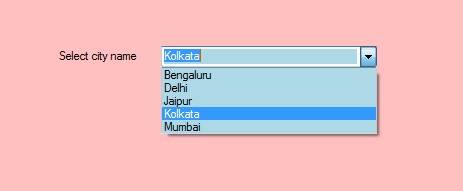
usingSystem;usingSystem.Collections.Generic;usingSystem.ComponentModel;usingSystem.Data;usingSystem.Drawing;usingSystem.Linq;usingSystem.Text;usingSystem.Threading.Tasks;usingSystem.Windows.Forms;namespaceWindowsFormsApp11 {publicpartialclassForm1 : Form {publicForm1(){InitializeComponent();}privatevoidForm1_Load(objectsender, EventArgs e){Label l =newLabel();l.Location =newPoint(222, 80);l.Size =newSize(99, 18);l.Text ="Select city name";this.Controls.Add(l);ComboBox mybox =newComboBox();mybox.Location =newPoint(327, 77);mybox.Size =newSize(216, 26);mybox.Sorted =true;mybox.BackColor = Color.LightBlue;mybox.ForeColor = Color.DeepPink;mybox.Name ="My_Cobo_Box";mybox.Items.Add("Mumbai");mybox.Items.Add("Delhi");mybox.Items.Add("Jaipur");mybox.Items.Add("Kolkata");mybox.Items.Add("Bengaluru");this.Controls.Add(mybox);}}}Output:

Hello,
I’ve took a lot of time to implement this, we can use a DataTrigger with MultiConverter:
In MainWindow, we can choose a Department, click the button, the value will be passed to DetailWindow:
<ComboBox Margin="5" Name="cmbDep" VerticalAlignment="Top" Width="100" Height="25" ItemsSource="{Binding}" />
<Button Content="Open Detail" Height="40" Width="100" Click="Button_Click" />
public MainWindow()
{
            InitializeComponent();

            List<string> data= new List<string>() { "AAA", "BBB", "CCC", "DDD" };
            this.cmbDep.DataContext = data;
}

private void Button_Click(object sender, RoutedEventArgs e)
{
            if (this.cmbDep.SelectedIndex != -1)
            {
                DetailWindow w = new DetailWindow(this.cmbDep.SelectedValue.ToString());
                w.Show();
                this.Close();
            }
            else
            {
                MessageBox.Show("Please select a value");
            }
}
In DetailWindow, it can get the value passed from MainWindow, when user click the employee ComboBox, the Conventer will compare each item’s Department to the selected Department:
<Window.Resources>
        <local:Converter x:Key="converter" />
    </Window.Resources>
    <Grid>
        <Grid.RowDefinitions>
            <RowDefinition Height="50" />
            <RowDefinition />
        </Grid.RowDefinitions>
        <Label Content="Selected Department: " Grid.Row="0" />
        <Label Name="label" Margin="120,0,0,0" Grid.Row="0" />
        <ComboBox ItemsSource="{Binding}" Grid.Row="1" DisplayMemberPath="Name" VerticalAlignment="Top" Width="100" Height="25" SelectedIndex="0" >
            <ComboBox.ItemContainerStyle>
                <Style TargetType="ComboBoxItem">
                    <Setter Property="Foreground" Value="Gray" />

                    <Style.Triggers>
                        <DataTrigger Value="true">
                            <DataTrigger.Binding>
                                <MultiBinding Converter="{StaticResource converter}">
                                    <Binding Path="."/>
                                    <Binding ElementName="label" Path="Content" />
                                </MultiBinding>
                            </DataTrigger.Binding>
                            <Setter Property="Foreground" Value="Green"/>
                            <Setter Property="FontWeight" Value="Bold" />
                        </DataTrigger>
                    </Style.Triggers>
                </Style>
            </ComboBox.ItemContainerStyle>
        </ComboBox>
    </Grid>
public partial class DetailWindow : Window
{
        private ObservableCollection<Employee> data = new ObservableCollection<Employee>();

        public DetailWindow()
        {
            InitializeComponent();
        }

        public DetailWindow(string parameter) : this()
        {
            this.label.Content = parameter;

            data.Add(new Employee() { Name = "Anna", Department = "AAA" });
            data.Add(new Employee() { Name = "John", Department = "AAA" });
            data.Add(new Employee() { Name = "Smith", Department = "AAA" });
            data.Add(new Employee() { Name = "Pol", Department = "BBB" });
            data.Add(new Employee() { Name = "Gen", Department = "CCC" });
            data.Add(new Employee() { Name = "Cris", Department = "CCC" });
            data.Add(new Employee() { Name = "Bill", Department = "DDD" });

            this.DataContext = data;
        }
}

class Converter : IMultiValueConverter
{
        public object Convert(object[] values, Type targetType, object parameter, System.Globalization.CultureInfo culture)
        {
            string value = ((Employee)values[0]).Department;
            string selectedvalue = values[1] as string;

            if (!string.IsNullOrEmpty(selectedvalue))
            {
                string department = selectedvalue;
                return value.Equals(department);
            }

            return false;
        }

        public object[] ConvertBack(object value, Type[] targetTypes, object parameter, System.Globalization.CultureInfo culture)
        {
            throw new NotImplementedException();
        }
}

public class Employee
{
        string name;
        string department;

        public string Name
        {
            get { return name; }
            set { name = value; }
        }

        public string Department
        {
            get { return department; }
            set { department = value; }
        }
}
Download Link:
http://sdrv.ms/1busEx0
We are trying to better understand customer views on social support experience, so your participation in this interview project would be greatly appreciated if you have time. Thanks for helping make community forums a great place.
Click
HERE to participate the survey.
-
Marked as answer by
zleug
Tuesday, October 29, 2013 2:53 PM
В формах Windows ComboBox предоставляет две разные функции в одном элементе управления, это означает, что ComboBox работает как TextBox, так и как ListBox. В ComboBox одновременно отображается только один элемент, а остальные элементы присутствуют в раскрывающемся меню. Вы можете установить цвет фона ComboBox с помощью свойства BackColor . Это придает более привлекательный вид вашему элементу управления ComboBox. Вы можете установить это свойство двумя разными способами:
1. Design-Time: It is the easiest method to set the background color of the ComboBox control using the following steps:
2. Run-Time: It is a little bit trickier than the above method. In this method, you can set the background color of the ComboBox programmatically with the help of given syntax:
public override System.Drawing.Color BackColor { get; set; }
Here, Color indicates the background color of the ComboBox. Following steps are used to set the background color of the ComboBox:
- Step 1: Create a combobox using the ComboBox() constructor is provided by the ComboBox class.
// Creating ComboBox using ComboBox class
ComboBox mybox = new ComboBox();
- Step 2: After creating ComboBox, set the background color of the ComboBox.
// Set the background color of the ComboBox
mybox.BackColor = Color.LightBlue;
- Step 3: And last add this combobox control to form using Add() method.
// Add this ComboBox to form
this.Controls.Add(mybox);
Example:
usingSystem;usingSystem.Collections.Generic;usingSystem.ComponentModel;usingSystem.Data;usingSystem.Drawing;usingSystem.Linq;usingSystem.Text;usingSystem.Threading.Tasks;usingSystem.Windows.Forms;namespaceWindowsFormsApp11 {publicpartialclassForm1 : Form {publicForm1(){InitializeComponent();}privatevoidForm1_Load(objectsender, EventArgs e){Label l =newLabel();l.Location =newPoint(222, 80);l.Size =newSize(99, 18);l.Text ="Select city name";this.Controls.Add(l);ComboBox mybox =newComboBox();mybox.Location =newPoint(327, 77);mybox.Size =newSize(216, 26);mybox.Sorted =true;mybox.BackColor = Color.LightBlue;mybox.Name ="My_Cobo_Box";mybox.Items.Add("Mumbai");mybox.Items.Add("Delhi");mybox.Items.Add("Jaipur");mybox.Items.Add("Kolkata");mybox.Items.Add("Bengaluru");this.Controls.Add(mybox);}}}Output:
В то время как мне нравится принятый ответ, проблема с ним заключается в том, что презентатор текстового окна был полностью упущен, и поэтому вы можете выбирать и стилизовать вещи, но они никогда не будут представлены конечному пользователю. Я думаю, что самый простой способ получить комбинированный блок, который показывает данные, а затем, когда будет выбран, будет следующим:
<Window http://schemas.microsoft.com/winfx/2006/xaml/presentation"
        xmlns:x="http://schemas.microsoft.com/winfx/2006/xaml"
        xmlns:d="http://schemas.microsoft.com/expression/blend/2008"
        xmlns:mc="http://schemas.openxmlformats.org/markup-compatibility/2006"
        xmlns:local="clr-namespace:Test" x:Class="MainWindow"
        mc:Ignorable="d" Title="MainWindow" Height="100" Width="200">
  <Window.Resources>
    <Style x:Key="ComboBoxTest2" TargetType="{x:Type ComboBox}">
      <Setter Property="Template">
        <Setter.Value>
          <ControlTemplate TargetType="ComboBox">
            <Grid>
              <ToggleButton Grid.Column="2" Focusable="false" IsChecked="{Binding Path=IsDropDownOpen,Mode=TwoWay,RelativeSource={RelativeSource TemplatedParent}}" >
                <ToggleButton.Template>
                  <ControlTemplate>
                    <Grid>
                      <Grid.ColumnDefinitions>
                        <ColumnDefinition Width="5*" />
                        <ColumnDefinition Width="*" />
                      </Grid.ColumnDefinitions>
                      <Border x:Name="Border"  Grid.ColumnSpan="2" CornerRadius="5" Background="Beige" BorderBrush="Black" BorderThickness="1" />
                      <Border Grid.Column="0" CornerRadius="5,0,0,5"  Margin="1"  Background="AliceBlue"  BorderBrush="Black" BorderThickness="0,0,1,0" />
                      <Path x:Name="Arrow" Grid.Column="1"  Fill="Orange" HorizontalAlignment="Center" VerticalAlignment="Center" Data="M 0 0 L 4 4 L 8 0 Z"/>
                    </Grid>
                    <ControlTemplate.Triggers>
                      <Trigger Property="ToggleButton.IsMouseOver" Value="true">
                        <Setter TargetName="Border" Property="Background" Value="Green" />
                      </Trigger>
                      <Trigger Property="ToggleButton.IsChecked" Value="true">
                        <Setter TargetName="Border" Property="Background" Value="Green" />
                      </Trigger>
                    </ControlTemplate.Triggers>
                  </ControlTemplate>
                </ToggleButton.Template>
              </ToggleButton>
              <ContentPresenter Name="ContentSite" IsHitTestVisible="False"  Content="{TemplateBinding SelectionBoxItem}" ContentTemplate="{TemplateBinding SelectionBoxItemTemplate}" ContentTemplateSelector="{TemplateBinding ItemTemplateSelector}" Margin="3"  />
              <TextBox x:Name="PART_EditableTextBox" Visibility="Hidden" IsReadOnly="{TemplateBinding IsReadOnly}"/>
              <Popup Name="Popup" Placement="Bottom" IsOpen="{TemplateBinding IsDropDownOpen}" AllowsTransparency="True"  Focusable="False" PopupAnimation="Slide">
                <Grid  Name="DropDown" SnapsToDevicePixels="True" MinWidth="{TemplateBinding ActualWidth}" MaxHeight="{TemplateBinding MaxDropDownHeight}">
                  <Border x:Name="DropDownBorder" Background="Blue" />
                  <ScrollViewer SnapsToDevicePixels="True">
                    <StackPanel IsItemsHost="True" />
                  </ScrollViewer>
                </Grid>
              </Popup>
            </Grid>
          </ControlTemplate>
        </Setter.Value>
      </Setter>
      <Style.Triggers>
      </Style.Triggers>
    </Style>
  </Window.Resources>
  <StackPanel Margin="10">
    <ComboBox VerticalAlignment="Top" Width="120" Style="{StaticResource ComboBoxTest2}">
      <ComboBoxItem>Item1</ComboBoxItem>
      <ComboBoxItem>Item2</ComboBoxItem>
    </ComboBox>
  </StackPanel>
</Window>
Ключевыми частями презентации, которые необходимо сделать, является шаблон «ToggleButton.Template» для начального отображения. Я решил игнорировать создание большего количества кистей и ссылок на большее количество шаблонов и просто сделать все это встроенным, чтобы другие могли играть с ним по мере необходимости. Я также выбрал то, что, как я думал, было легко Идентифицируемые цвета, чтобы просто перейти к ссылке, он должен выглядеть ниже, когда он работает:

29.12.2019C#
В формах Windows ComboBox предоставляет две разные функции в одном элементе управления, это означает, что ComboBox работает как TextBox и ListBox. В ComboBox одновременно отображается только один элемент, а остальные элементы отображаются в раскрывающемся меню. Вы можете установить цвет фона ComboBox с помощью свойства BackColor . Это дает более привлекательный вид вашему элементу управления ComboBox. Вы можете установить это свойство двумя разными способами:
1. Время разработки: это самый простой способ установить цвет фона элемента управления ComboBox, выполнив следующие действия:
2. Время выполнения: это немного сложнее, чем описанный выше метод. В этом методе вы можете установить цвет фона ComboBox программно с помощью данного синтаксиса:
public override System.Drawing.Color BackColor { get; set; }
Здесь Color указывает цвет фона ComboBox. Следующие шаги используются для установки цвета фона ComboBox:
- Шаг 1. Создайте комбинированный список с помощью конструктора ComboBox (), предоставляемого классом ComboBox.
// Creating ComboBox using ComboBox class
ComboBox mybox = new ComboBox();
- Шаг 2: После создания ComboBox установите цвет фона ComboBox.
// Set the background color of the ComboBox
mybox.BackColor = Color.LightBlue;
- Шаг 3: И наконец добавьте этот элемент управления combobox в форму, используя метод Add ().
// Add this ComboBox to form
this.Controls.Add(mybox);
Пример:
usingSystem;usingSystem.Collections.Generic;usingSystem.ComponentModel;usingSystem.Data;usingSystem.Drawing;usingSystem.Linq;usingSystem.Text;usingSystem.Threading.Tasks;usingSystem.Windows.Forms;namespaceWindowsFormsApp11 {publicpartialclassForm1 : Form {publicForm1(){InitializeComponent();}privatevoidForm1_Load(objectsender, EventArgs e){Label l =newLabel();l.Location =newPoint(222, 80);l.Size =newSize(99, 18);l.Text ="Select city name";this.Controls.Add(l);ComboBox mybox =newComboBox();mybox.Location =newPoint(327, 77);mybox.Size =newSize(216, 26);mybox.Sorted =true;mybox.BackColor = Color.LightBlue;mybox.Name ="My_Cobo_Box";mybox.Items.Add("Mumbai");mybox.Items.Add("Delhi");mybox.Items.Add("Jaipur");mybox.Items.Add("Kolkata");mybox.Items.Add("Bengaluru");this.Controls.Add(mybox);}}
}Выход:

Рекомендуемые посты:
- Как установить цвет переднего плана CheckBox в C #?
- Как установить цвет фона кнопки в C #?
- Как проверить, является ли поток фоновым потоком или нет в C #
- C # | Как изменить цвет фона текста в консоли
- C # | Как изменить основной цвет текста в консоли
- Как установить цвет переднего плана TextBox в C #?
- Как установить цвет фона TextBox в C #?
- Как установить цвет фона CheckBox в C #?
- Как установить основной цвет кнопки в C #?
- Как установить расположение ComboBox в C #?
- Как установить имя ComboBox в C #?
- Как установить размер ComboBox в C #?
- Как добавить элементы в ComboBox в C #?
- Как отсортировать элементы ComboBox в C #?
- Как установить видимость ComboBox в C #?
Как установить цвет фона ComboBox в C #?
0.00 (0%) 0 votes