Добавляем цвета и скрываем лишнее.
Недавно в комментарии The AGENT задал(a) вопрос:
А можно как-то убрать эти бестолковые твиты на заглавной? Уж очень бесят, не читаю я их.
Да, сайты не могут точно соответствовать ожиданиям своего посетителя. Но читатель может изменить «под себя» любой сайт. Эта статья расскажет о том, как поправить раздражающие детали (например, мелкий шрифт или слишком яркий фон) на веб-странице и сделать так, чтобы эти изменения сохранялись при последующих посещениях.
Все инструкции ниже — для Google Chrome.
Базовый алгоритм
1. Устанавливаем Stylebot
2. Открываем нужный сайт, кликаем на значок дополнения и выбираем пункт меню Open Stylebot.
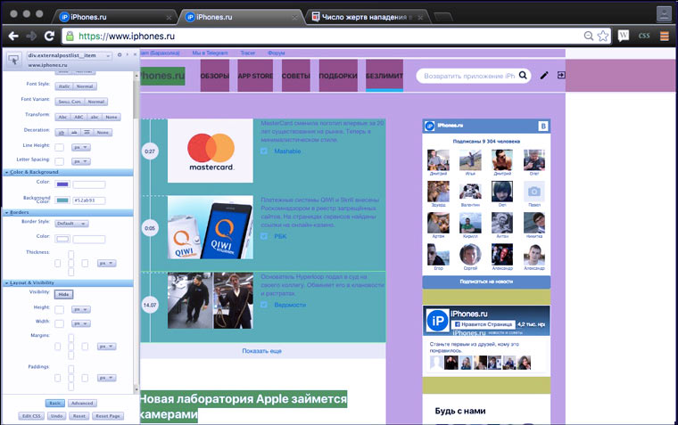
3. Выделяем какой-нибудь блок на странице, чтобы вокруг него появилась зеленая рамка (если не получилось сразу, нажмите на кнопку, обведенную на картинке красным).
4. Нажимаем на крестик в правом верхнем углу панели расширения и откройте страницу в новой вкладке. Теперь iPhones.ru всегда отображается с сиреневым блоком (когда включен Stylebot).
Как сделать элемент на странице невидимым?
1. Выделяем элемент.
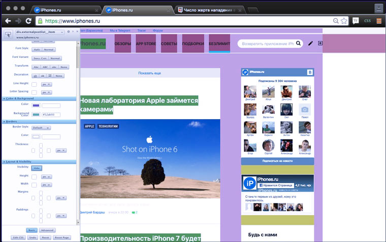
2. В блоке Layots and Visibility нажимаем кнопку Hide.
3. Куда же пропали короткие новости?
Как добавить фоновую картинку?
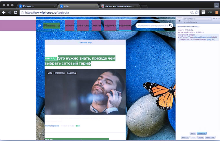
1. В самом низу блока активируем кнопочку Advanced и выделяем нужный элемент.
2. Вводим CSS-код:
[code]
background-image: url(«http://www.planwallpaper.com/static/images/butterfly-wallpaper.jpeg»);
[/code]
3.PROFIT!!!
P.S. Замените ссылку на изображение в коде на ту, которая вам нужна. С помощью CSS можно сделать гораздо больше, чем просто добавление фоновой картинки. К примеру: сделать все четыре стороны границ разных цветов или закрыть часть страницы черным квадратом. Для справки используйте Google и W3Schools CSS Reference.
Что делать, если вид элемента не меняется?
Определить из каких более мелких элементов он состоит, выделить их и применить к ним стили по отдельности. Если это не помогло, значит дизайн этой части страницы выполнен без помощи CSS-кода. Возможно, это картинка или flash-баннер.
Как отменить применение стилей?
Для этого в правом нижнем углу есть кнопка Reset Page.
Как поделится стилями с другими?
1. В меню дополнения выбираем пункт Share on Social
2. Регистрируемся/авторизируемся.
3. Снова в меню дополнения выбираем пункт Share on Social.
4. Заполняем информацию о публикуемом стиле
5. Нажимаем кнопку Post
6. Находим свой набор стилей в общем списке. Кириллицу сайт Stylebot не признает. Опубликованный пост легко удаляется.
Эту функцию можно использовать, чтобы делится стилями с самим собой и устанавливать их на разные компьютеры.
Как установить набор стилей из коллекции?
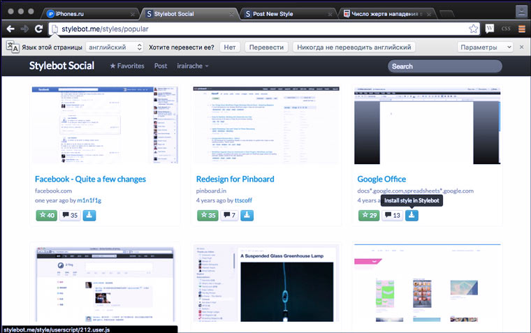
1. Находим нужный набор стилей с помощью формы поиска, фильтра по новинкам (Newest) или фильтра по популярности (Popular).
2. Нажимаем на зеленую кнопочку возле нужного стиля Install on Stylebot.
3. Заходим на соответствующий сайт и проверяем.
В коллекции Stylebot сложно найти что-то интересное. Если вы хотите использовать труд других людей, то лучше воспользоваться Stylish.
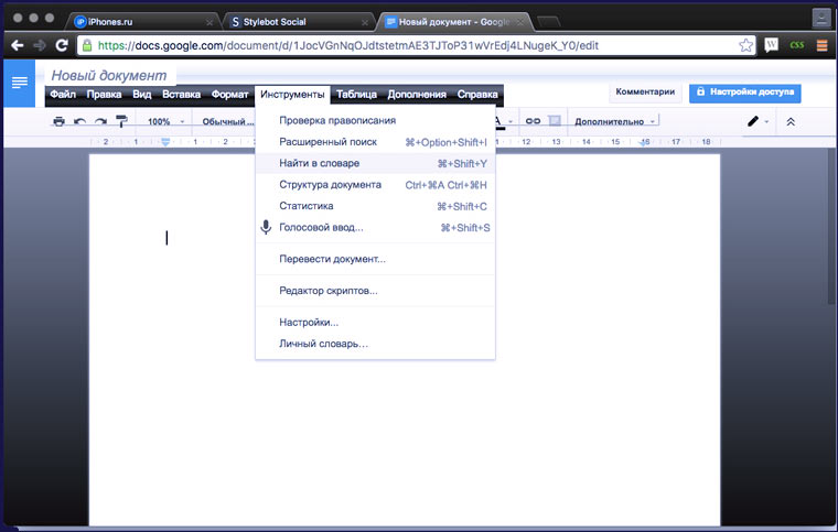
Как установить наборы стилей из Stylish?
1. Устанавливаем дополнение Stylish
2. Заходим на какой-нибудь популярный сайт, нажимаем на значок дополнения в правом верхнем углу и выбираем пункт меню Найти другие стили для этого веб-сайта.
3. Выбираем интересный нам набор стилей и переходим на страницу с описанием. Нажимаем Install with Stylish.
4. Обновляем страницу с сайтом, чтобы посмотреть как он теперь смотрится. С Яндексом получилось не очень, а вот Google теперь красавец!
Создавать темы для Stylish можно используя встроенный обозревать кода или advanced-функции Stylebot. Это расширение имеет также версию для Firefox.
 (Проголосуйте первым за статью!)
🤓 Хочешь больше? Подпишись на наш Telegram.
iPhones.ru
Добавляем цвета и скрываем лишнее. Недавно в комментарии The AGENT задал(a) вопрос: А можно как-то убрать эти бестолковые твиты на заглавной? Уж очень бесят, не читаю я их. Да, сайты не могут точно соответствовать ожиданиям своего посетителя. Но читатель может изменить «под себя» любой сайт. Эта статья расскажет о том, как поправить раздражающие детали (например,…
- дизайн

Серёжа СыроежкинКопирайтер
Фон для сайта HTML можно изменить как с помощью атрибутов тега body, так и с помощью CSS-стилей, примененных также к тегу body. Рассмотрим оба варианта как сделать фон для сайта.
Меняем цвет фона с помощью HTML
Тег body, как и практически любой HTML-тег имеет свои атрибуты. К атрибутам тега body относятся:
- bgcolor — определяет цвет фона для страницы;
- background — позволяет задать картинку в качестве фона веб-страницы (подробно этот вопрос рассмотрен в статье: Как сделать фон сайта картинкой HTML);
- scroll — управляет отображением полосы прокрутки на странице;
- text — задает базовый цвет текста, который будет выводиться на веб-странице;
- bgproperties — указывает, будет ли прокручиваться фон вместе со страницей;
- link — управляет цветом ссылок по умолчанию на странице;
- alink — устанавливает цвет для активной ссылки;
- vlink — определяет цвет для посещенной ссылки на странице;
- leftmargin/rightmargin — задает отступ контента от левого или правого края окна браузера;
- topmargin/bottommargin — задает отступ контента от верхнего или нижнего края окна браузера;
Чтобы изменить цвет фона с помощью HTML, воспользуемся атрибутом bgcolor:
<html>
 <head>
	<title>Меняем фон сайта с помощью HTML - Нубекс</title>
 </head>
 <body bgcolor="#fa8e47" text="#fff">
	<p>Это пример текста белого цвета, заданного с помощью атрибута text тега body.</p>
 </body>
</html>
Примечание: Рекомендуется определять цвет фона страницы, даже если фон белый. Это связано с тем, что некоторые пользователи могут использовать в браузере нестандартный цвет фона, и из-за этого текст на вашем сайте может быть нечитабельным.
Меняем цвет фона страницы с помощью CSS
Во избежании избыточности кода, рекомендуется всё, что связано с оформлением страницы, переносить на плечи CSS. К этому числу относится и задание цвета фона. CSS фон задается следующим образом:
<html>
 <head>
	<title>Меняем фон сайта с помощью CSS - Нубекс</title>
   <style>
	body {
   	   background: #fa8e47;
	   color: #fff;
   }
   </style>
 </head>
 <body>
	<p>Это пример текста белого цвета, заданного с помощью background CSS. Фон страницы также задан с помощью CSS.</p>
 </body>
</html>
В конструкторе сайтов «Нубекс» для любого сайта можно выбрать уже готовый фон из большой билиотеки изображений, или добавить свой.
Смотрите также:
Download Article
An easy-to-follow guide for coding with CSS and HTML to add the background colors of a page
Download Article
- Setting a Solid Background Color
- Creating a Gradient Background
- Creating a Changing Background
- Q&A
- Tips
- Warnings
|
|
|
|
|
Did you want to change the background color of that page using HTML? Unfortunately, with HTML 5, this is no longer possible in just HTML coding. Instead, you’ll need to use both HTML and CSS coding, which works even better. This wikiHow teaches you how to change the background color of a web page by editing its HTML and CSS.
Things You Should Know
- Although the attribute for HTML to manage background color is gone, you can still use HTML with CSS to change your background color easily.
- You’ll need a numeric code for the color you want if you want a specific color. If you don’t need a specific color, you can use words like «orange» or «light blue.»
- When editing a web page with HTML and CSS, you can create a solid background, gradient, or changing background.
-

1
Find your document’s «html» header. It should be near the top of the document.
-
2
Add the «background-color» property to the «body» element. Type
background-color:between the body brackets. You should now have the following «body» element:- In this context, only one spelling of «color» will work; you can’t use «colour» here.
body {
    background-color:
}
Advertisement
-
3
Add your desired background color to the «background-color» property. Type your selected color’s numeric code followed by a semicolon next to the «background-color:» element to do so. For example, to set your page’s background to pink, you would have the following:
body {
    background-color: #d24dff;
}
-
4
Review your «style» information. At this point, your HTML document’s header should resemble the following:
<!DOCTYPE html>
<html>
<head>
<style>
body {
background-color: #d24dff
}
</style>
</head>
</html>
-
5
Use «background-color» to apply background colors to other elements. Just as you set it in the body element, you can use «background-color» to define the backgrounds of other elements such as headers, paragraphs, and so on. For example, to apply a background color to a main header (<h1>) or a paragraph (<p>), you would have something resembling the following code:[1]
<!DOCTYPE html>
<html>
<head>
<style>
body {
    background-color: #93B874;
}
h1 {
    background-color: #00b33c;
}
p {
    background-color: #FFFFFF);
}
</style>
</head>
<body>
<h1>Header with Green Background</h1>
<p>Paragraph with white background</p>
</body>
</html>


Advertisement
-
1
Find your document’s «html» header. It should be near the top of the document.
-
2
Understand the basic syntax of this process. When making a gradient, there are two pieces of information you’ll need: the starting point/angle, and the colors that the gradient will transition between. You can select multiple colors to have the gradient move between all of them, and you can set a direction or angle for the gradient.[2]
background: linear-gradient(direction/angle, color1, color2, color3, etc);
}}
-
3
Make a vertical gradient. If you don’t specify the direction, the gradient will go from top to bottom. To create your gradient, add the following code between the
<style></style>tags:- Different browsers have different implementations of the gradient function, so you’ll have to include several versions of the code.
html {
    min-height: 100%; }
body {
    background: -webkit-linear-gradient(#93B874, #C9DCB9);
    background: -o-linear-gradient(#93B874, #C9DCB9);
    background: -moz-linear-gradient(#93B874, #C9DCB9);
    background: linear-gradient(#93B874, #C9DCB9);
    background-color: #93B874; }
-
4
Make a directional gradient. If you’d rather create a gradient that isn’t strictly vertical, you can add direction to the gradient in order to change the way the color shift appears. Do so by typing the following in between the
<style></style>tags:[3]
- You can play around with the «left» and «right» tags to experiment with different directions for your gradient.
html {
    min-height: 100%;}

body {
    background: -webkit-linear-gradient(left, #93B874, #C9DCB9);
    background: -o-linear-gradient(right, #93B874, #C9DCB9);
    background: -moz-linear-gradient(right, #93B874, #C9DCB9);
    background: linear-gradient(to right, #93B874, #C9DCB9);
    background-color: #93B874; }
-
5
Use other properties to adjust the gradient. There’s a lot more that you can do with gradients.
- For example, not only can you add more than two colors, you can also put a percentage after each one. This will allow you to set how much spacing you want each color segment to have. Here’s a sample gradient that uses this principle:
background: linear-gradient(#93B874 10%, #C9DCB9 70%, #000000 90%);
- For example, not only can you add more than two colors, you can also put a percentage after each one. This will allow you to set how much spacing you want each color segment to have. Here’s a sample gradient that uses this principle:
-
6
Add transparency to your colors. This will make the color fade. Use the same color to fade from the color to nothing. You’ll need to use the rgba() function to define the color. The ending value determines the transparency: 0 for solid and 1 for transparent.
background: linear-gradient(to right, rgba(147,184,116,0), rgba(147,184,116,1));
-
7
Review your completed code. The code to create a color gradient as your website’s background will look something like this:
<!DOCTYPE html>
<html>
<head>
<style>
html {
    min-height: 100%;
}

body {
    background: -webkit-linear-gradient(left, #93B874, #C9DCB9);
    background: -o-linear-gradient(right, #93B874, #C9DCB9);
    background: -moz-linear-gradient(right, #93B874, #C9DCB9);
    background: linear-gradient(to right, #93B874, #C9DCB9);
    background-color: #93B874;
}
</style>
</head>
<body>
</body>
</html>


Advertisement
-
1
Find your document’s «html» header. It should be near the top of the document.
-
2
Add the animation property to the «body» element. Type the following into the space below the «body {» bracket and above the closing bracket:[4]
- The top line of text is for Chromium-based browsers while the bottom line of text is for other browsers.
    -webkit-animation: colorchange 60s infinite;
    animation: colorchange 60s infinite;
-
3
Add your colors to the animation. Now you’ll use the @keyframes rule to set the background colors through which you’ll cycle, as well as the length of time each color will appear on the page. Again, you’ll need separate entries for the different sets of browsers. Enter the following lines of code below the closed «body» bracket:[5]
- Note that the two rules (@-webkit-keyframes and @keyframes have the same background colors and percentages. You’ll want these to stay uniform so the experience is the same on all browsers.
- The percentages (0%, 25%, etc) are of the total animation length (60s). When the page loads, the background will be the color set at 0% (#33FFF3). Once the animation has played for 25% of of 60 seconds, the background will turn to #7821F, and so on.
- You can modify the times and colors to fit your desired outcome.
@-webkit-keyframes colorchange {
     0%  {background: #33FFF3;}
    25%  {background: #78281F;}
    50%  {background: #117A65;}
    75%  {background: #DC7633;}
    100% {background: #9B59B6;}
}
@keyframes colorchange {
     0%  {background: #33FFF3;}
    25%  {background: #78281F;}
    50%  {background: #117A65;}
    75%  {background: #DC7633;}
    100% {background: #9B59B6;}
}
-
4
Review your code. Your entire code for the changing background color should resemble the following:
<!DOCTYPE html>
<html>
<head>
<style>
body {
    -webkit-animation: colorchange 60s infinite;
    animation: colorchange 60s infinite;
}
@-webkit-keyframes colorchange {
     0%  {background: #33FFF3;}
    25%  {background: #78281F;}
    50%  {background: #117A65;}
    75%  {background: #DC7633;}
    100% {background: #9B59B6;}
}
@keyframes colorchange {
     0%  {background: #33FFF3;}
    25%  {background: #78281F;}
    50%  {background: #117A65;}
    75%  {background: #DC7633;}
    100% {background: #9B59B6;}
}
</style>
</head>
<body>
</body>
</html>


Advertisement
Add New Question
-
Question
How do I set a background color for a specific width?

Use the background-size property inside of the «body» element. For example, «background-size: 300px 150px» makes the background 300 pixels wide and 150 pixels high.
-
Question
It does not work. What can I do?
UsernameHere11
Community Answer
To make it black, try:
body {
background-color: #190707} -
Question
What is the correct HTML for adding a background color?
My text goes here!
Replace the html code above with your text and selected your preferred color.
See more answers
Ask a Question
200 characters left
Include your email address to get a message when this question is answered.
Submit
Advertisement
-
Use online HTML pickers if you want a very specific color for your background. If, for example, you want the background to be the same color as your walls, you can match HTML colors with paint splotches at certain sites.
-
If you want to use basic colors within your HTML code, you can type the colors’ names without the pound sign (#) instead of using an HTML color code. For example: to create an orange background, you would type in
background-color: orange;here.
Show More Tips
Thanks for submitting a tip for review!
Advertisement
-
Make sure you test any changes to your website before publishing them online.
Advertisement
References
About This Article
Thanks to all authors for creating a page that has been read 1,491,185 times.
Is this article up to date?
Download Article
An easy-to-follow guide for coding with CSS and HTML to add the background colors of a page
Download Article
- Setting a Solid Background Color
- Creating a Gradient Background
- Creating a Changing Background
- Q&A
- Tips
- Warnings
|
|
|
|
|
Did you want to change the background color of that page using HTML? Unfortunately, with HTML 5, this is no longer possible in just HTML coding. Instead, you’ll need to use both HTML and CSS coding, which works even better. This wikiHow teaches you how to change the background color of a web page by editing its HTML and CSS.
Things You Should Know
- Although the attribute for HTML to manage background color is gone, you can still use HTML with CSS to change your background color easily.
- You’ll need a numeric code for the color you want if you want a specific color. If you don’t need a specific color, you can use words like «orange» or «light blue.»
- When editing a web page with HTML and CSS, you can create a solid background, gradient, or changing background.
-
1
Find your document’s «html» header. It should be near the top of the document.
-
2
Add the «background-color» property to the «body» element. Type
background-color:between the body brackets. You should now have the following «body» element:- In this context, only one spelling of «color» will work; you can’t use «colour» here.
body {
    background-color:
}
Advertisement
-
3
Add your desired background color to the «background-color» property. Type your selected color’s numeric code followed by a semicolon next to the «background-color:» element to do so. For example, to set your page’s background to pink, you would have the following:
body {
    background-color: #d24dff;
}
-
4
Review your «style» information. At this point, your HTML document’s header should resemble the following:
<!DOCTYPE html>
<html>
<head>
<style>
body {
background-color: #d24dff
}
</style>
</head>
</html>
-
5
Use «background-color» to apply background colors to other elements. Just as you set it in the body element, you can use «background-color» to define the backgrounds of other elements such as headers, paragraphs, and so on. For example, to apply a background color to a main header (<h1>) or a paragraph (<p>), you would have something resembling the following code:[1]
<!DOCTYPE html>
<html>
<head>
<style>
body {
    background-color: #93B874;
}
h1 {
    background-color: #00b33c;
}
p {
    background-color: #FFFFFF);
}
</style>
</head>
<body>
<h1>Header with Green Background</h1>
<p>Paragraph with white background</p>
</body>
</html>
Advertisement
-
1
Find your document’s «html» header. It should be near the top of the document.
-
2
Understand the basic syntax of this process. When making a gradient, there are two pieces of information you’ll need: the starting point/angle, and the colors that the gradient will transition between. You can select multiple colors to have the gradient move between all of them, and you can set a direction or angle for the gradient.[2]
background: linear-gradient(direction/angle, color1, color2, color3, etc);
}}
-
3
Make a vertical gradient. If you don’t specify the direction, the gradient will go from top to bottom. To create your gradient, add the following code between the
<style></style>tags:- Different browsers have different implementations of the gradient function, so you’ll have to include several versions of the code.
html {
    min-height: 100%; }
body {
    background: -webkit-linear-gradient(#93B874, #C9DCB9);
    background: -o-linear-gradient(#93B874, #C9DCB9);
    background: -moz-linear-gradient(#93B874, #C9DCB9);
    background: linear-gradient(#93B874, #C9DCB9);
    background-color: #93B874; }
-
4
Make a directional gradient. If you’d rather create a gradient that isn’t strictly vertical, you can add direction to the gradient in order to change the way the color shift appears. Do so by typing the following in between the
<style></style>tags:[3]
- You can play around with the «left» and «right» tags to experiment with different directions for your gradient.
html {
    min-height: 100%;}

body {
    background: -webkit-linear-gradient(left, #93B874, #C9DCB9);
    background: -o-linear-gradient(right, #93B874, #C9DCB9);
    background: -moz-linear-gradient(right, #93B874, #C9DCB9);
    background: linear-gradient(to right, #93B874, #C9DCB9);
    background-color: #93B874; }
-
5
Use other properties to adjust the gradient. There’s a lot more that you can do with gradients.
- For example, not only can you add more than two colors, you can also put a percentage after each one. This will allow you to set how much spacing you want each color segment to have. Here’s a sample gradient that uses this principle:
background: linear-gradient(#93B874 10%, #C9DCB9 70%, #000000 90%);
- For example, not only can you add more than two colors, you can also put a percentage after each one. This will allow you to set how much spacing you want each color segment to have. Here’s a sample gradient that uses this principle:
-
6
Add transparency to your colors. This will make the color fade. Use the same color to fade from the color to nothing. You’ll need to use the rgba() function to define the color. The ending value determines the transparency: 0 for solid and 1 for transparent.
background: linear-gradient(to right, rgba(147,184,116,0), rgba(147,184,116,1));
-
7
Review your completed code. The code to create a color gradient as your website’s background will look something like this:
<!DOCTYPE html>
<html>
<head>
<style>
html {
    min-height: 100%;
}

body {
    background: -webkit-linear-gradient(left, #93B874, #C9DCB9);
    background: -o-linear-gradient(right, #93B874, #C9DCB9);
    background: -moz-linear-gradient(right, #93B874, #C9DCB9);
    background: linear-gradient(to right, #93B874, #C9DCB9);
    background-color: #93B874;
}
</style>
</head>
<body>
</body>
</html>
Advertisement
-
1
Find your document’s «html» header. It should be near the top of the document.
-
2
Add the animation property to the «body» element. Type the following into the space below the «body {» bracket and above the closing bracket:[4]
- The top line of text is for Chromium-based browsers while the bottom line of text is for other browsers.
    -webkit-animation: colorchange 60s infinite;
    animation: colorchange 60s infinite;
-
3
Add your colors to the animation. Now you’ll use the @keyframes rule to set the background colors through which you’ll cycle, as well as the length of time each color will appear on the page. Again, you’ll need separate entries for the different sets of browsers. Enter the following lines of code below the closed «body» bracket:[5]
- Note that the two rules (@-webkit-keyframes and @keyframes have the same background colors and percentages. You’ll want these to stay uniform so the experience is the same on all browsers.
- The percentages (0%, 25%, etc) are of the total animation length (60s). When the page loads, the background will be the color set at 0% (#33FFF3). Once the animation has played for 25% of of 60 seconds, the background will turn to #7821F, and so on.
- You can modify the times and colors to fit your desired outcome.
@-webkit-keyframes colorchange {
     0%  {background: #33FFF3;}
    25%  {background: #78281F;}
    50%  {background: #117A65;}
    75%  {background: #DC7633;}
    100% {background: #9B59B6;}
}
@keyframes colorchange {
     0%  {background: #33FFF3;}
    25%  {background: #78281F;}
    50%  {background: #117A65;}
    75%  {background: #DC7633;}
    100% {background: #9B59B6;}
}
-
4
Review your code. Your entire code for the changing background color should resemble the following:
<!DOCTYPE html>
<html>
<head>
<style>
body {
    -webkit-animation: colorchange 60s infinite;
    animation: colorchange 60s infinite;
}
@-webkit-keyframes colorchange {
     0%  {background: #33FFF3;}
    25%  {background: #78281F;}
    50%  {background: #117A65;}
    75%  {background: #DC7633;}
    100% {background: #9B59B6;}
}
@keyframes colorchange {
     0%  {background: #33FFF3;}
    25%  {background: #78281F;}
    50%  {background: #117A65;}
    75%  {background: #DC7633;}
    100% {background: #9B59B6;}
}
</style>
</head>
<body>
</body>
</html>
Advertisement
Add New Question
-
Question
How do I set a background color for a specific width?
Use the background-size property inside of the «body» element. For example, «background-size: 300px 150px» makes the background 300 pixels wide and 150 pixels high.
-
Question
It does not work. What can I do?
UsernameHere11
Community Answer
To make it black, try:
body {
background-color: #190707} -
Question
What is the correct HTML for adding a background color?
My text goes here!
Replace the html code above with your text and selected your preferred color.
See more answers
Ask a Question
200 characters left
Include your email address to get a message when this question is answered.
Submit
Advertisement
-
Use online HTML pickers if you want a very specific color for your background. If, for example, you want the background to be the same color as your walls, you can match HTML colors with paint splotches at certain sites.
-
If you want to use basic colors within your HTML code, you can type the colors’ names without the pound sign (#) instead of using an HTML color code. For example: to create an orange background, you would type in
background-color: orange;here.
Show More Tips
Thanks for submitting a tip for review!
Advertisement
-
Make sure you test any changes to your website before publishing them online.
Advertisement
References
About This Article
Thanks to all authors for creating a page that has been read 1,491,185 times.
Is this article up to date?
-
1
Определите цвет фона, который вы хотите использовать. В HTML цвета задаются кодами, которые определяют различные оттенки. Воспользуйтесь бесплатным онлайн-инструментом W3Schools HTML Color Picker, чтобы найти коды нужных цветов:
- Перейдите на страницу https://www.w3schools.com/colors/colors_picker.asp в веб-браузере компьютера.
- Выберите базовый цвет, который хотите использовать, в разделе «Pick a Color» (Выбрать цвет).
- Выберите оттенок в правой части страницы.
- Запишите код, который отобразится справа от выбранного оттенка.
-
2
Откройте HTML-файл в текстовом редакторе. Помните, что в HTML5 атрибут <bgcolor> больше не поддерживается. Поэтому цвет фона и другие параметры стиля страницы задаются с помощью CSS.[1]
- HTML-документ можно открыть в Notepad++ или Блокноте (Windows), а также в TextEdit или BBEdit (Mac).
-
3
Добавьте заголовок «html» в документ. Все параметры стиля страницы, включая цвет фона, должны находиться между тегами
<style></style>:<!DOCTYPE html> <html> <head> <style> </style> </head> </html>
-
4
Создайте пустую строку между тегами «style». На этой строке, которая должна находиться под тегом
<style>и над тегом</style>, вы введете необходимую информацию. -
6
Добавьте элемент «body». Введите следующий код между тегами
<style></style>:- Все, что будет заключено внутри элемента «body» в CSS, повлияет на всю страницу.
- Пропустите этот шаг, если хотите создать градиентный фон.
Реклама


5


-
1
Найдите заголовок «html». Он должен быть в верхней части документа.
-
2
Добавьте свойство «background-color» в элемент «body». Введите
background-color:в фигурных скобках внутри элемента «body». Должен получиться следующий код:body { background-color: }
- Обратите внимание, что в этом коде необходимо использовать слово «color», а не «colour».
-
3
Добавьте нужный цвет фона в свойство «background-color». Справа от «background-color:» введите числовой код выбранного цвета, а затем введите точку с запятой (;). Например, чтобы фон страницы сделать розовым, напишите следующий код:
body {
    background-color: #d24dff;
}
-
4
Просмотрите информацию внутри тегов «style». На этом этапе заголовок вашего HTML-документа должен выглядеть следующим образом:
<!DOCTYPE html>
<html>
<head>
<style>
body {
background-color: #d24dff
}
</style>
</head>
</html>
-
5
Используйте «background-color», чтобы задать цвет фона других элементов (заголовков, абзацев и тому подобных). Например, чтобы задать цвет фона основного заголовка (<h1>) или абзаца (<p>), напишите следующий код:[2]
<!DOCTYPE html>
<html>
<head>
<style>
body {
    background-color: #93B874;
}
h1 {
    background-color: #00b33c;
}
p {
    background-color: #FFFFFF);
}
</style>
</head>
<body>
<h1>Заголовок на зеленом фоне</h1>
<p>Абзац на белом фоне</p>
</body>
</html>
Реклама


-
1
Найдите заголовок «html». Он должен быть в верхней части документа.
-
2
Запомните основной синтаксис этого процесса. Чтобы создать градиент, необходимо знать две величины: начальную точку/угол и ряд цветов, которые будут переходить один в другой. Можно выбрать несколько цветов, чтобы они переходили друг в друга; также можно задать направление или угол перехода. [3]
background: linear-gradient(направление/угол, цвет1, цвет2, цвет3 и так далее);
-
3
Создайте вертикальный градиент. Если не задать направление, градиент будет идти сверху вниз. Чтобы создать такой градиент, введите следующий код между тегами
<style></style>:html { min-height: 100%; } body { background: -webkit-linear-gradient(#93B874, #C9DCB9); background: -o-linear-gradient(#93B874, #C9DCB9); background: -moz-linear-gradient(#93B874, #C9DCB9); background: linear-gradient(#93B874, #C9DCB9); background-color: #93B874; }
- В различных браузерах функции градиента реализованы по-разному, поэтому нужно добавить несколько версий кода.
-
4
Создайте направленный градиент. Если вы не хотите, чтобы градиент шел по вертикали, укажите направление перехода цветов. Для этого введите следующий код между тегами
<style></style>:[4]
html {
    min-height: 100%;
}

body {
    background: -webkit-linear-gradient(left, #93B874, #C9DCB9);
    background: -o-linear-gradient(right, #93B874, #C9DCB9);
    background: -moz-linear-gradient(right, #93B874, #C9DCB9);
    background: linear-gradient(to right, #93B874, #C9DCB9);
    background-color: #93B874;
}
- Если хотите, переставьте слова «left» (влево) и «right» (вправо), чтобы поэкспериментировать с разными направлениями градиента.
-
5
Используйте другие свойства для настройки градиента. С ним можно сделать больше, чем кажется.
- Например, после каждого цвета можно ввести число в процентах. Так вы укажите, какое пространство будет занимать каждый цветовой сегмент. Вот пример кода с такими параметрами:
background: linear-gradient(#93B874 10%, #C9DCB9 70%, #000000 90%);
- Добавьте прозрачность к цвету. В этом случае он будет постепенно затухать. Чтобы добиться эффекта затухания, используйте один и тот же цвет. Чтобы задать цвет, понадобится функция rgba(). Последнее значение определит прозрачность: 0 — непрозрачный цвет и 1 — прозрачный цвет.
background: linear-gradient(to right, rgba(147,184,116,0), rgba(147,184,116,1));
- Например, после каждого цвета можно ввести число в процентах. Так вы укажите, какое пространство будет занимать каждый цветовой сегмент. Вот пример кода с такими параметрами:
-
6
Просмотрите код. Код для создания цветового градиента в качестве фона веб-страницы будет выглядеть примерно так:
<!DOCTYPE html>
<html>
<head>
<style>
html {
    min-height: 100%;
}

body {
    background: -webkit-linear-gradient(left, #93B874, #C9DCB9);
    background: -o-linear-gradient(right, #93B874, #C9DCB9);
    background: -moz-linear-gradient(right, #93B874, #C9DCB9);
    background: linear-gradient(to right, #93B874, #C9DCB9);
    background-color: #93B874;
}
</style>
</head>
<body>
</body>
</html>
Реклама


-
1
Найдите заголовок «html». Он должен быть в верхней части документа.
-
2
Добавьте свойство «animation» в элемент «body». Введите следующий код после «body {» и до закрывающей фигурной скобки:[5]
    -webkit-animation: colorchange 60s infinite;
    animation: colorchange 60s infinite;
- Верхняя строка текста предназначена для браузеров на основе Chromium, а нижняя строка текста — для других браузеров.
-
3
Добавьте цвета в свойство «animation». Воспользуйтесь правилом «@keyframes», чтобы задать цвета фона, которые будут циклически меняться, а также время, в течение которого каждый цвет будет отображаться на странице. Не забудьте ввести разный код для различных браузеров. Введите следующий код под закрывающей фигурной скобкой элемента «body»: [6]
@-webkit-keyframes colorchange {
     0%  {background: #33FFF3;}
    25%  {background: #78281F;}
    50%  {background: #117A65;}
    75%  {background: #DC7633;}
    100% {background: #9B59B6;}
}
@keyframes colorchange {
     0%  {background: #33FFF3;}
    25%  {background: #78281F;}
    50%  {background: #117A65;}
    75%  {background: #DC7633;}
    100% {background: #9B59B6;}
}
- Обратите внимание, что два правила (@-webkit-keyframes и @keyframes) имеют одинаковые цвета фона и проценты. Это сделано для того, чтобы меняющийся фон правильно работал в любом браузере.
- Проценты (0%, 25% и так далее) обозначают долю от времени (60 с). Когда страница загрузится, ее фоном будет цвет #33FFF3. Когда пройдет 15 с (25% от 60 с), фон сменится на цвет # 7821F и так далее.
- Измените время и цвета, чтобы они соответствовали желаемому результату.
-
4
Просмотрите код. Код для создания меняющегося фона должен выглядеть следующим образом:
<!DOCTYPE html>
<html>
<head>
<style>
body {
    -webkit-animation: colorchange 60s infinite;
    animation: colorchange 60s infinite;
}
@-webkit-keyframes colorchange {
     0%  {background: #33FFF3;}
    25%  {background: #78281F;}
    50%  {background: #117A65;}
    75%  {background: #DC7633;}
    100% {background: #9B59B6;}
}
@keyframes colorchange {
     0%  {background: #33FFF3;}
    25%  {background: #78281F;}
    50%  {background: #117A65;}
    75%  {background: #DC7633;}
    100% {background: #9B59B6;}
}
</style>
</head>
<body>
</body>
</html>
Реклама


Советы
- Если вы хотите использовать основные цвета в HTML-коде, можно вводить имена цветов (без символа #), а не их числовые коды. Например, чтобы создать оранжевый фон, введите
background-color: orange;. - В качестве фона веб-страницы можно установить изображение.
Реклама
Предупреждения
- Проверьте изменения, внесенные в код веб-сайта, прежде чем публиковать их.
Реклама
Источники
Об этой статье
Эту страницу просматривали 185 520 раз.